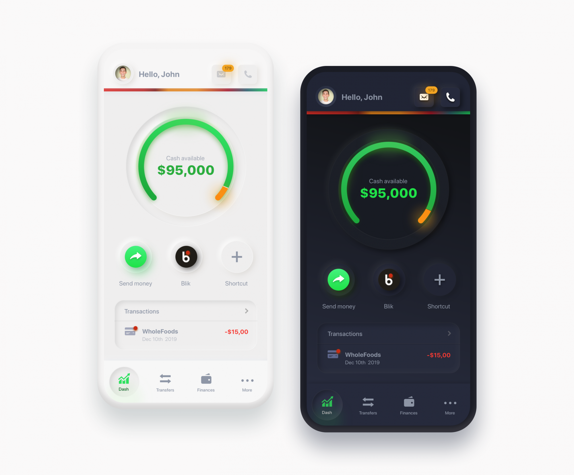

RESOURCES
- Neumorphism
- https://css-tricks.com/neumorphism-and-css/
- GENERATOR: https://neumorphism.io/#e0e0e0
- UI KIT $69: https://demo.themesberg.com/neumorphism-ui-pro/html/components/all.html
- FREE KIT: https://medium.muz.li/neumorphic-design-ad5586796b1b
KIT: https://github.com/turq84/NeuVision-Gatsby-Template (LIVE DEMO) - EXAMPLES:
- MORE
- https://dribbble.com/search/neumorphism
- https://bashooka.com/inspiration/neumorphism-ui-design-examples/
- https://www.easeout.co/blog/2020-03-27-25-top-neumorphism-ui-design-examples/
- ISSUES
- Neumorphism in user interfaces
- Neumorphism — the zombie trend
- Let’s talk Neumorphism and Accessibility
- FREE UI KITS: https://themesberg.com/templates/free
- https://themesberg.com/docs/neumorphism-ui/getting-started/quick-start/
- neumorphism-ui-v1.0.0.zip
- https://demo.themesberg.com/volt-react-dashboard/#/documentation/quick-start
- https://themesberg.com/docs/pixel-bootstrap/getting-started/overview/
- pixel-lite.zip
- github : https://github.com/themesberg/neumorphism-ui-bootstrap
- neumorphism-ui-bootstrap-master.zip
- https://demo.themesberg.com/volt-react-dashboard/#/documentation/quick-start
- Impact Design System
- impact-design-system-v1.0.0.zip
- https://demos.creative-tim.com/impact-design-system-pro/docs/getting-started/quick-start/
- Swipe
https://themesberg.com/product/bootstrap/swipe-free-mobile-app-one-page-bootstrap-5-template
swipe-v1.2.0.zip
https://github.com/themesberg/swipe-one-page-bootstrap-5
https://css-tricks.com/neumorphism-and-css/
Neumorphism as a user interface
We’ve already established that the defining quality of neumorphism is a blend of minimalism and skeuomorphism. And that’s a good way to look at it. Think about the minimal aesthetic of Material Design and the hyper-realistic look of skeuomorphism. Or, think back to Apple’s design standards circa 2007-12 and compare it to the interfaces it produces today.
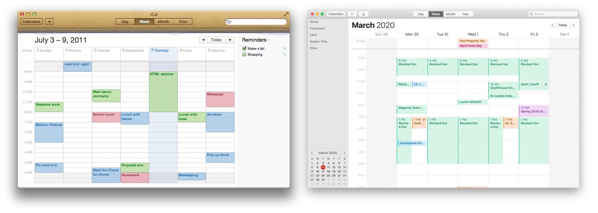
 Nine years of Apple Calendar! The image on the left is taken from 2011 and exhibits the look and feel of a real, leather-bound journal, said to be inspired by one on Steve Jobs’ personal yacht. The right is the same app as shown today in 2020, bearing a lot less physical inspiration with a look and feel we might describe as “flat” or minimal.
If we think about Apple’s skeuomorphic designs from earlier in the century as one extreme and today’s minimal UI as another, then we might consider neumorphism as something in the middle.
 Alexander Plyuto has championed and evolved neomorphic designs on his Dribbble account. (Source)
Neumorphic UI elements look like they’re connected to the background, as if the elements are extruded from the background or inset into the background. They’ve been described by some as “soft UI” because of the way soft shadows are used to create the effect.
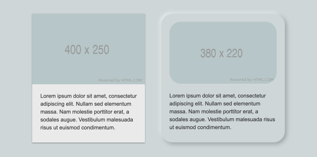
Another way to understand neumorphic UI is to compare it to Material Design. Let’s use a regular card component to draw a distinction between the two.
 Notice how the Material Design card (left) looks like it floats above the background, while the neumorphic variation(right) appears to be pushed up through the background, like a physical protrusion.
Let’s break down the differences purely from a design standpoint.
| Quality | Material Design | Neomorphism |
|---|---|---|
| Shadows | Elements have a single or multiple dark shadows around them. | Elements have two shadows: one light and one dark. |
| Background colors | An element’s background color can be different than the background color of the parent element. | Background colors must be the same (or very similar) as the background color of the parent element. |
| Edges | Elements can be rounded or squared. | Rounded edges are a defining quality. |
| Borders | There are no hard rules on borders. Using them can help prevent elements that look like they are floating off the screen. | Elements can have an optional subtle border to improve contrast and make the edges a bit sharper |
That should draw a pretty picture of what we’re talking about when we refer to neumorphism. Let’s move on to how it’s implemented in CSS.
Neumorphism and CSS
Creating a neumorphic interface with CSS is seemingly as easy as applying a regular box-shadow property on any element, but it’s more nuanced than that. The distinctiveness of a neumorphic UI comes from using multiple box-shadow and background-color values to achieve different types of effects and variations.
Neumorphic box shadows
Let’s do a quick refresher on the property first so we can get a better understanding. Here’s the syntax:
box-shadow: [horizontal offset] [vertical offset] [blur radius] [optional spread radius] [color];
Following options can be adjusted:
- Horizontal offset: A positive value offsets shadow to the right, while a negative value offsets it to the left.
- Vertical offset: A positive value offsets shadow upwards, while a negative value offsets it downwards.
- Blur Radius: The length of the shadow. The longer the length, the bigger and lighter the shadow becomes. There are no negative values.
- Spread Radius: This is another length value, where larger values result in bigger, longer shadows.
- Color: This defines the shadow’s color, just as we’d do for the CSS color property.
- Inset: The default value (initial) results in a drop shadow. Using the inset value moves the shadow inside the frame of the element, resulting in an inner shadow.
We can apply multiple shadows using comma-separated box-shadow values. Up to four values can be concatenated, one for each side of the box.
box-shadow: 20px 20px 50px #00d2c6,
            -30px -30px 60px #00ffff;
The following shows the box-shadow property values for a neumorphic UI element. Individual offset, blur and opacity values can be adjusted to be higher or lower, depending on the size of an element and the intensity of the effect that you’re trying to achieve. For neumorphism, it’s required to keep the shadows soft and low contrast.
As we’ve mentioned before, a core part of neumorphic elements is the use of two shadows: a light shadow and a dark shadow. That’s how we get that sort of “raised” effect and we can create variations by changing the “light source” of the shadows.
Two positive and two negative offset values need to be set. Taking this into account, we get the following four combinations, simply by changing the placement of each shadow.
Let’s use CSS variables to keep the values abstract and better understand the variations.
box-shadow: var(--h2) var(--v1) var(--blur1) var(--color-dark),
            var(--h2) var(--v2) var(--blur2) var(--color-light);
| Light Source | Positive Values | Negative Values |
|---|---|---|
| Top Left | --h2, --v1 |
--h2, --v2 |
| Top Right | --h2, --v1 |
--h2, --v2 |
| Bottom Left | --h2, --v2 |
--h2, --v1 |
| Bottom Right | --h2, --v2 |
--h2, --v1 |
We can use inset shadows to create yet more variations. Unlike drop shadows that make an element appear to be raised from beneath the background, an inset shadow gives the appearance that the element is being pressed into it.
We can change if the element is extruded from the background or inset into the background by applying the initial (not apply the option at all) or inset, respectively.
Let’s keep our light source as the top left and only toggle the inset option to see the difference.
Background colors
You might have noticed that the box-shadow values change the look of the edges of a neumorphic element. So far, we haven’t changed the background-color because it needs to be transparent or have the same (or similar) color as a background color of an underlying element, such as the element’s parent.
We can use both solid and gradient backgrounds. Using a solid color background on the element can create a flat surface sort of look, when that solid color is the same as the color of the underlying element.
On the other hand, using subtle gradients can change how the surface is perceived. As with the box-shadow property, there is alight and a dark value in a gradient. The gradient angle needs to be adjusted to match the light source. We have the following two variations when using gradients:
- Convex surface variation: The surface curves outwards where the gradient’s lighter section is aligned with the shadow’s lighter section, and the gradient’s darker section is aligned to the shadow’s darker section.
- Concave surface variation: The surface curves inward where the gradient’s lighter section is aligned to the shadow’s darker section, and the gradient’s darker section is aligned to the shadow’s lighter section.
.element {
  background: linear-gradient(var(--bg-angle), var(--bg-start), var(--bg-end));
  box-shadow: var(--h2) var(--v1) var(--color-dark),
              var(--h2) var(--v2) var(--color-light);
}
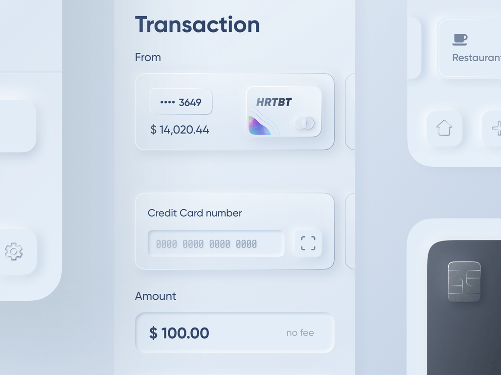
Neumorphism in practice
Let’s see how Neumorphism performs when applied to a simple button. The main characteristic of a neumorphic interface is that it blends with the background and does so by having a similar or same background color as the underlying element. The main purpose of many buttons, especially a primary call-to-action, is to stand out as much as possible, usually with a prominent background color in order to separate it from other elements and other buttons on the page.
The background color constraint in neumorphism takes away that convenience. If the background color of the button matches the background color of what it’s on top of, we lose the ability to make it stand out visually with a unique color.
We can try and adjust text color, add a border below the text, add an icon or some other elements to increase the visual weight to make it stand out, etc. Whatever the case, a solid background color on a neumorphic button seems to stand out more than a gradient. Plus, it can be paired with an inset shadow on the active state to create a nice “pressed” effect.
 Even though the solid color on a neumorphic button calls more attention than a gradient background, it still does not beat the way an alternate color makes a button stand out from other elements on the page.
Taking some inspiration from the real-world devices, I’ve created the following examples as an attempt to improve on the neumorphic button and toggle concept. Although the results look somewhat better, the regular button still provides a better UX, has much fewer constraints, is more flexible, is simpler to implement, and does a better job overall.
The first example was inspired by a button on my router that extrudes from the device and has a sticker with an icon on it. I added a similar “sticker” element with a solid color background as well as a slight inset to add more visual weight and make it stand out as closely as possible to the ideal button. The second example was inspired by a car control panel where the button would light up when it’s in an active (pressed) state.
Let’s take a look at some more HTML elements. One of the downsides of neumorphism that has been pointed out is that it shouldn’t be applied to elements that can have various states, like inputs, select elements, progress bars, and others. These states include:
- User interaction: Hover, active, focus, visited
- Validation states: Error, success, warning, disabled
UX and accessibility rules require some elements to look different in each of their respective validation states and user interaction states. Neumorphism constraints and restrictions severely limit the customization options that are required to achieve the different styles for each possible state. Variations will be very subtle and aren’t possibly able to cover every single state.
 Everything looks like a button! Notice how the input and button look similar and how the progress bar looks like a scrollbar or a really wide toggle.
It’s hard to see which elements are clickable! Even though this is the simplest possible example that showcases the issue, we could have added extra elements and styles to try and mitigate the issues. But as we’ve seen with the button example, some other types of elements would still perform better in terms of UX and accessibility.
It’s important to notice that Neumorphic elements also take more space (inside padding and outside margin) due to the shadow and rounded corners. A neumorphic effect wouldn’t look so good on a small-sized element simply because the visual effects consume the element.
The ideal element for neumorphism are cards, or any other static container element that doesn’t have states based on user interaction (e.g. hover, active and disabled) or validation (e.g. error, warning, and success).
In his highly critical article on neumorphism, Michal Malewicz (who helped coin “Neumorphism” as a term) suggests adding Neumorphic effects to the cards that already look good without it.
So the only way it works OK is when the card itself has the right structure, and the whole extrusion is unnecessary for hierarchy.
See?
It works well when it can be removed without any loss for the product.
Accessibility and UX
We’ve seen which elements work well with neumorphism, but there are some important rules and restrictions to keep in mind when adding the effect to elements.
First is accessibility. This is a big deal and perhaps the biggest drawback to neumorphism: color contrast.
Neumorphic UI elements rely on multiple shadows that help blend the element into the background it is on. Using subtle contrasts isn’t actually the best fit for an accessible UI. If a contrast checker is scanning your UI, it may very well call you out for not having high enough contrast between the foreground and background because shadows don’t fit into the equation and, even if they did, they’d be too subtle to make much of a difference.
Here are some valid criticisms about the accessibility of a neumorphic design:
- Users with color blindness and poor vision would have difficulty using it due to the poor contrast caused by the soft shadows.
- Page hierarchy is difficult to perceive when the effect is overused on a page. No particular element stands out due to the background color restrictions.
- Users can get confused when the effect is overused on a page. Due to the extrusion effect, it’s difficult to determine which elements users can interact with and which are static.
In order to achieve a good contrast with the shadow, the background color of what a neumorphic element sits on shouldn’t get too close to the edges of RGB extremes (white and black).
Let’s talk UX for a moment. Even though Neumorphic UI looks aesthetically pleasing, it shouldn’t be a dominant style on a page. If used too often, the UI will have an overwhelmingly plastic effect and the visual hierarchy will be all out of whack. The page could easily lose its intended structure when directing users to the most important content or to the main flow.
My personal take is that neumorphism is best used as an enhancement to another style. For example, it could be paired with Material Design in a way that draws distinctions between various component styles. It’s probably best to use it sparsely so that it adds a fresh alternative look to something on the screen — there’s a diminishing return on its use and it’s a good idea to watch out for it.
Here’s an example where neumorphic qualities are used on card elements in combination with Materialize CSS:
See, it can be pretty nice when used as an accent instead of an entire framework.
That’s a wrap
So that was a deep look at neumorphism. We broke down what makes the style distinct from other popular styles, looked at a few ways to re-create the effect in CSS, and examined the implications it has on accessibility and user experience.
In practice, a full-scale neumorphic design system probably cannot be used on a website. It’s simply too restrictive in what colors can be used. Plus, the fact that it results in soft contrasts prevents it from being used on interactive elements, like buttons and toggle elements. Sure, it’s aesthetically-pleasing, modern and unique, but that shouldn’t come at the expense of usability and accessibility. It should be used sparsely, ideally in combination with another design system like Material Design.
Neumorphism is unlikely to replace the current design systems we use today (at least in my humble opinion), but it may find its place in those same design systems as a fresh new alternative to existing cards and static container styles.
References
https://uxdesign.cc/neumorphism-in-user-interfaces-b47cef3bf3a6
Neumorphism in user interfaces
How UI trends reach for inspiration into the real world and what problems do we have to solve to make those trends work.
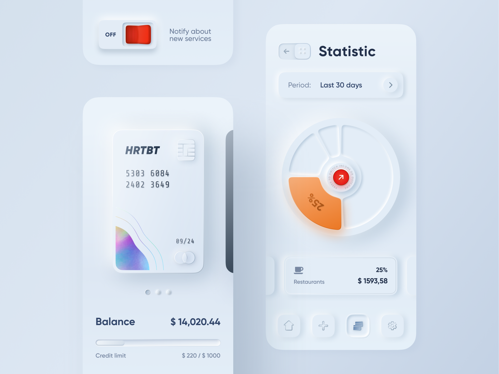
The example we’ve made live in front of an audience in about 1h at our DoGoodS*!t design event.
Last week we explored some potential new trends in UI design, with one particular trend gaining a lot of attention on both Dribbble and Instagram lately. This “New skeuomorphism” has been called by Jason Kelley Neuomorphism in the comments. I decided to skip the “o” and the name Neuomorphism came alive.
(Also thanks for all the great comments — I understand that Skeuomorphism was always “just behind the corner” but it’s all about the designers perceived trends vs reality here)
🔥 Also check out my YouTube videos where I cover many of the design trends, including this one.
Skeuomorphism anyone?
While various forms of Skeuomorphism still exist in UI’s (your desktop OS trash bin for example) the trend towards a particular part of this style is more apparent.
As Kamil Falana pointed out the switch from lifeless “representations” to something mid-way to realism started happening.

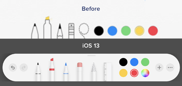
We also noticed a while back, that this change started happening all around us — Apple being a good example. The push towards “super flat and minimal” got a pushback and ended up with a bit more of that textureless 3d feel. People seem to like it.
Halfway back, but better?
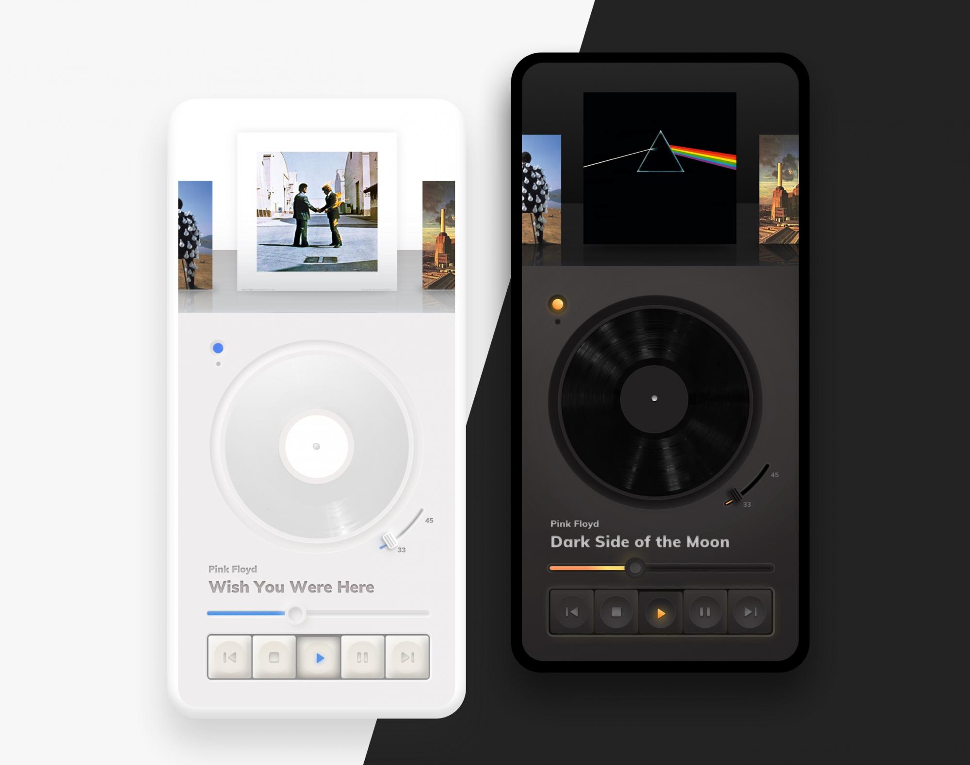
The entire hype started with one Dribbble shot that quickly went viral.
This shot by Dribbble user alexplyuto gained over 3000 likes and pushed the trend forward. After that it exploded in popularity and similar concepts started to emerge. We also made a couple 🙂
This shot started a trend and while parts of it don’t make a whole lot of sense (a slide-to-go back arrow?) it was precisely what we needed to get excited with UI’s again. Thanks Alex!
What’s the difference?
Since the buttons didn’t change as much, let’s focus on the actual cards concept that makes this such a nice visual style.
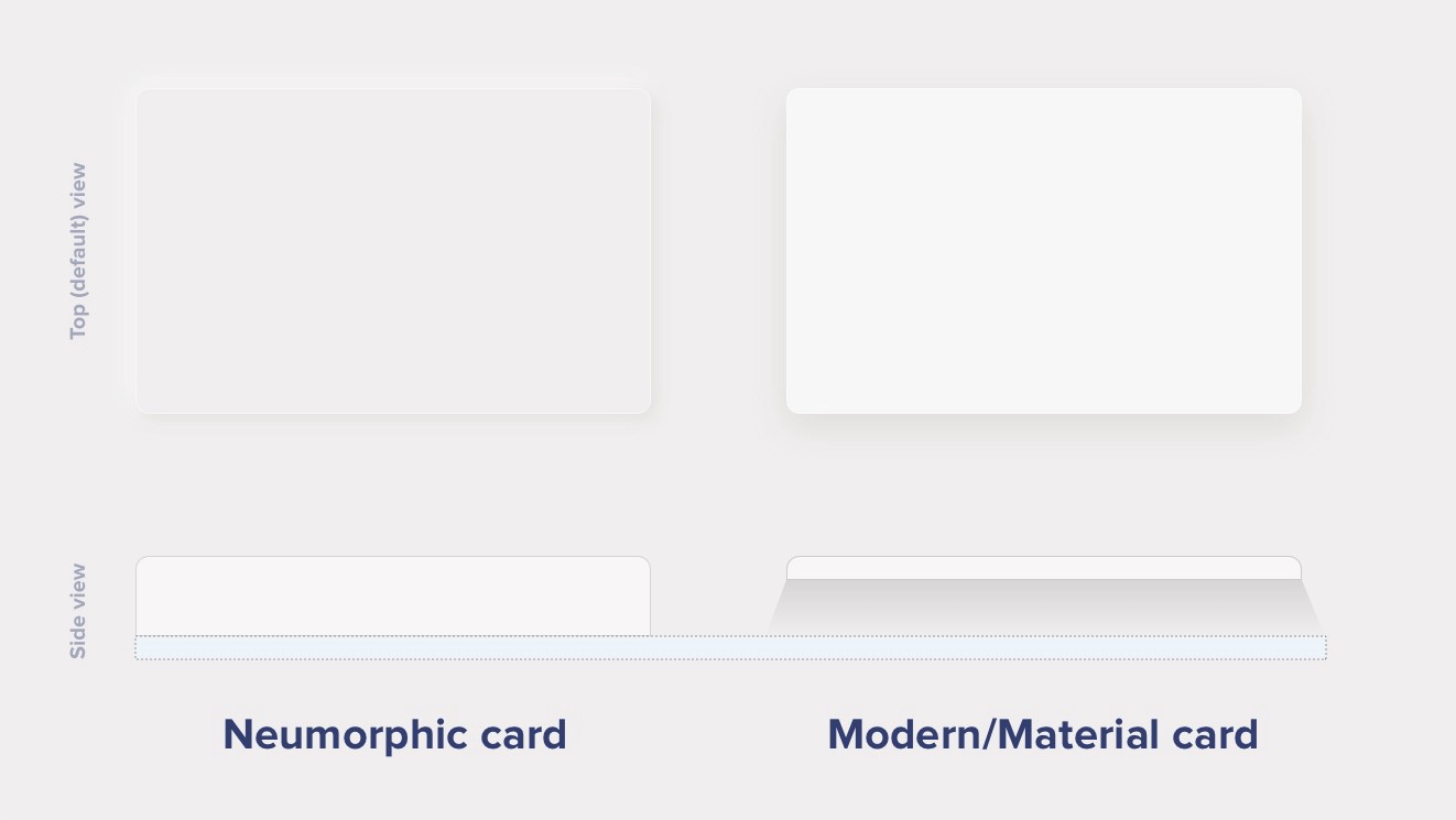
Modern / Material Cards
A Modern / Material (upgraded) card usually is a surface floating on top of our perceived background and casting a shadow onto it. The shadow both gives it depth and also in many cases defines the shape itself — as it’s quite often borderless.
Neumorphic cards
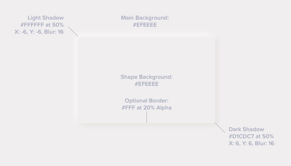
Neumorphic card however pretends to extrude from the background. It’s a raised shape made from the exact same material as the background. When we look at it from the side we see that it doesn’t “float”.
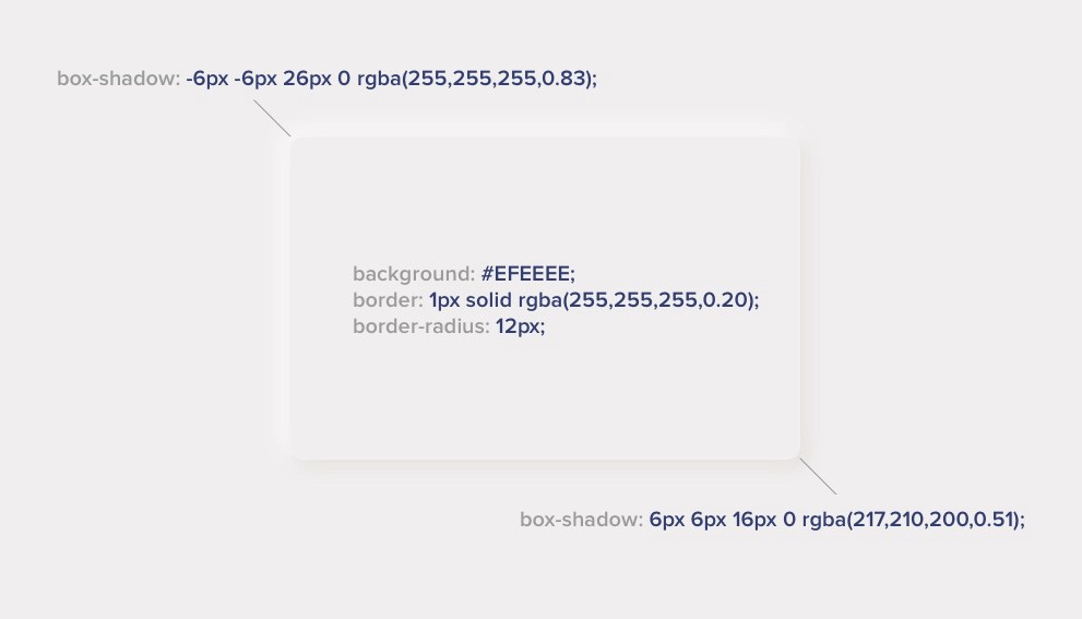
This effect is pretty easy to achieve by playing with two shadows, one at negative values while the other at positive. But for it to work our background cannot be fully black or fully white. It needs at least a tiny bit of tint so both dark and “light” shadows will be visible. You can use any hue for the background so it can be warmer or colder depending on your choice. But white and dark shadows have to be visible on it, if slightly.
Here’s the recipe — tweak it to your liking:
The pros and cons
The main benefit of this style is the “freshness” (at least for as long as it lasts). It brings that “new feel” to the interface and make it stand out. It can also be mixed with other styles, so it’s not overwhelmingly “soft extruded plastic” everywhere.
There are however some problems with it that need addressing. Two main problems we found so far (but we’re still looking) are:
- Accessibility
- Ways to efficiently code this
Visibility — Accessibility
The main problem with figure to background contrast ratio is that when they’re both the same color there’s no contrast to measure 😉 Objectively there’s a shadow so we could approximate and try to measure the first pixel outside of it. In the case of our example above we end up with these contrast values.

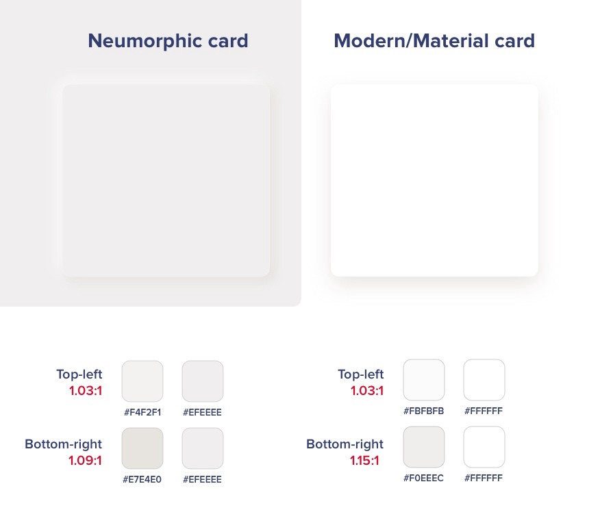
As you can see both the modern and neuomorphic cards are pretty low on contrast. Of course that’s partially their appeal and the cards themselves are not used for active elements — so as long as we keep the buttons prominent and with high enough contrast we should be fine.
The difference between those is marginal and if we wanted to use a much better contrast for the cards we’d have to do them this way:

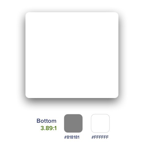
And since almost nobody does the shadows that strong it means the rest of the UI elements have to be accessible. This assumption leads to a conclusion that those cards / extruded plastic cards are not really that important if we do the right hierarchy through typography, proximity and contrast with the important elements.
This has yet to be tested (and I will try to find the time to do it) but for now we’re assuming that both “versions” of the element below are “OK”. Even if some people don’t see the soft shadows on it, there’s still enough contrast for them to see the icon and “use it”.


Accessibility
While a “button” should look like a button, if the icon itself is contrasted well enough with the background it will still work. So the main thing to remember here is that if you’re going with this style keep all the important elements on it with high enough contrast.
After all most of the “modern” card views also don’t pass the contrast test with their shadows anyway.
Cards only?
The main problem with accessibility appears however if we decide to use our components as buttons and not cards.
We can easily create a pressed state with inverted-inner shadows like in the example below.


This is a no-no.
The problem here is actually big.
This pressed state has too little contrast to signify a difference. When it was OK for cards to “disappear” if the rest of the interface delivers, active elements need to communicate their state at all times.
There are a couple of ideas here like using an outline and filled icon, an underline or even filling the pressed state with a color.


Play around with various ideas but states need to be recognizable right away.
Keep that in mind when designing. We all love the “pretty” but we also need to remember for it to be usable by everyone.
Coding
Let’s treat coding as a bonus round here, as it’s actually easier than we think to achieve that “soft plastic” look in CSS. We have yet to look into Swift and Kotlin, but I don’t think it should be a problem.
Of course you can merge the two box-shadows together with a comma between them.
If you want a handy generator, one creative web developer made one at https://neumorphism.io
Other effects
However the background shapes are one thing. This new style also comes with more “graphic intense” buttons and switches. In many cases we simply need to go back to “good old days” and use bitmaps. That seems like a regression but fret not — it’s not necessary. You can easily combine modern, fully code’able buttons with those card shapes with great results.
We also made this exercise (soon to be posted) while seeing what simple effects can achieve. And while it’s quirky and “retro” looking it was a lot of fun to make buttons that look like buttons 😉
Do we really need all that?
While this new trend has surely inspired a lot of designers, it’s problems are not that great compared to the accessibility issues with previously used card components.
So go wild! Play around with this trend and tweak it to make it yours. The UI designer’s job is moving rectangles around, so every time the rectangles turn out a bit “different” and “new” it’s bringing a bit of that joy back. Without that constant exploration all products will start to look the same again.
Let’s have fun!
But also keep in mind that each new trend comes with caveats and has to be carefully designed to be usable.
— — — — — — — — — — — — — — — —
What’s next? 👋
Get THE UI DESIGN BOOK or subscribe on YOUTUBE
You can also follow my Twitter profile for a weekly dose of design-related stories. We’re on DRIBBBLE too 🙂