Design Development
Toolkit 2021

RESOURCES

  • COMPILERS / STARTERS / CHECKERS
  • https://embold.io/
  • https://linx.software/
  • https://www.zoho.com/creator
  • http://www.codecharge.com/
  • http://www.codelobster.com/
  • https://quixy.com/
  • https://dbschema.com/
  • https://studio3t.com/
  • DESIGN STUDIO TOOLS
  • https://projects.invisionapp.com/d/main?origin=v7#/projects
  • https://www.invisionapp.com/craft
  • https://www.sketch.com/documents/all-documents
  • https://www.adobe.com/products/xd/details.html
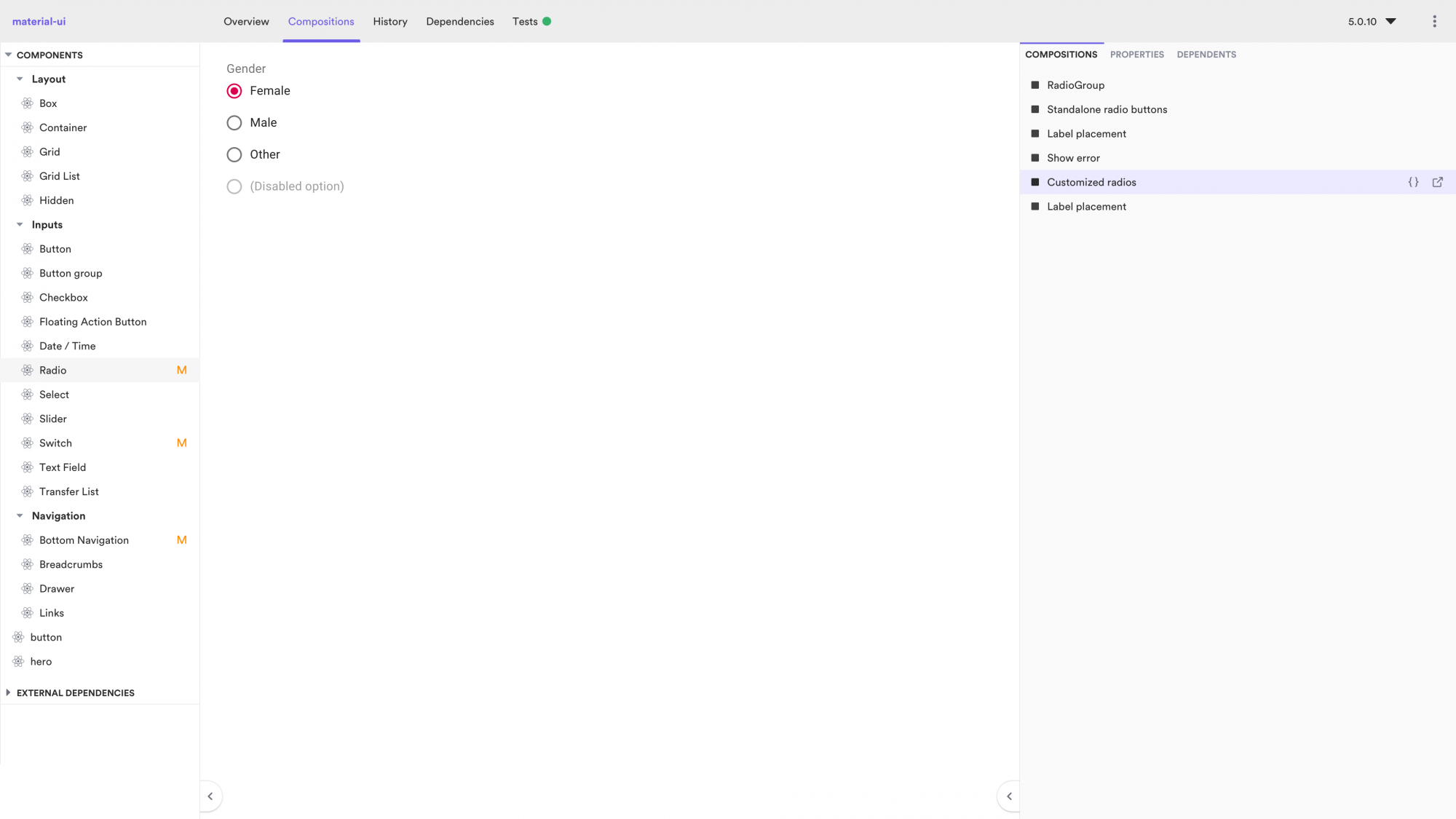
  • https://github.com/teambit/bit
  • FramerX (react)
  • https://builderx.io/
  • http://svelte/
  • https://github.com/ionic-team/stencil
  • https://github.com/Polymer/lit-html
  • https://storybook.js.org/ | https://github.com/storybookjs/design-system
  • https://blog.zeplin.io/introducing-connected-components-components-in-design-and-code-in-harmony-aa894ed5bd95
  • https://sketch2react.io/


design system
https://www.uxpin.com/create-design-system-guide

https://app.uxpin.com/dashboard/projects

Creating a Design System: The Step-by-Step Guide

Design is more important than ever.

Companies fighting on the hyper competitive global software market can rely only on experience as a key differentiator. That puts enormous pressure on designers all over the world to take on more projects, deliver higher quality, and work faster.

But design doesn’t scale easily. Efficiency doesn’t emerge from thin air.

Scaling design through hiring, without putting standards in place, is a myth. With every new hire, new ideas for color palettes, typography and patterns appear in the product, growing the inconsistency and increasing the maintenance cost. Every new hire increases the design entropy.

There’s only one way to stop the growth of the chaos. Committing to running a design system process. Gradual growth of a design system equals gradual decline in consistency and speed of software development.

Design scales. But it scales only with a design system.

A design system is a set of standards for design and code along with components that unify both practices. Think of it as the same instructions and Lego kit for everyone.

If you’re a designer or a developer, then this guide is for you.

Built on the experience of creating an internal design system at UXPin and interviewing 40+ design and engineering leaders working on design systems, this guide helps you with every step of creating a design system (and includes bonus resources):

  1. Create the UI Inventory for the Design System
  2. Get Organizational Buy-In for the Design System
  3. Build a Multidisciplinary Design Systems Team
  4. Establish Rules and Principles for the Design System
  5. Build the Color Palette for the Design System
  6. Build the Typographic Scale for the Design System
  7. Implement an Icons Library for the Design System
  8. Standardize Other Style Properties
  9. Build the First Design System Pattern
  10. Run a Sprint Retrospective
  11. Conclusion
  12. Recommended Resources

It takes just one committed person to kick off the process and change the way your organization builds software.

Want a head start? Get the free Design Systems Starter Kit. It includes this guide as an actionable checklist, a deck for evangelizing design systems, and an ebook on why design systems matter.


Basic / OverviewDesign System ToolsDevelopment ToolsDevelopment Setup v3

Basic Blurb

  1. Git and GitHub: Although there are companies that still use Subversion or CVS even, let alone the awful Clearcase, you probably shouldn’t work at one of them. Git is now a basic skill like tying your shoes or spell checking.
  2. SSH: Yeah, I know: You’re a Windows developer and you don’t know no stinking shell. But you’re going to run into having to create an SSH key or do other SSH stuff. So you may as well learn now.
  3. Terminal Services or remote login: Even if you’re a Linux or Mac person, sooner or later you’ll have to deal with Windows. These tools are how you will connect in.
  4. Amazon Web Services: AWS isn’t just cloud, it is the reason you don’t have to wait on IT. There are other cloud providers, but you’ll have to deal with AWS sooner or later. AWS has gotten so big that you can’t know all of AWS any more, but you do need to know at least the EC2 stuff.
  5. JavaScript: You don’t need to know it cold, but this is the scripting language of the now. If a product or tool is going to add a scripting API, it will probably be for JavaScript.
  6. Bash and PowerShell: Sure, more modern devops tools are handy, but sooner or later something isn’t going to work and it won’t have quite what you need. So, expect to need to know how to write a basic restart script, grab an error code from an exiting command, or do a few things in a loop. That’s what Bash (in Linux, many Unixes, MacOS, and Windows 10) and Microsoft’s PowerShell let you do. Bonus: Add a tool like Grep (PowerShell’s equivalent Select-String is more wordy) and you’ll be an even more powerful deity.
  7. MongoDB: You need to know how to work with at least one document database. MongoDB is the easiest to learn. Whether you’re ultimately going to use MongoDB isn’t relevant; what matters is learning how to deal with a new-generation database. If you’re going to use an index like Apache Solr, which is document-shaped, or you’re going to work with a more columnar structured database, the MongoDB skills will transfer.
  8. Curl and Invoke-RestMethod: Most software now has a REST API. On Mac and Linux, Curl is the command-line tool that lets you test and tweak and even script against a REST API. In PowerShell, it is Invoke-RestMethod (although like everything on PowerShell, it requires more typing). There are GUI tools like Postman that accomplish the same work, but a serious developer needs to be able to move past a point-and-click interface for efficiency’s sake.
  9. Markdown: This is the format of the README.md file in GitHub. You should be able to read and write a simple Markdown document. And that’s easy because it has just seven symbols: (# is a header, ## is a subheader, * is a bullet, __ and ** are bold, _ and * are italics, ` is monospace, and — is a break or rule). Markdown editors often have extensions but those are the basics. From that basic markup language, you can get slides, PDFs, and HTML. Often these output formats can be consistently formatted with CSS or some other way. Best of all, you don’t end up with smart quotes in your code samples.
  10. Basic HTML: I can’t make a decent-looking web page to save my life; I’m a back-end developer. But whether you’re going to stub something out or have to parse HTML, you will need to know basics of the web markup language.


Chrome Workspace

https://www.bitdegree.org/learn/chrome-workspaces


Experimenting with CSS rules and HTML code in the Elements panel is convenient if you need to change the appearance of your website temporarily. However, if you want to make such modifications to the front-end permanent, you need to learn how Chrome Workspaces are set up in DevTools.

If you are manually transferring changes from DevTools to local files, Chrome Workspace will perform this task automatically and save precious time!

Developers use Chrome Workspaces to save the modifications to CSS, DOM, and JavaScript of a page. Therefore, you can automatically transfer various changes that you made to the style or code.

To set up your workspace, you need to perform two main actions. First, map your local folder to your workspace.

Then, map local files to URL to make sure that the applied changes will persist. Both of these actions are explained in this tutorial.

If you need to open local file in Chrome, you can do this by selecting Open File from the File menu. You can also use shortcuts: press CMD + O on iOS. For users of Windows and Linux operating systems, Chrome open local file works by pressing CTRL + O buttons.

After setting up Chrome Workspaces, you can easily modify files without having to jump from the browser to the code editor!

Contents

Chrome DevTools Workspace: Main Tips

  • In this tutorial, we show you how to set up and use the Workspace in Chrome Developer Tools.
  • Workspaces let you save the changes you make during live edits in the Sources panel.
  • While changes to CSS via the Workspace are shown immediately, you must manually save and refresh to display modifications to the DOM.

Workspace Explained

Chrome Workspaces are used for saving the changes you make via the Chrome Developer Tools interface.

So, this includes changes to the DOM, CSS or even JavaScript.

If you are developing locally, you can add folders to DevTools' workspaces by:

  • Right-clicking on the interface that is displaying source files, and selecting Add Folder to Workspace.
  • Dragging and dropping the folder on the Sources panel interface.

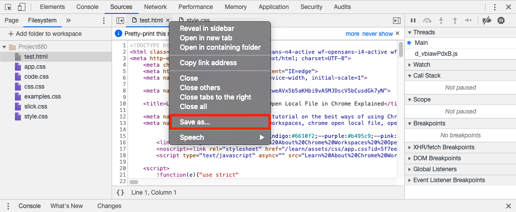
Then, you will be able to access files in the Sources panel interface and save the changes by right-clicking the tab of the file in the editor and selecting SAVE.
Chrome Workspaces

After refreshing, the HTML DOM will show the new content as well.

Ways to Manage Local Files

With Workspace, you can also manage files on your computer.

You can add, delete, back up, refresh, and search for them. Consequently, this makes developing with DevTools even more convenient. We provide simple instructions on how this file-management is done.

Add

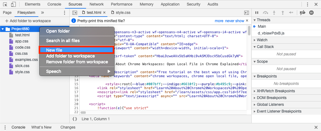
Find the folder in the right pane of the Sources panel and right-click it. This is the folder you are planning to add a file to.

Select the option New File.

You need to type in a name for the file. The extension must be a part of the name as well.
Chrome Workspaces

Delete

Find the file in the right pane of the Sources panel and right-click it.

Select the option https://www.bitdegree.org/learn/goon/datacamp)

Back Up

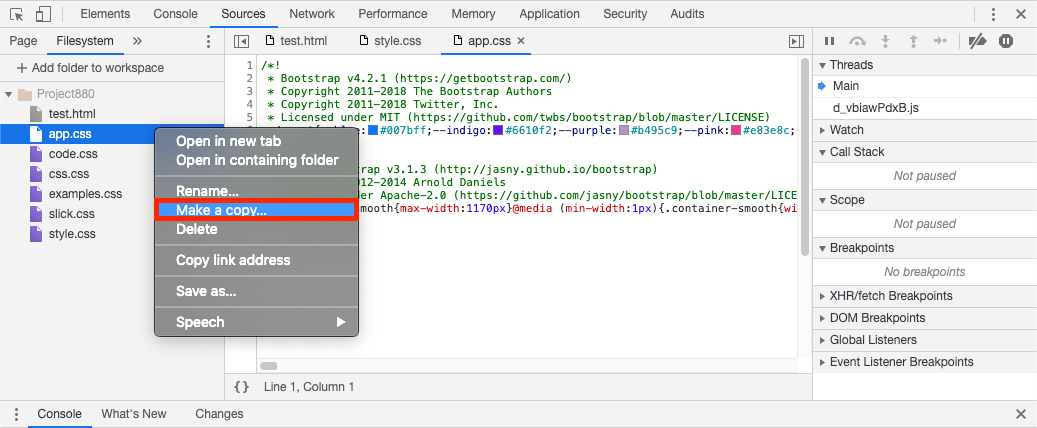
Often it may be useful to create a duplicate of a file before major changes are applied.

Find the file in the right pane of the Sources panel and right-click it.

Select the option Make a Copy.

Add a name to the copy of a file. Remember that you must include the extension in the file name.
Chrome Workspaces

Refresh

To refresh a file or a folder, right-click it and select REFRESH.

This feature is helpful when you make changes using an external editor, and want such modifications to be displayed in Chrome Developer Tools. Usually, this is done automatically, but you can do this manually as well.

To open up the Search menu, press CTRL + SHIFT + F on Windows and CMD + OPT + F on Mac.

These shortcuts open a pane on the bottom of the Sources panel.

In this pane, you can search for files by their names or by their contents.

Also, you have various options for whether they should be case-sensitive, or whether they must look for a regular expression.

Limitations of Workspace

The Chrome Workspace seems like a handy and dynamic tool for editing pages on the browser.

However, the feature comes with certain limitations.

The following list contains the limits of Workspaces in Chrome:

  • In the Elements panel, only changes to CSS persist, not to DOM.
  • You can only save CSS changes into .css files.
  • If files are mapped to a remote server instead of a local one, Chrome will reload the page from the remote one upon refreshes. The changes will persist on disk anyway while editing in the Workspace.
  • If a file is mapped, the full version (including the file extension) must be in the specified path.

Chrome DevTools Workspace: Summary

  • Our tutorial explained how you can prepare Chrome Workspaces and use them.
  • Workspaces allow people to automatically save changes they make in the Sources panel.
  • While modifications in the CSS are displayed automatically, changes in DOM need to be saved and refreshed manually.


Set 2
Hidden content


A dream of no framework

https://hackernoon.com/7-frontend-javascript-trends-and-tools-you-should-know-for-2020-fb1476e41083


HOW TO BUILD A DESIGN SYSTEM (bit)

https://blog.bitsrc.io/how-we-build-our-design-system-15713a1f1833

How we Build a Design System

Building a design system with components to standardize and scale our UI development process.

Image for post

In this article, I will show and explain our process of creating a design system. I will share real examples every
step of the way.

Design systems were created to bring order into an inevitable entropy. The first design system was introduced by NASA in 1976, and
today nearly all large organizations like Uber, Pinterest, Airbnb,
or Shopify
have such a system to bring consistency into the chaos of more products and teams.

At , we build tools for 150,000+ developers
working with components. Our platform helps developers build, share, and collaborate on components to speed up and
improve web application development.

We enjoy a Design System driven by Components.

Over the past 2 years, we’ve been “dogfooding” our platform to build a design system and turn it into a living
ecosystem of shared modular components.

The benefits of our system go way beyond UI/UX consistency. We greatly accelerated and scaled our development,
improved our product quality, and greatly improved work between developers, designers, and everyone else.

By letting everyone create and share components in a collaborative way, we are able to achieve faster and wider
adoption of our design system.

In this article, I will focus on the developer-side fo things, and will share our goals, process, and results. Feel
free to AMA in the comments below.

  1. Visual Language
  2. Shared Components
  3. Documentation and Discovery
  4. Incremental Upgrades
  5. Rippling Changes to Dependencies
  6. Project Updates
  7. Team Communication
  8. Designer — Developer Collaboration

1. Our Visual Language

Audit, then order.

Our process of creating a visual language was a bit different than what you would read in most articles on design systems.
This is a privilege saved for larger enterprises and is often a luxurious choice for younger companies.

As a growing company, we didn’t have the time to stop and turn our design system into a large and complex project.
Instead, we had to audit and turn our existing visual language into an organized system.

This process, led by Bit’s head of design Amir
Shalev
, was twofold: First auditing our existing styles and elements, and then
creating a consistent system to standardize our visual language as a strong yet flexible base.

Image for post

Image for post

Our surfaces and colors used in bit.dev

Visual consistency means creating a unified style-guide standard for colors, fonts, sizes,
positions, and every other part of your visual language. Aspects such as typefaces, typography, primary and
secondary colors can still be specified as part of the design system.

In addition, we needed to create a consistent set of UI elements that can be later implemented as components using a
modern framework (e.g. React).


Image for post

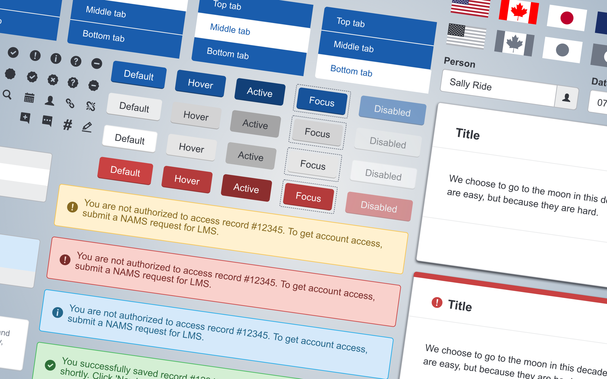
Our buttons, avatars, and other basic components

To make your system of elements actionable n the real world, it must include more than just a set of basic UI
components like Button or Avatar. It should include concrete examples of more specific instances or compositions of
components, which are the most basic implementation of your features.


Image for post

Composition of components to create more concrete and advanced features

The design of your system is not ready until you have two assets:

a) A style-guide that defines the styling and implementation of your UI. This is usually a rather
long document with a lot of text and typography.

b) A set of reusable visual elements that bring together both visual (UI) and functional
(UX) consistency
through components. This is usually a rather large canvas with elements drawn on Figma
or Sketch
etc (we use both).

2. Shared Components

Building a component ecosystem.

Some people just publish a single-versioned package with all their components. We prefer creating a shared component
ecosystem.

Our process

If you head over to the you will see
something awesome
. When the mouse hovers over a component, a highlighter will turn on, indicating the
component's name, version, and parent Scope. Try it.

Image for post](https://bit.dev/)

The Bit.dev homepage — a composition of shared components

What you see here is a page composed of
shared components
. However, these are independent components developed and owned by different teams and
published from different projects, which are mixed and integrated together.

At Bit, we have more than just one design system. We have different teams that build and share their
components, in a UI component ecosystem.

If you hover over components like link or paragraph and click the links, you will see
that these components are part of the “
Scope.
This is our most basic design system, developed by our design system team in an
autonomous GitHub repo, and published to Bit.dev for everyone to
use.

Image for post](https://bit.dev/bit/base-ui)

“Base-ui” — Our base design system components

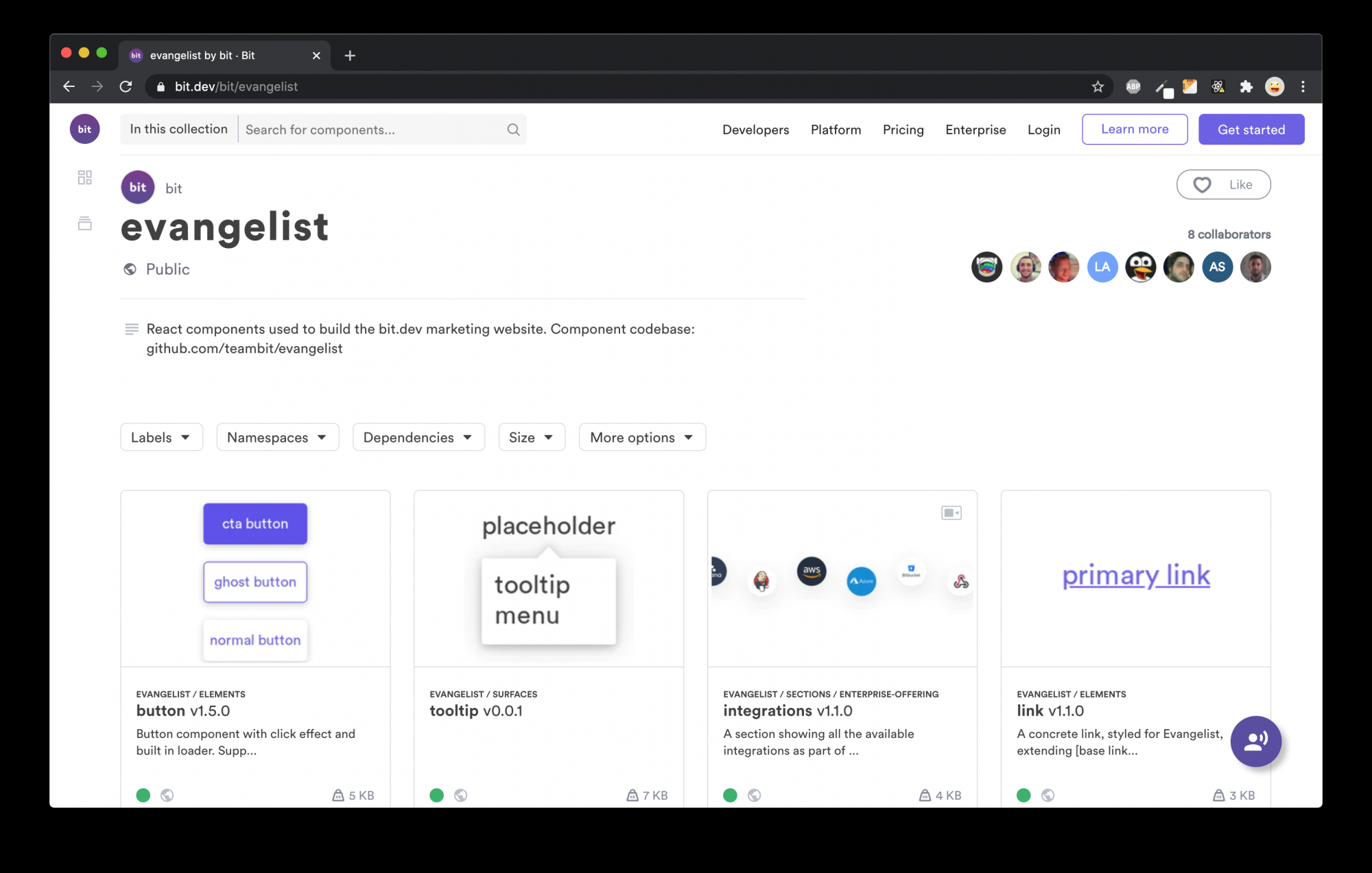
The marketing team, however, needs some more concrete components like a marketing “heading” or “action-button”. These are not a part of the base-ui
design system but are a part of another Scope called “Evangelist”. They belong autonomously to the
marketing team in this GitHub repo. Since they use components
from base-ui, they get updates from the base-ui team.

Image for post](https://bit.dev/bit/evangelist)

“Evangelist” — Our marketing components

Evangelist is just one of many Scope of components that compose and extend the base-ui components. In fact, each team
in the company builds and shares its own Scope of components with everyone else.

Instead of publishing a single one-size-fits package for components, we create an ecosystem where everyone works
together yet deliver independently. The design system’s team role is to facilitate and regulate, not block or
enforce.

This turned out to be a huge success, and we were able to reduce the building time of new marketing pages by ~75%
while keeping our design consistent. Try visiting the bit.dev/enterprise
page or /support pages to see examples. Similar success was recorded by
many other teams in the company.

Working with our own tools

Our own “dogfooding” of Bit means we build the way we help other people build. We’ve been doing so for a few years,
since 2017. Here’s the gist.

  1. We use Bit’s OSS Workspace to develop, manage, and publish
    decoupled components in different codebases owned by different teams.
  2. We enjoy Bit’s cloud platform to help all teams smoothly expose, share, and
    integrate components with each other.
  3. The design-system team provides our base components, controls updates, and regulates changes to ensure
    consistency and standardization.

Choosing React

We chose to use React back in 2017 for a variety of reasons, and have been very happy with our choice. Since the
introduction of Hooks and Context API in React 16, the ability to decouple components from each other even in terms
of state management, for example, has become phenomenal.

Yet, we’re seeing many teams choosing to use Bit for Vue or Angular and even Stencil Web Components. We’ve even been
working with the Angular team itself to provide support for Bit with Angular. After taking everything into account,
we believe React is the best solution for us at this point.

Independent components

Bit workspace helps you build modular projects, while enjoying a simple and holistic dev experience. Each component
is independently developed, built, tested, documented, published, and integrated into new applications. All
components are composed and managed together in harmony. Try
it
.


Image for post

Standardizing development

Another great way to achieve consistency in design is to standardize the development of components. Bit helps us do
so with a variety of features such as standard component dev environments, reusable docs templates, and even
extensible and reusable build pipelines to standardize the release process.


Image for post

Customizable, extensible, reusable build pipelines

3. Documentation and Discovery

Always up to date. No extra tools.

Another advantage we have when working with Bit is that we don’t need to create or maintain extra documentation
websites for components.

Local development

As we write components, Bit’s UI presents the documentation for every component in the local development environment.
This includes descriptions, examples, and even compositions that render the component in isolation.

You can create customizable and reusable docs templates so that all components can be documented by the same
standards and design.


Image for post

Docs are a part of local development

Docs on the cloud

Docs are just a part of every Bit component. When it is exported to the cloud, its docs become the front-page of the
component for everyone to see. Docs can be viewed and explored in the same place the component is hosted. If you
install or import a component, you can locally develop the docs too.

“Tokens, then React, UI Kit, then Doc Site for changed links to those + release docs”

— Kaelig Deloumeau-Prigent, Developer, Shopify’s Polaris

All the docs on Bit.dev are exactly what we see when we develop locally. With every new version of a component, its
docs can be easily updated too. No extra overhead, no complex processes, no outdated documentation.


Image for post

What you develop locally is what you get on the cloud

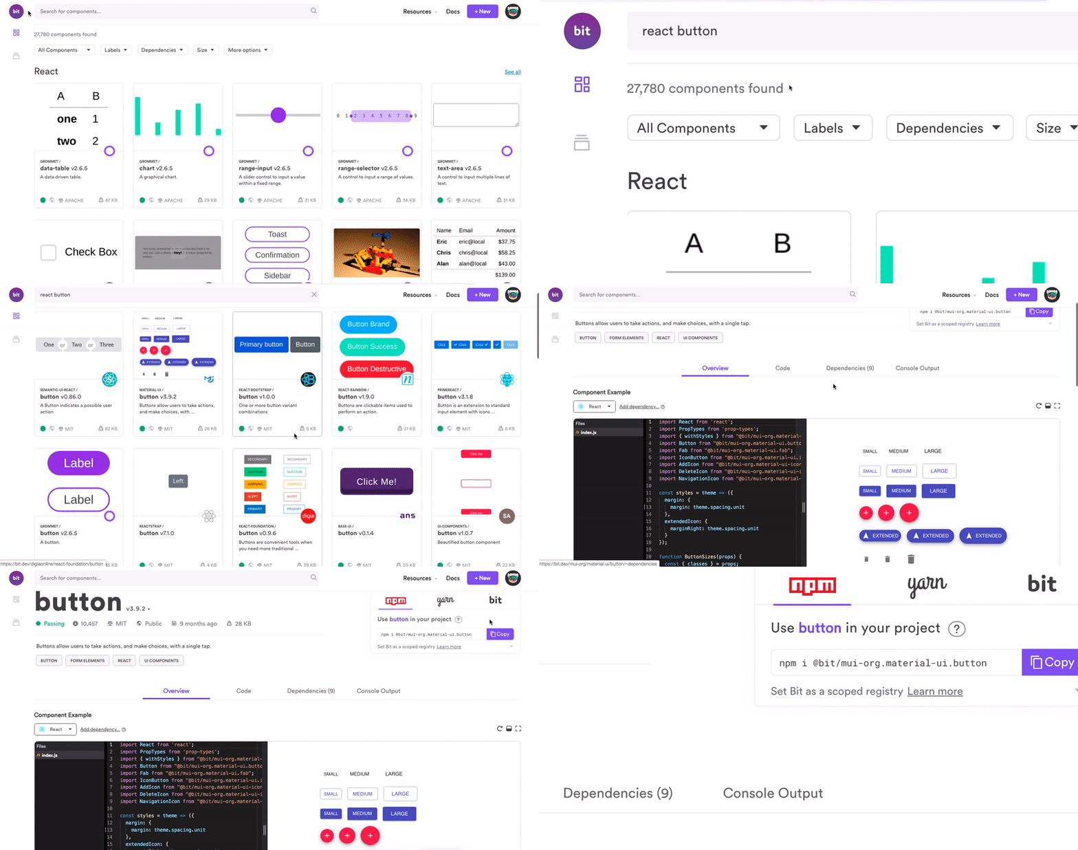
And as we have more and more components, Bit.dev makes components discoverable with features like
component-search and context-filters that help us instantly search through many components with
ease.

Image for postImage for post

Head over to bit.dev and search thousands of OSS components, or add your own

4. Incremental Upgrades

Independent component versioning.

Our design system is versioned by component, and not as a single package.

Versioning
independent components
is much better
than versioning all components as a single package.
Independent per-component sem-ver has been a game-changer for us. I’d also suggest reading this wonderful post
by the awesome Nathan
Curtis
. Here are the key advantages for us:

  1. We only get updates you need to the things you use.
  2. We easily and quickly upgrade a single component.
  3. We easily hotfix or rollback any component.
  4. We mix and match components to create anything.

Bit helps us version and publish each component as an independent package. Since each component is versioned
independently, our different projects can get incremental upgrades to components, instead of just one large package.

If you head over to this
component you will notice that it is currently on version 1.5.0, and started on version 1.0.0 a while back.


Image for post

This gives both our designers and developers great freedom to constantly innovate and release upgrades to production.

For example, here is version 1.5.0 of
‘button’ used in production.


Image for post

Evangalist/button@1.5.0

And here is the previous version 1.4.0.


Image for post

And here’s the earliest version 1.0.0 of
‘button’.


Image for post

Evangalist/button@1.0.0

If you head back to version 1.5.0 you will notice that it has an array of examples that support more design use-cases
than ever before.


Image for post

Our designers and developers are able to freely innovate and deliver upgrades without having to wait on large bloated
versions or long releases.

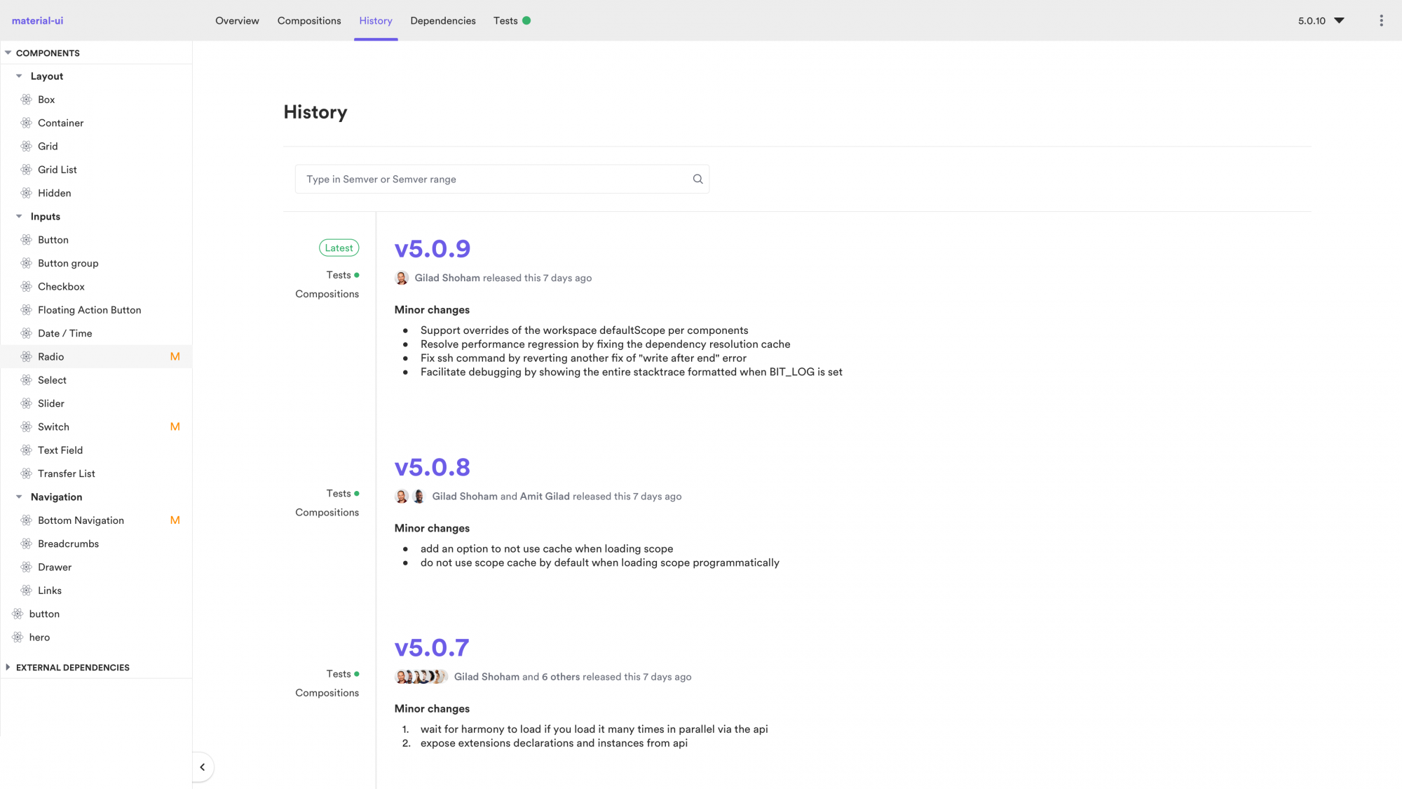
Component developers can control each component’s version bumps according to sem-ver rules, view its history, and
even its view changelog.

App builders don’t get updates they don’t need. Everyone is happy.

Image for post

Image for post

5. Rippling Changes to Dependencies

Managing all component relationships.

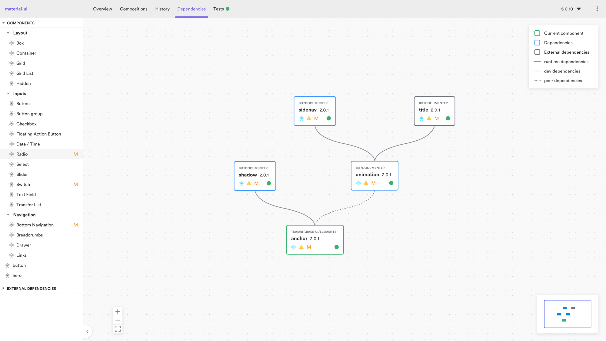
Bit manages the dependency graph between all components in a project. This means that when we upgrade or break a
component, Bit will “know” which other components depend on it, and will run their builds and tests.


Image for post

As a result, it becomes much easier to develop many components inside a single project, since it’s easier to master
their internal relationships.

“If we upgrade and break a component, we have to go through and fix all the dependent components”

— Jony Cheung, Software Engineering Manager, Atlassian’s Atlaskit

On every change, the builds and tests of all dependant components will run and let us know exactly what’s broken and
what’s not. If all is well, we can simply tell Bit to bump all dependant components at once.

Image for post

Image for post

We’re now working on a new product called Ripple CI. Through the cloud, Ripple’s build process will
propagate changes to all dependant components in all of the organization’s applications. We (and you) will be able
to see exactly how every component is impacted, where, and how, then fix and release (want to learn more? ask to get
in our Beta program).

6. Project Updates

Automated with a GitHub Integration.

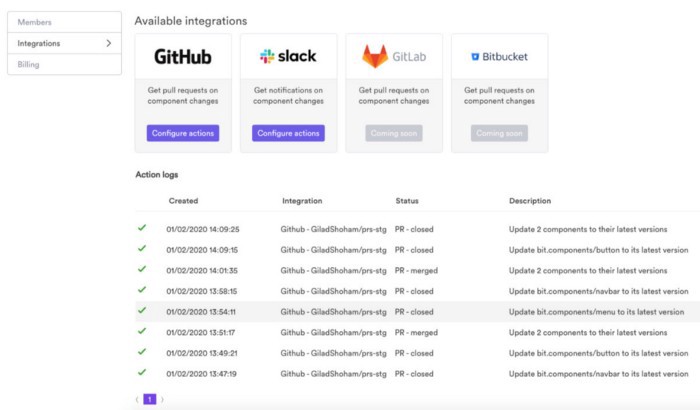
We use a publically
available integration
to connect Bit.dev with GitHub. When a new version of a component is published to
Bit.dev, it will “know” which GitHub (or GitLab) projects should be getting this update.

Then the process becomes fully automated.

The new version of the component is sent to all-consuming projects as an automated Pull-Request that can be accepted
with one click.


Image for post

This makes it very easy for our design-system team to continuously deliver upgrades and help all product-builders
accept and integrate the changes.

And, our design system team can monitor who forgot to update what and where at all times. Here Gilad
Shoham
who leads our core team just avoided a serious nudge! Watch out Gilad, we see everything.


Image for post

7. Team Communication

Automated with a Slack Integration.

When a new component version is published, all teams that use this component (i.e. have this component as a
dependency) will get an update notification via the platform and also via
a Slack integration
.

So, for example, when a version of ‘button’ inside ‘shopping-cart’ gets exported, our team gets a notification that
includes the user’s name, the type of action (export), the number of components related to that specific action.

Here Eden
Ella
from the Envagalism team is caught upgrading buttons.


Image for post

When importing, the same notification shows but with the origin Scope.


Image for post

This workflow helps everyone stay in sync and work better together.

8. Developer — Designer Collaboration

Working together over code, in a visual way.

A design system means
different things
to designers and developers.

Designers usually talk about elements on their canvas. Developers talk about the React component in their IDE. Users
will get the code, not the design.

That’s why it’s critical to include designers in our UI development process.

We use two great tools to achieve a firm, mutual handshake.

The first is Zeplin
— Which is a great way for designers to work with developers. We use to translate and organize design tasks into
development tasks, and we work with it every day.

The second is — Which is a fantastic way for developers to work
with designers. It creates a bridge for our designers to take an active part in the development of UI components.
Moreover, helps our designers to monitor and collaborate on code changes and new versions of components.

💡 The Zeplin and Bit teams are now working on a joint integration!

Image for postImage for post

Designers can see and try the actual React components in a visual way

We use Bit to expose all our components to our designers and help them always make sure everything stays perfectly
aligned with the design.

Features like hot-reloading rendering and editable examples are a great way for designers to view components, and
even try different designs hands-on.

When there’s a new component published to Bit.dev, or a new version of an existing component, designers can instantly
and visually see what changed. That makes it easy to ensure everything stays consistent with the design.

Then, after designers approve, the change can be sent as an
automated PR
to all projects affected by the change. This means our designers now work with developers
directly on the development of components. Cool, right?

In the near future, our team intends to add more designer-facing features to Bit.dev such as an interactive property
panel, so designers can create changes to components, and save them as new versions. Should be ready in 2021.

Conclusion


Image for post

NASA’s Design System 2020

Creating and keeping a consistent UI/UX across every touchpoint of your products helps users intuitively navigate,
and successfully interact, with different parts of your applications without confusion. It’s your brand.

You need a good brand.

In our process, we have been creating a design system from the ground up. We audited the existing design, then turned
it into an orderly system that defines our visual elements and styleguide, which tell our Brand’s story.

We rely on our own tools cloud platform to create a system of shared components that
brings everyone together in the process. We let components drive the development of our products, in a democratized
yet regulated ecosystem. This system gets fast and almost absolute adoption.

I hope this helped you learn a little bit about our process and the possibilities that exist out there to build web
applications together in the modern world.

We’ve been helping many really great teams build their own systems in a similar way, and please feel free to reach out to us and ask anything!

Thanks for reading 🍻 🎨 ❤️

USING INVISION

https://medium.com/ux-power-tools/everything-you-need-to-know-about-invisions-new-design-system-manager-including-how-to-build-one-3d32a40c22ea

Everything You Need to Know About InVision’s New Design System Manager, Including How to Build One

Team collaboration, made simple.

His name might now sound familiar, but Ransom E. Olds is considered by many to be the founder of the automotive industry and patriarch of mass production. Maybe you’ve heard of the Oldsmobile? He’s that guy.

This forgotten pioneer is credited with developing the assembly line, which helped him build the world’s first mass-produced automobile, the Oldsmobile Curved Dash. Now there’s a car!

The credit for the invention of the assembly line often goes to Henry Ford because of one very critical addition — Ford put the cars on a conveyor of sorts, creating the all-important *moving* assembly line.

The assembly line is one of the most extraordinary innovations ever developed. For the first time, products could be assembled quickly and consistently without sacrificing quality. There was no guesswork — products coming off the line looked the same and worked the same, every single time.

The concept has been improved and adapted across all industries to accelerate production and improve output, and it’s finally made its way into the mainstream design practice with design systems.

The Right Time

If you’re building digital products at scale with an in-house design team of more than one person, it might be time to start building out a design system.

There are varying levels of sophistication and complexity, but all systems include some kind of a collection of reusable elements and components. When you’ve settled on an elemental set of design pieces, you can start codifying how and when they’ll be used, and save them in a central location for assembly-line-style fabrication by your design team.

InVision Design System Manager (DSM)

We’re going through an industrial revolution of sorts where new design tools are released every single day, and it can be hard to see through the clutter.

After vetting various tools, I ultimately ended up coming back to InVision DSM plugin because InVision has and always will be central to our design delivery workflow. It just made sense to me to stay in the ecosystem.

Note: I haven’t switched to Studio because my agency is very engrained in Sketch. At this moment, it would be a costly switch, but we’re not ruling it out. I hear great things, and the time may be more right in the future.

DSM is the Ford of design systems, offering an improvement on the concept which makes it easier to update and scale a design system without abandoning your design tool of choice.

Why not just use Sketch Libraries?

Totally understandable question — I asked the same thing. Here’s why I like it:

  • Drag-and-drop interface
  • You can search for components
  • Symbols are organized visually in a toolbox
  • Team sharing is simpler
  • Version history and version deployment
  • Automatically-generated online style guide

Building Your Design System

Let’s break down every step required for building out your design system in InVision DSM. It’s worth noting that full-blown design systems typically include design, philosophy, and code. I’ll be covering the design portion in this article, but just recognize that it’s just one part of a larger assembly line.

I’m going to assume you’ve already built out your styles and symbols…if you haven’t done that yet, feel free to follow along using , the sample design system provided by InVision DSM.

Open up your design system Sketch file where you’ve been building out the various components of your design system, and let’s get started.

Step 1: Creating a Library

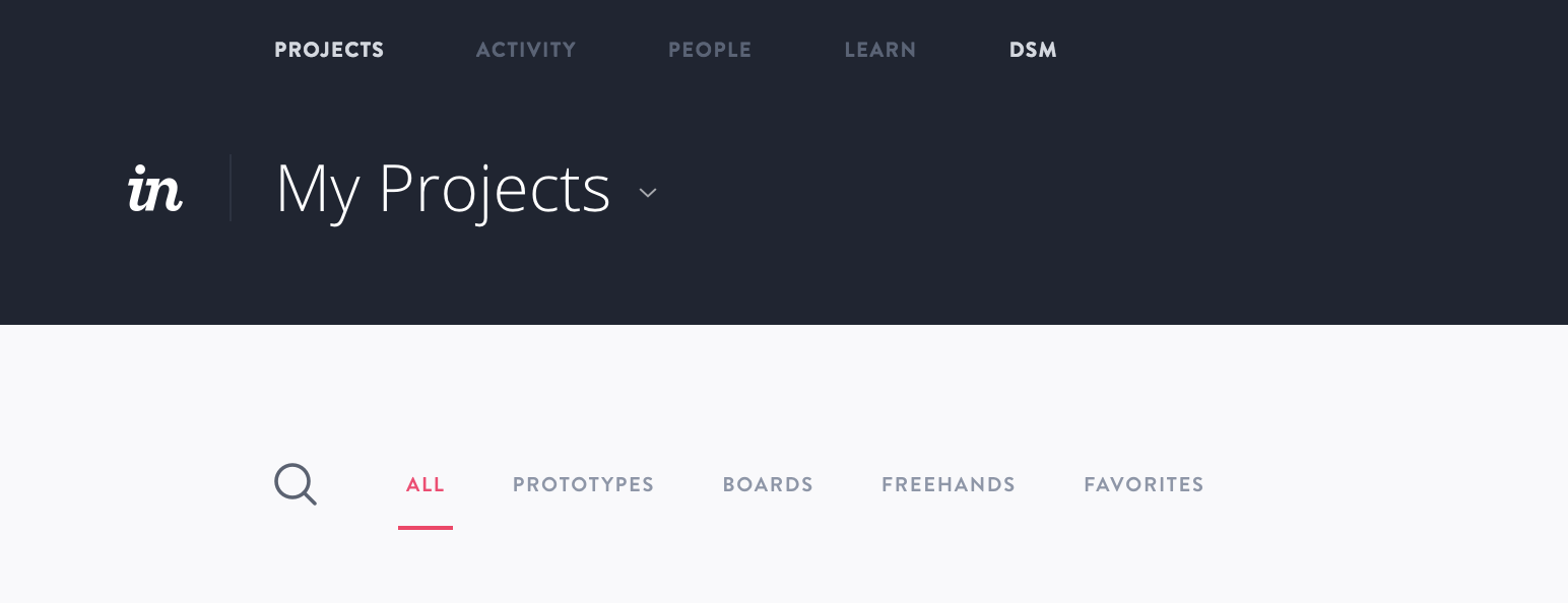
Head to your InVision web dashboard and click on DSM.

Image for post

In the same way that you need to create a new InVision Project before you can start syncing screens, we have to create a new design system library. As your design system grows, it’s best practice to compartmentalize your system components across multiple libraries — one library for desktop, one for iOS mobile, one for Android mobile, one for core components, one for product-specific components, etc.

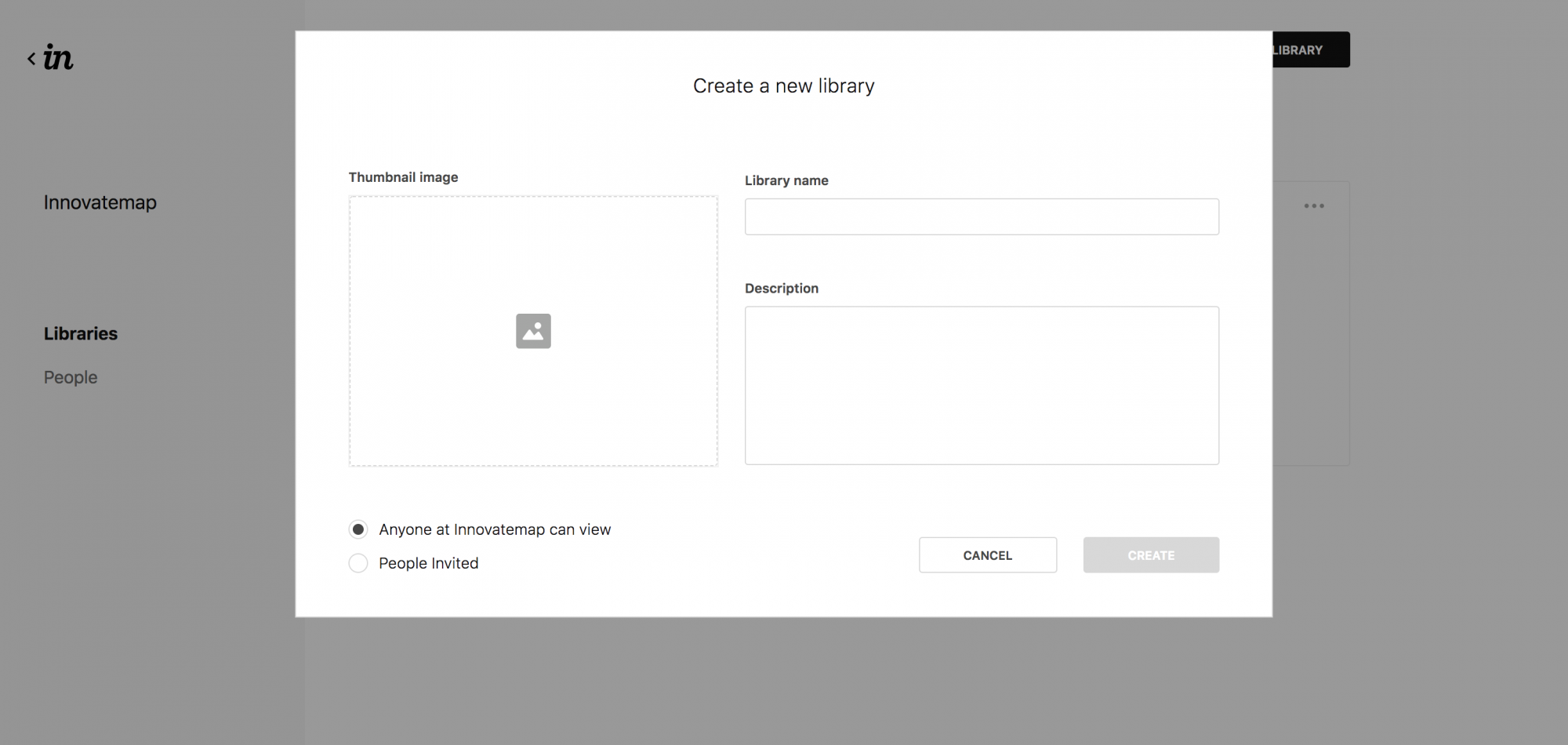
Image for post

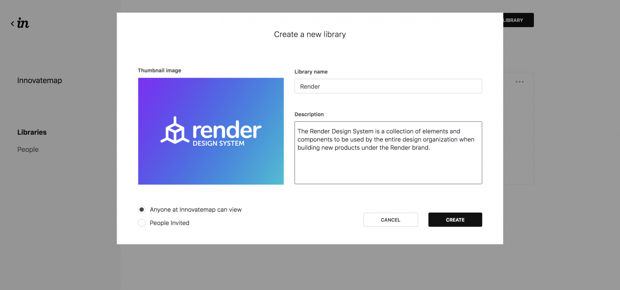
Click Create New Library to get started:

Image for post

Image for post

Image for post

Image for post

Step 2: Downloading the Plugin

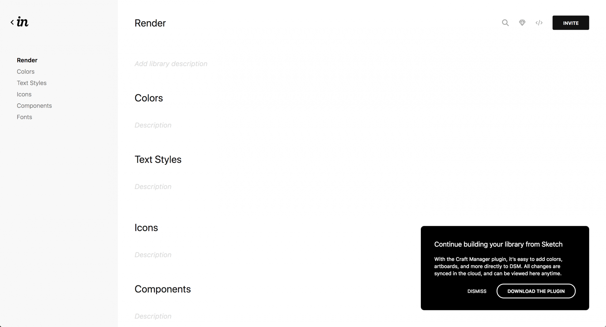
Your design system “shell” is ready, and it’s time to start filling it with elements, components, and saved styles.

Image for post

Image for post

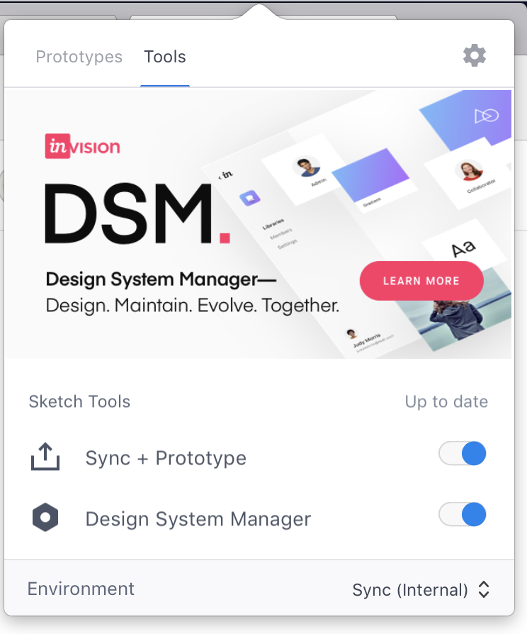
Download and install the InVision Craft plugin if you haven’t already. If you’ve never used it before, you might get confused when you open the app because you don’t see anything launch. You’ll find it in your Mac menu bar.

Make sure you activate the DSM tool under the Tools tab at the top.

Image for post

Craft | InVisionCraft is a suite of plugins to let you design with real data in mind. Manage them via the new Craft Manager for…www.invisionapp.com

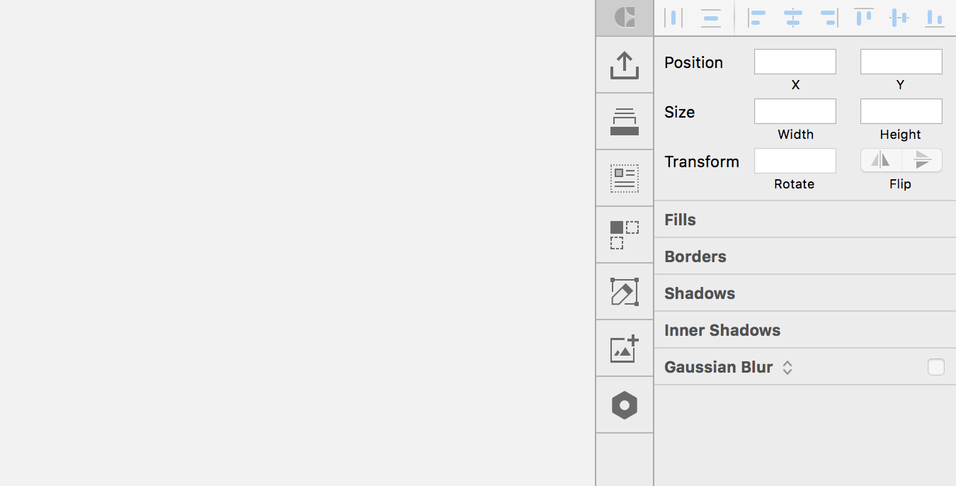
If you installed it correctly, you’ll see a new vertical toolbar inside of Sketch:

Image for post

Image for post

Step 3: Understanding the Library Sections

Click on the cog shape at the bottom (it might be in a different place depending on which tools you have activated in Craft Manager). You’ll see the DSM toolbox open in a new window, and your new library shell should already be selected:

Image for post

Pro Tip: Show and hide this window by pressing Command + L!

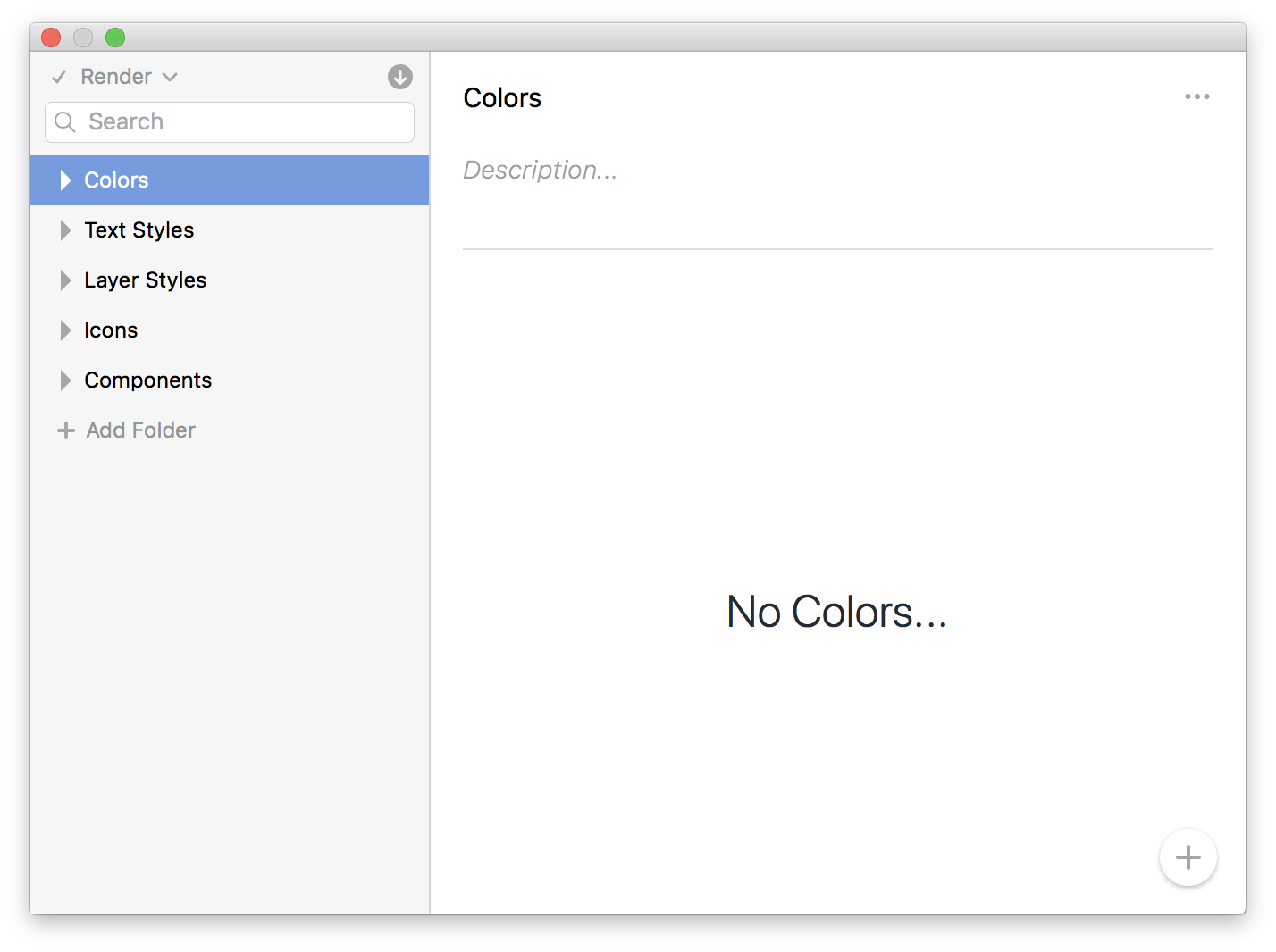
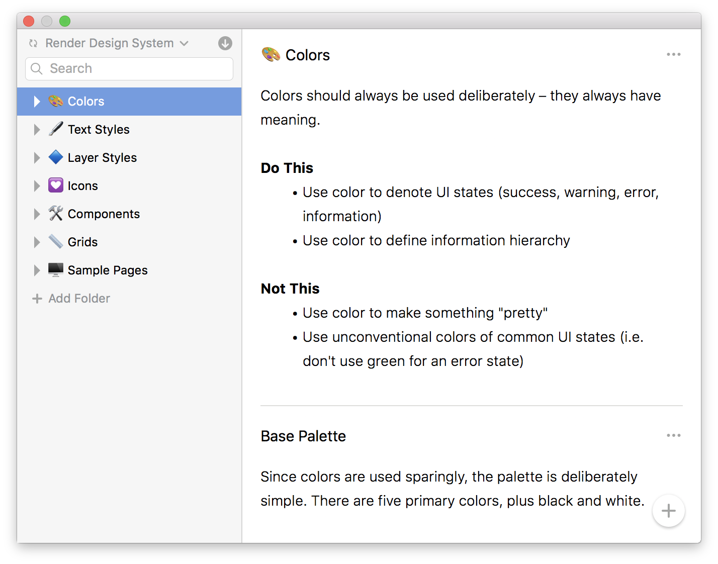
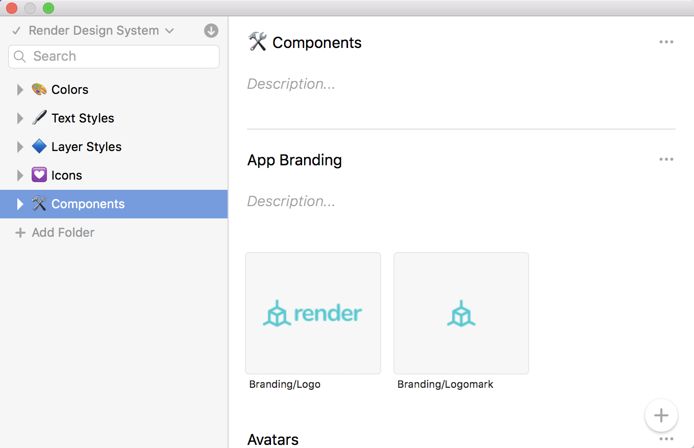
A DSM library is divided into five sections (called “Folders”) by default:

  • Colors: This is where you’ll put all of the colors used in your system
  • Text Styles: This is where you’ll put all of the saved text styles
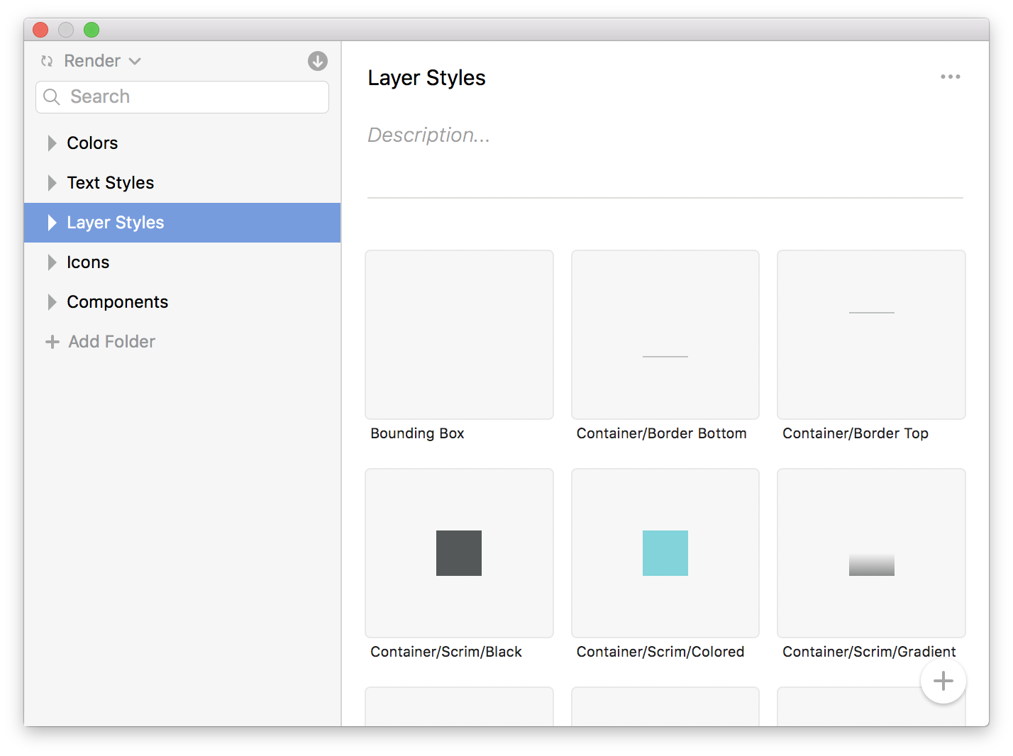
  • Layer Styles: This is where you’ll put all of the saved layer styles (fills, borders, shadows, etc…)
  • Icons: This is where you can organize all of your design system icon symbols.
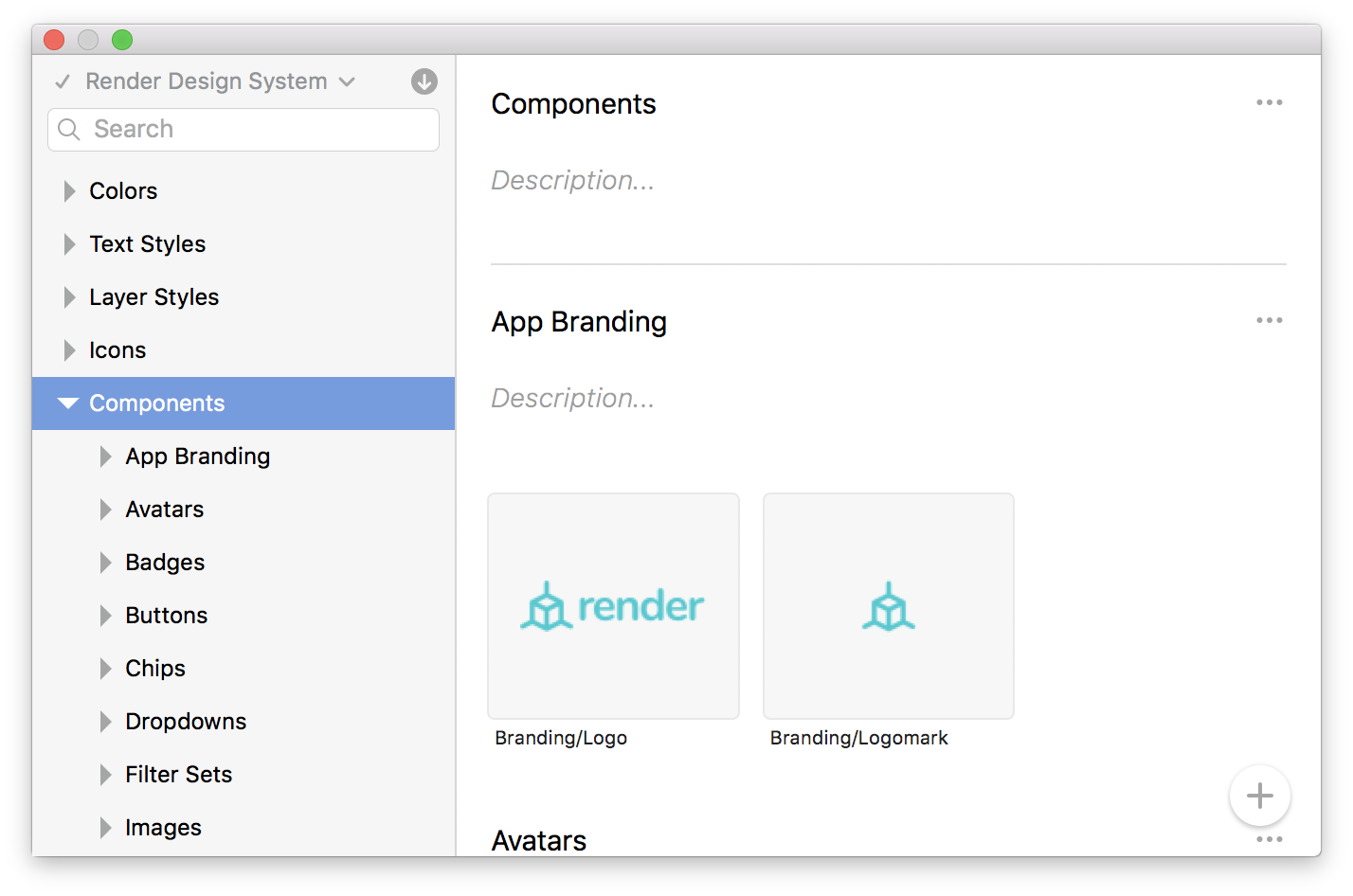
  • Components: This is where you’ll put all of your symbols.

Folders

Folders are probably the most convenient tool in DSM because they allow you to thoughtfully organize the pieces of your design system so they make sense to everyone using it. You can even create folders within other folders to add deeper organization (currently limited to two levels of nesting).

Step 4: Adding Colors

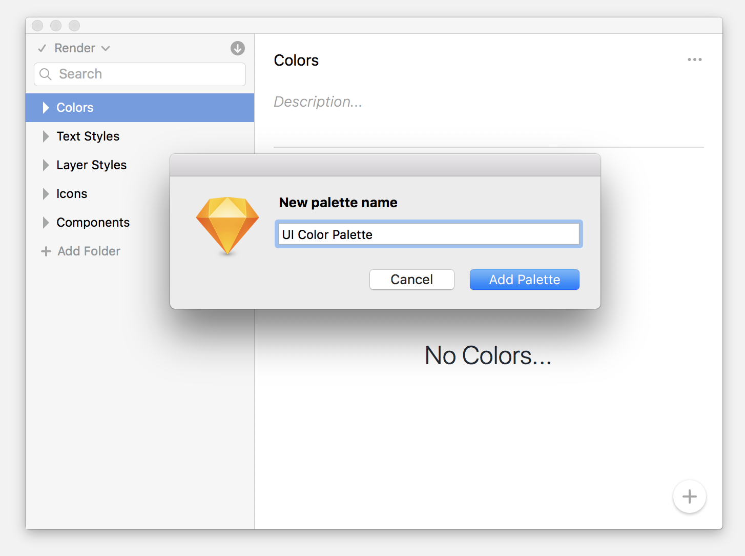
Select the Colors folder and click the + button in the bottom right. A modal will pop up asking you to name this color palette. You can have multiple color palettes based on your color system, so feel free to create one or many.

Image for post

Image for post

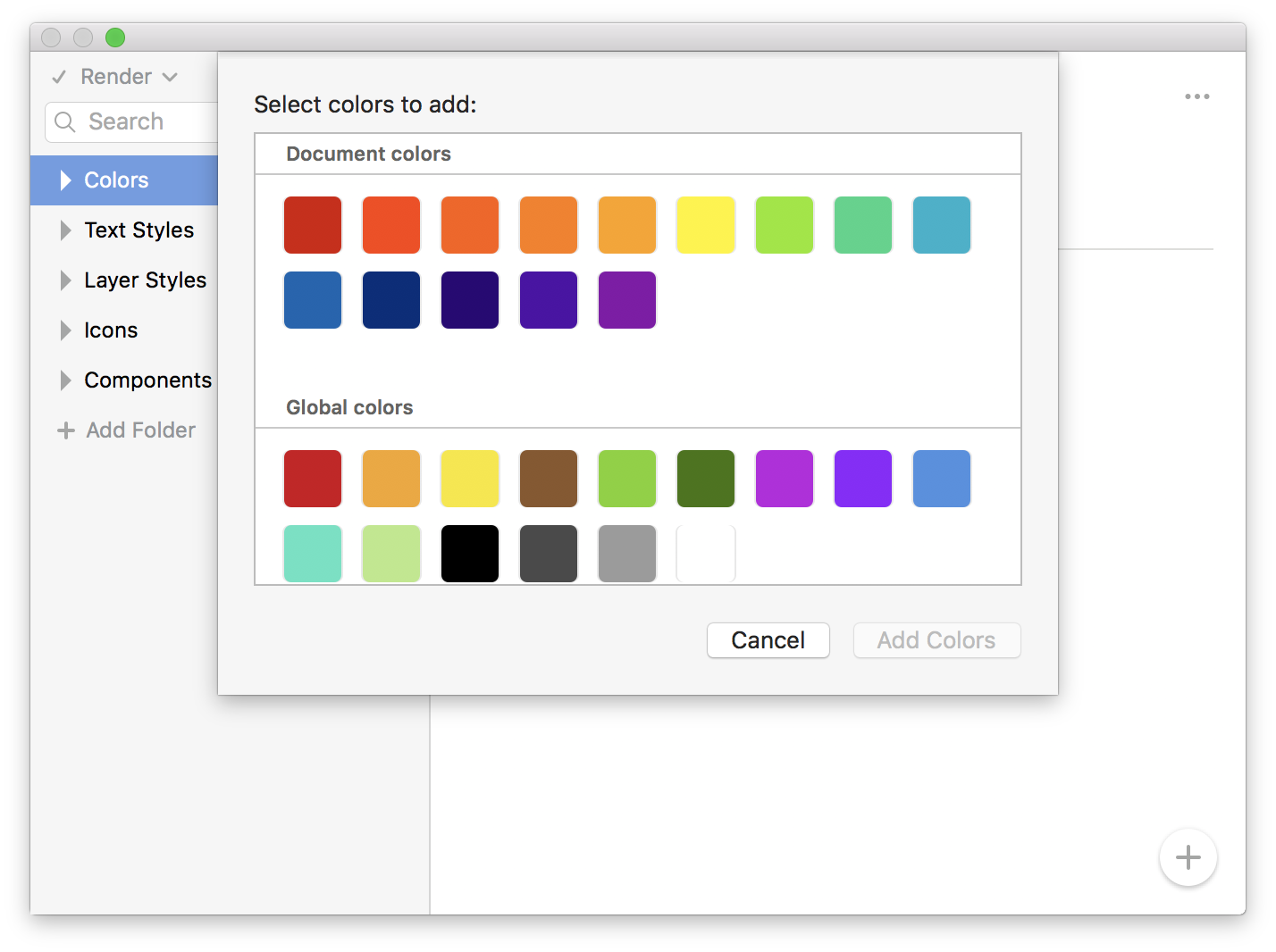
DSM will scan your document to find all of the colors that you use. Select which ones you want to add to this palette, then click Add Colors.

Image for post

Click the text below the color swatch to rename your colors to something a little more useful:

Image for post

DSM let’s you add descriptions to components in your library, which is great for adding usage guidelines and design principles:

Image for post

Image for post

Image for post

The rich text editor is pretty dope – I don’t have to hack it with my own homegrown formatting.

Step 5: Adding Text Styles

If you’re not already using text styles, I *implore you* to start immediately. When you design products using text styles, it makes it mind-numbingly easy to make file-wide updates to the font by just updating the style, then syncing.

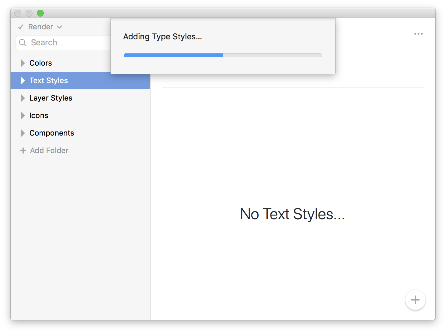
Anyway, adding text styles is super easy because DSM just does it all for you. Click into the Text Styles folder, then click the + button in the bottom right:

Image for post

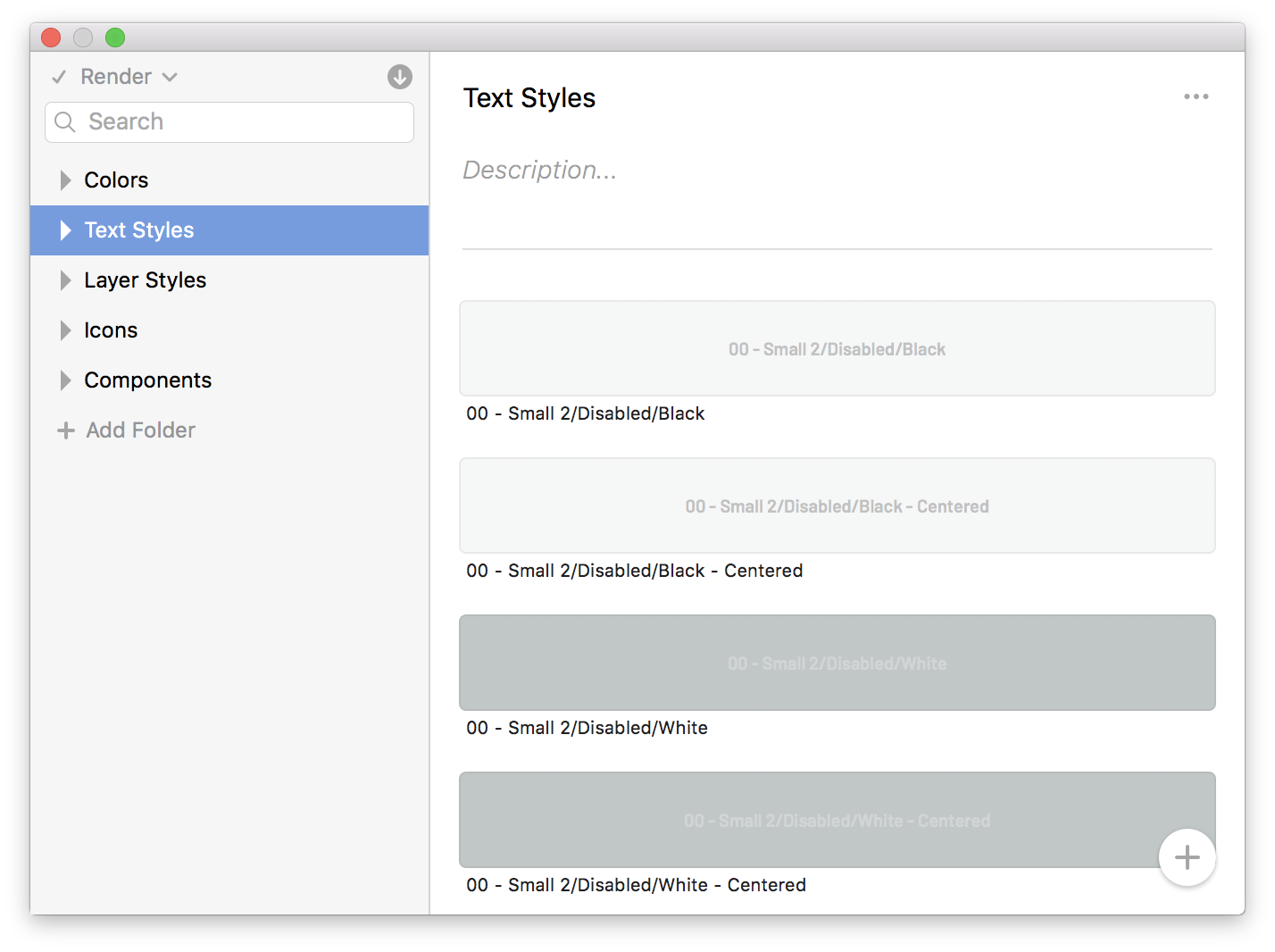
It looks like it’s pulling duplicates, but it’s not. I have two text styles set up for left- and center-alignment!

DSM will auto-detect every text style in your document. Just click Select All, and Add Text Styles.

Image for post

Image for post

Image for post

Step 6: Adding Layer Styles

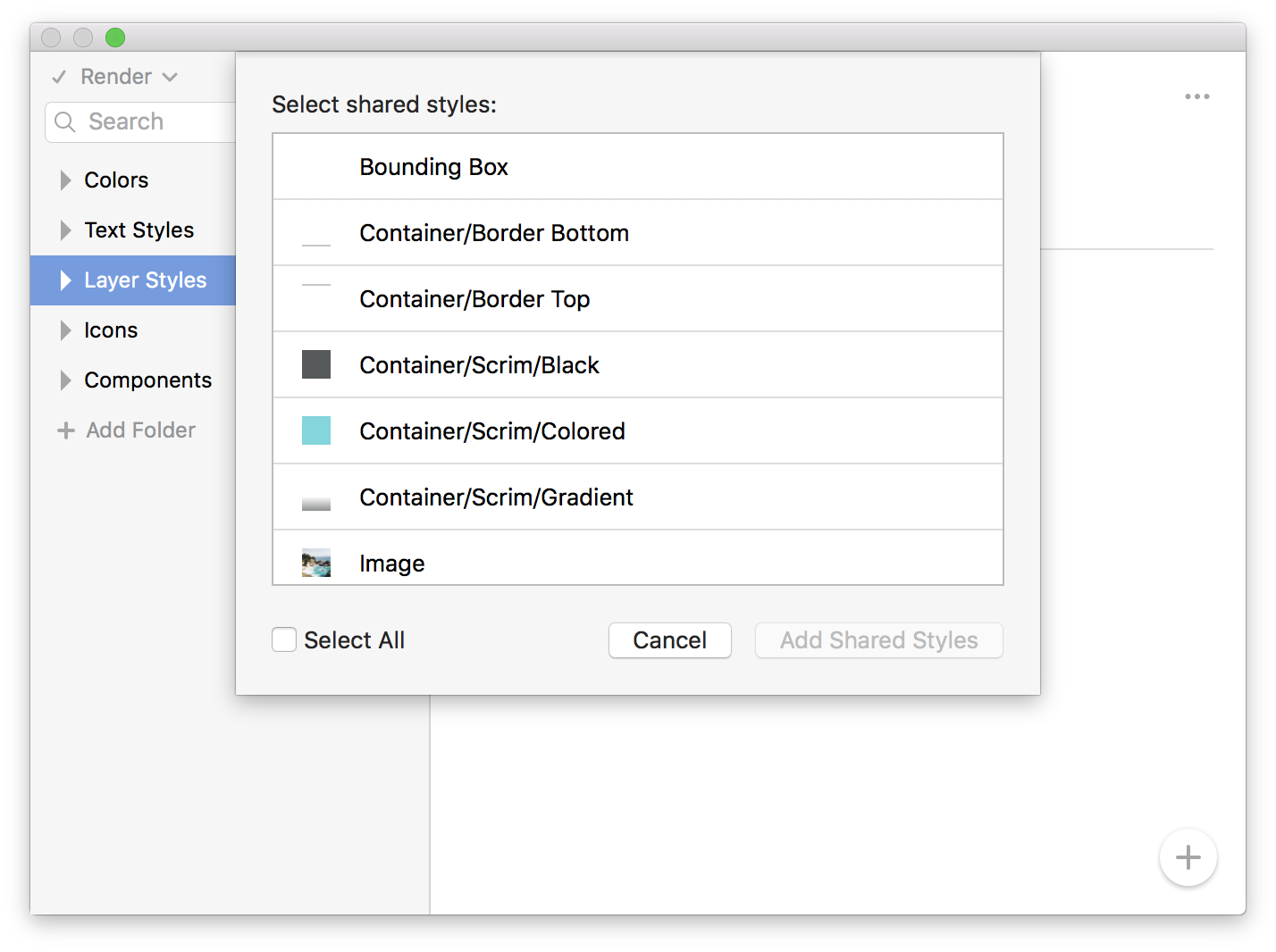
Click into the Layer Styles folder, then repeat the previous step. Pretty easy!

Image for post

Image for post

Image for post

Step 7: Adding Icons

It’s important to note that icons don’t have to be symbols in order to add them into your DSM library.

*!!! A Very VERY Important Note !!!
*
DSM supports deep-nesting in symbols. This means that if you’re using the color symbol technique to allow you to change the color of your icons, DSM will automatically scrape your file for all nested symbols and import those into the library for you automatically. This means you do not need to import your color symbols. Just import your final symbol composites…not the individual nested symbols that make up the final component.

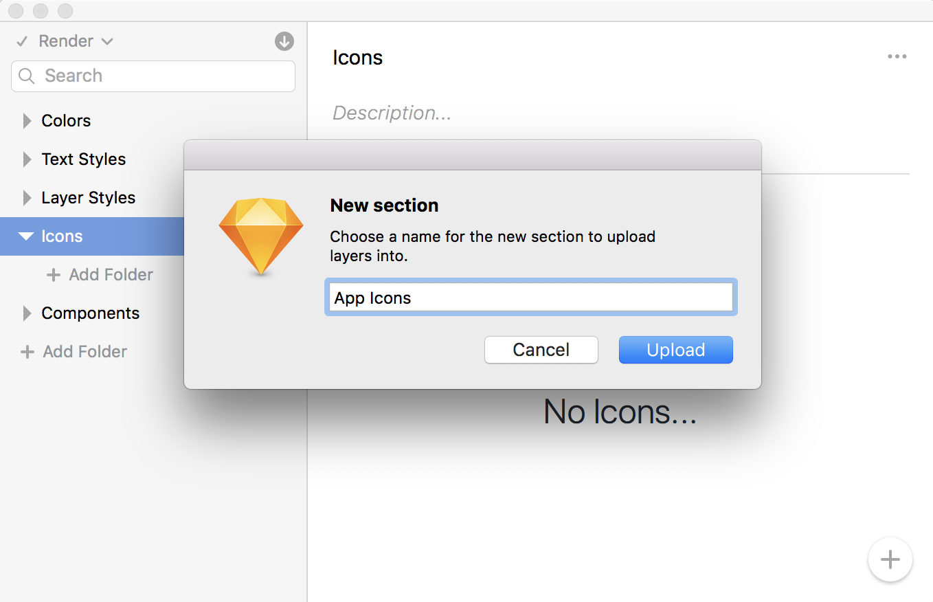
Click into the Icons folder, select an icon layer or symbol, then click the + button to add. Note: You can select multiple icons at a time and add them in one fell swoop. No need to do them one-at-a-time. Phew.

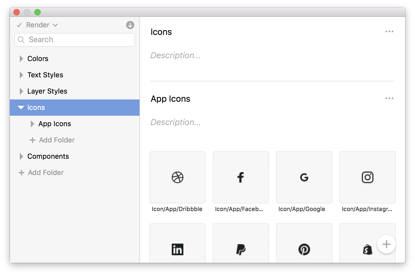
I strongly recommend you take some time organizing your icons into an understandable sub-folder structure. It’ll make it easier to find them later:

Image for post

Image for post

Image for post

I usually divide mine into the following:

  • App Icons: Product icons for things like Twitter and Facebook.
  • UI Icons: Standard UI icons like settings, delete, user profile, etc.
  • Toggle Icons: Things like checkboxes, radios, and switches.
  • Misc Icons: Anything else that doesn’t fit in the above categories.

Step 8: Adding Components

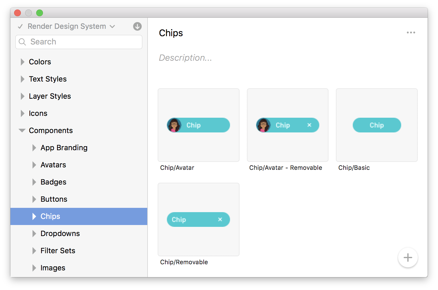
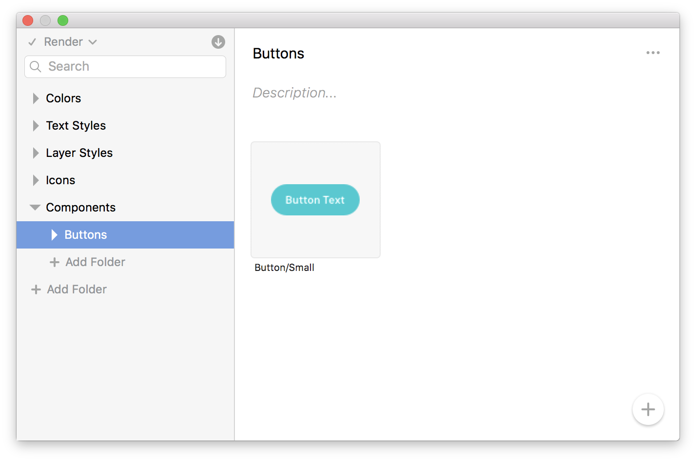
You should have the hang of it by now! Click into the Components folder, then click the + button to start adding your reusable elements and components.

This is where you’ll want to be *super* organized with your folder structure:

Image for post

Remember, DSM will automatically import any deeply-nested symbols that make up your larger symbol composites, so you only have to import the “final component” into DSM:

Image for post

The Chips above have lots of nested symbols in them to allow for choosing different avatar styles (image, initials, icons), chip color, and text color. I only had to import my final chip symbol into DSM. When I’m using chips from my design system in another file, DSM will bring all of those nested symbols with it, including any nested symbols that have the same artboard size.

It’s really really nice.

Step 9: Deploying and Using the System

When you’ve finished adding all of the necessary components to your design system, they’ll instantly be available to everyone on your team! They’ll just have to click sync to update their file with the latest-and-greatest from the shared DSM library.

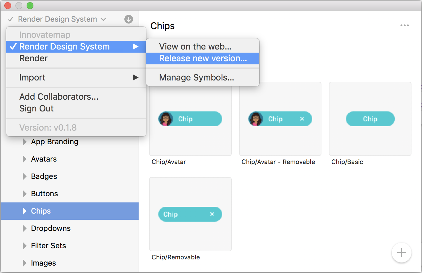
On the Enterprise plan, you’ll have the ability to do some fancier things like library versioning, user permissions, and library access control.

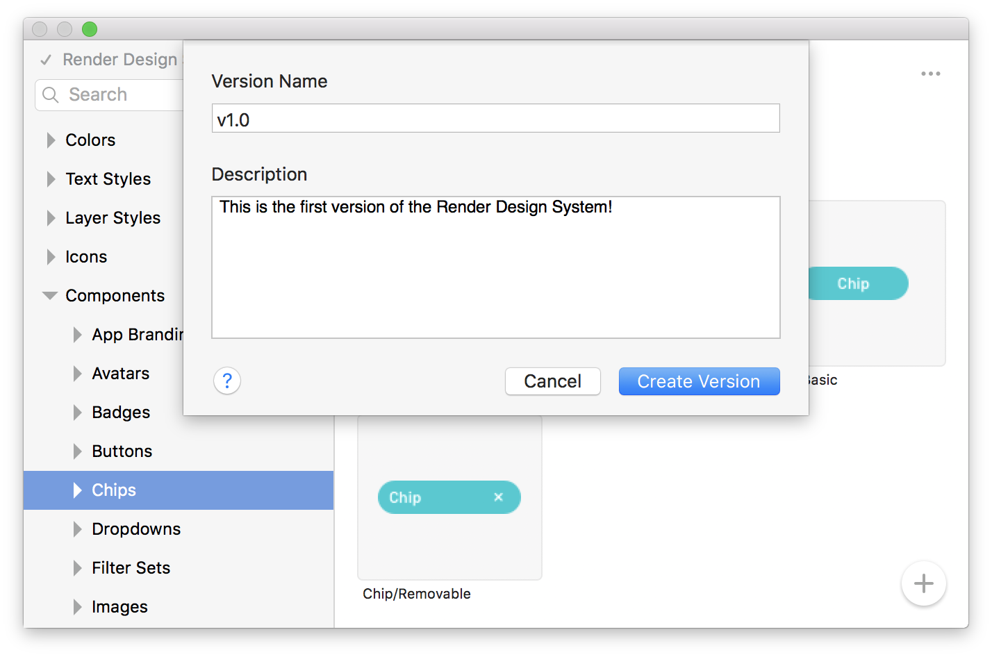
If you’re on the enterprise plan and want to release a new version, just click on the dropdown in the top left, then choose Release new version…

Image for post

Image for post

Image for post

Image for post

Your new design system version now exists, and if you’ve already released an earlier one, you can see what’s been changed by clicking Version history…

This will take you to a web view of your change log, just like you might see when you update an app on your computer:

Image for post

You should really aim to be a lot more verbose and detailed than I was in the above screenshot so that your team knows what has changed.

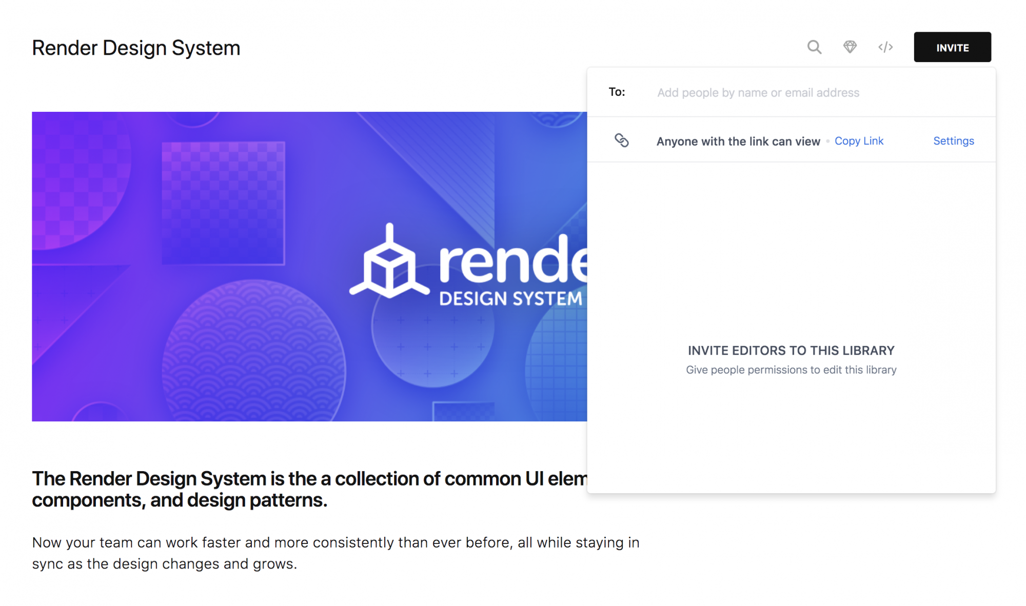
Speaking of team, you’ll probably want to invite some other designers to use, edit, and manage your new DSM library.

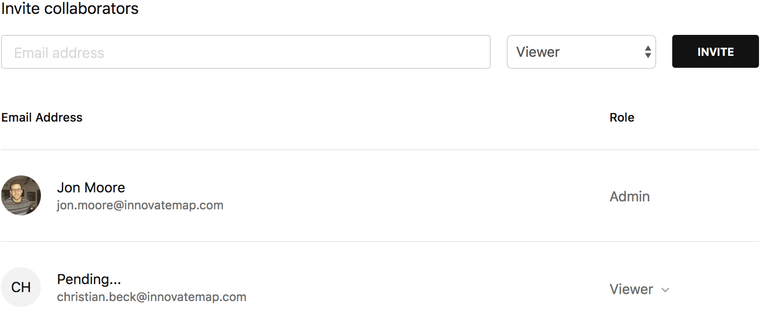
From within your library in the web interface, click the Invite button in the upper right of the screen. You’ll see a popover where you can invite other designers.

Note: If you’re on the Enterprise plan, you’ll have the added ability to invite users to View, Edit, or Manage (admin) this library.

Image for post

You can also visit the People tab on the DSM home screen to view, edit, and add collaborators to your libraries.

Image for post

Image for post

These permissions and roles are only available on the Enterprise plan.

You can quickly jump to this page from within the DSM plugin, too:

Image for post

Step 10: Making Updates to Your System

Since you’re the “master librarian” of your new design system, it makes sense that you’ll want to make updates from time to time, whether it be adding new components, or updating existing ones.

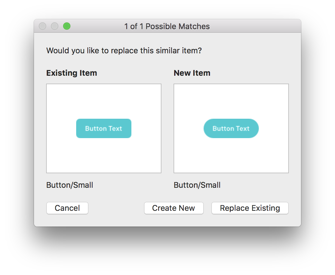
Click into the folder that contains the component you want to update, then click the + button. If DSM detects that the symbol already exists, you’ll get a dialog box that looks like this:

Image for post

Decide whether you want to Create New or Replace Existing, and the change will propagate into your DSM library:

Image for post

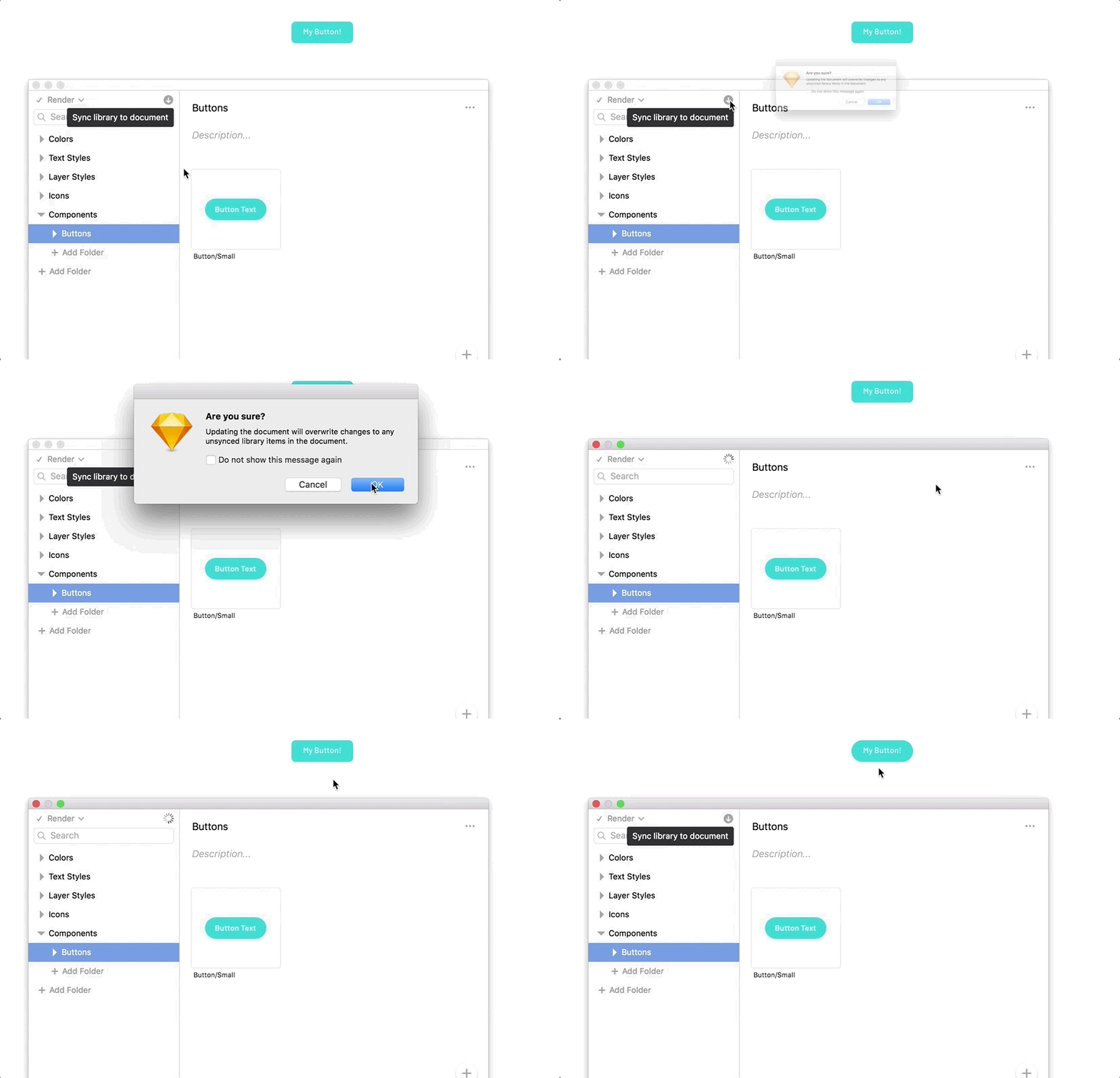
When updates are made in your library, members of your design team will get notified that components have been updated:

All they have to do is click Sync library to document and the changes will be reflected in their document, with all existing overrides (like text) preserved:

Image for post

Really-Quick-Side-Note: Anyone who shouldn’t be poking around in the library symbols can just be set to be a Viewer instead of an Admin or Editor inside of the collaborator permissions. Protect your system from any unwanted changes!

Image for post

Summary

In this article, we learned how to create a library, install the Craft plugin, build out your library, and deploy your system. You and your team are now ready to start using your brand new design system!

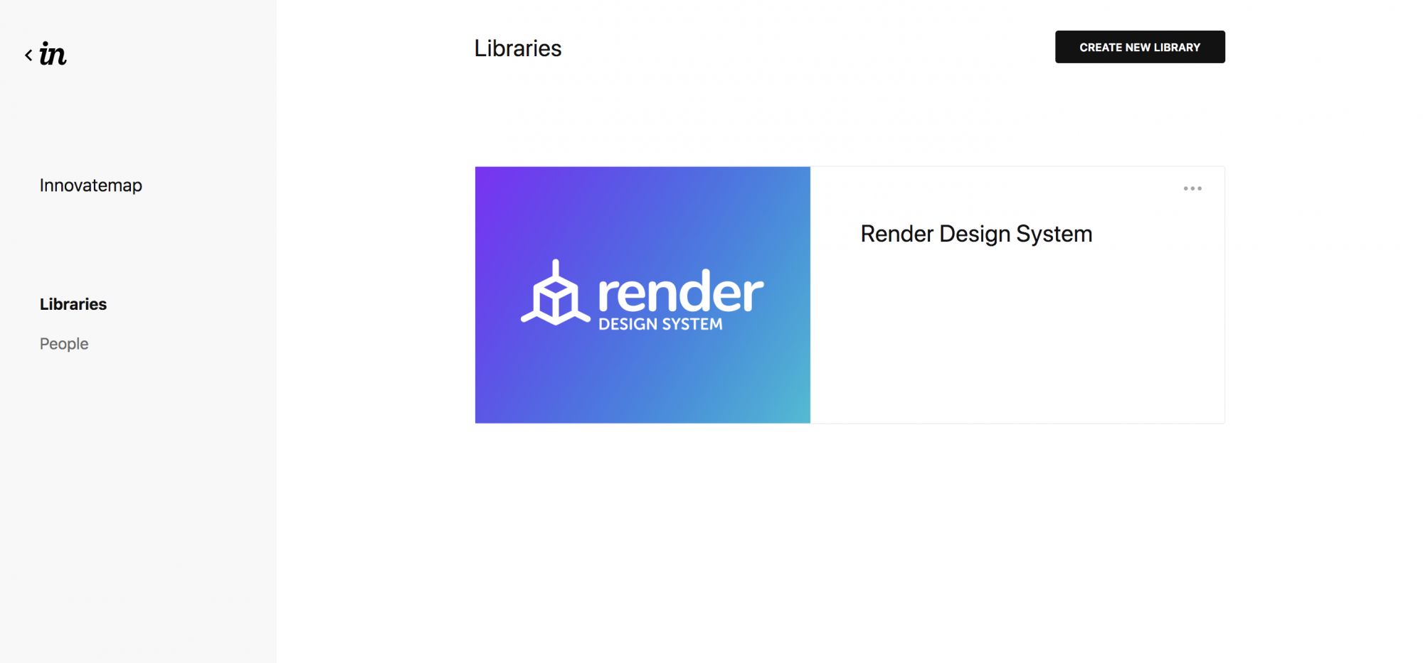
I helped InVision create a sample design system called so you can see how nice it looks in their web view. and the , and you can begin assembling your own library with the DSM tool using the Render system as a starting point.

Image for post

Click above to view the completed Design System on InVision!


https://blog.bitsrc.io/7-tools-for-building-your-design-system-in-2020-452d9c9b3b8e

7 Tools for Building Your Design System in 2021

Building a component design system? Seeking better designer-developer collaboration? Here are some awesome tools ⭐️
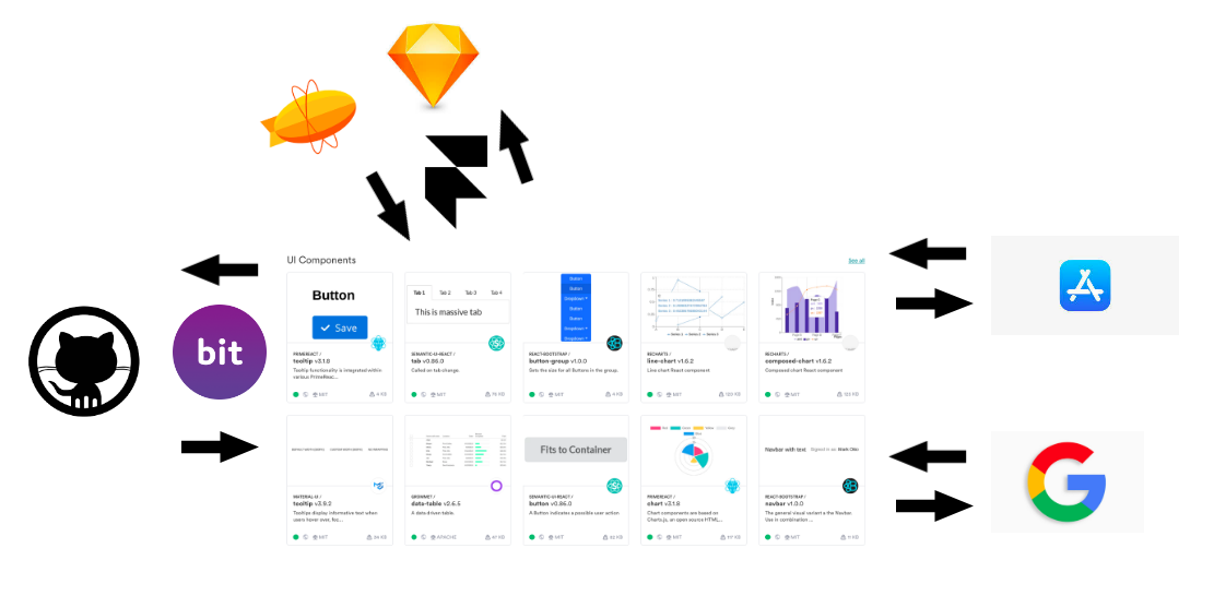
 

Image for post

Legend has it that the first design system was introduced by NASA in 1976. Since then, design systems turned into a widely common practice used to standardize design and development of a visual language in multiple instances across different teams, projects and applications.

Today, modern components take the notion of design systems beyond visual elements, opening the door to the true consolidation of component-based design and development. However, the current ecosystem is still gapped between design tools and developer tools. Through tools built to bridge this gap from both design and development ends, we can bring together designers and developers to collaborate like never before, in one unified system.

In this post we’ll explore some of the most popular and most promising tools and technologies that pave the way into this future. We’ll explore how familiar design tools like Invision and Sketch manage component design systems, introduce groundbreaking developer-first component collaboration tools like Bit and component-based design tools like Framer, and beyond.

Feel free to comment below and share your own ideas and insights!

1. Designers: Invision Design System Manager, Sketch Libraries and Adobe XD

Manage your visual language as a component design system.

Invision DSM

Image for post

Image for post

Invision Design System manager empowers designers to manage the design angle of their system in a way built for standardized and unifed systems. It provides tools such as component drag & drop, component search, enhanced team sharing, management of version history and a semi-automatically generated style guide to complete the visual system you build. It even integrates into your Sketch libraries to create a unified workflow.

Sounds useful? it is, and just think of the potential if combined with component platforms like Bit on the developer’s side, to turn the visual design system into a managed, reusable and cross-project controlled set of visualized and consumable components which can be used and updated anywhere.

Experience a truly connected workflow with InVision Design System ManagerInVision DSM makes our design system’s visual organization so much simpler. It’s great to be able to see components…www.invisionapp.com

Sketch Libraries

Image for post

Image for post

If you’re working as part of a team with other designers, Sketch’s Libraries let you place your document somewhere where your colleagues have read-access such as a Dropbox folder, or repository in GitHub, etc, have them add the document to their Libraries in Preferences, and they will have quick and easy access to the styles and Symbols in that document. You can receive updates made to the file. And, it works with Invision DSM too, and hopefully soon it will integrate with platforms like Bit for an utopian component experience.

A Library is just an ordinary Sketch document that contains Symbols, Text Styles and Layer Styles, which you can then use in any other Sketch document. If you update any of the Symbols or styles in your Library file, documents containing instances of those Symbols, or any of your predefined styles, will receive a notification telling you that they can be updated. Definitely a mandatory option to explore when building a design system.

LibrariesThe best design happens when designers collaborate together. With Libraries, designers can now share Symbols and styles…www.sketch.com

Adobe XD

Image for post

Image for post

Adobe XD lets you save your work as a cloud document to quickly share with collaborators and use as your single source of truth. XD automatically updates cloud documents so you never lose your work. You can bring colors, character styles, and components from shared cloud documents to the Assets panel. When changes are made to a linked asset, you’ll be notified and have the option to accept the updates. It lets you access and apply raster images, vector graphics, colors, character styles, and other assets created in Photoshop, Illustrator, and other Adobe Creative Cloud apps from right inside XD.

2. Developers: bit.dev UI component platform

Easily share and manage reusable components across projects and teams. Let everyone collaborate over your actual components.

Read: “

How We Build a Design SystemBuilding a design system with components to standardize and scale our UI development process.blog.bitsrc.io

Image for post

Design systems made from real code components in bit.dev

is a popular developer-first platform for managing and collaborating over components across projects and teams. It’s built for components written in any JS framework, or without a framework. Using Bit you can build a reusable component system for your organization, that gets adoption.

Through Bit you can seamlessly isolate components from different GitHub projects, and export them into a unified collection in the bit.dev platform. From there, everyone can discover, install and update components anywhere.

When building a design system, Bit lets your colalborate and reuse components to keep your UI/UX consistent and development standardized. It also brings everyone together over your actual managed code, in a visual way.

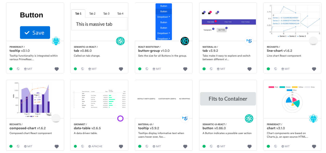
Image for post

Image for post

A design system from real components in React: just choose, use and collaborate

tracks and isolates components in a reposiotry in an isolated capsule environment, so you can build, test and export each as a reusable and managed unit. It requires zero refactoring or configurations, and components can be used and updated right from any consuming project. The result is a nearly limitless ability to build, distribute and collaborate over components.

is where exported components are organized, visualized and made discoverable for teams to build together. Different team members can easily find shared components, view and save examples in real code, consume components and sync updates driven from any consuming project. Apart from developers, designers, products and marketers can also collaborate over the code itself, so the entire team knows exactly what’s going on at any moment.
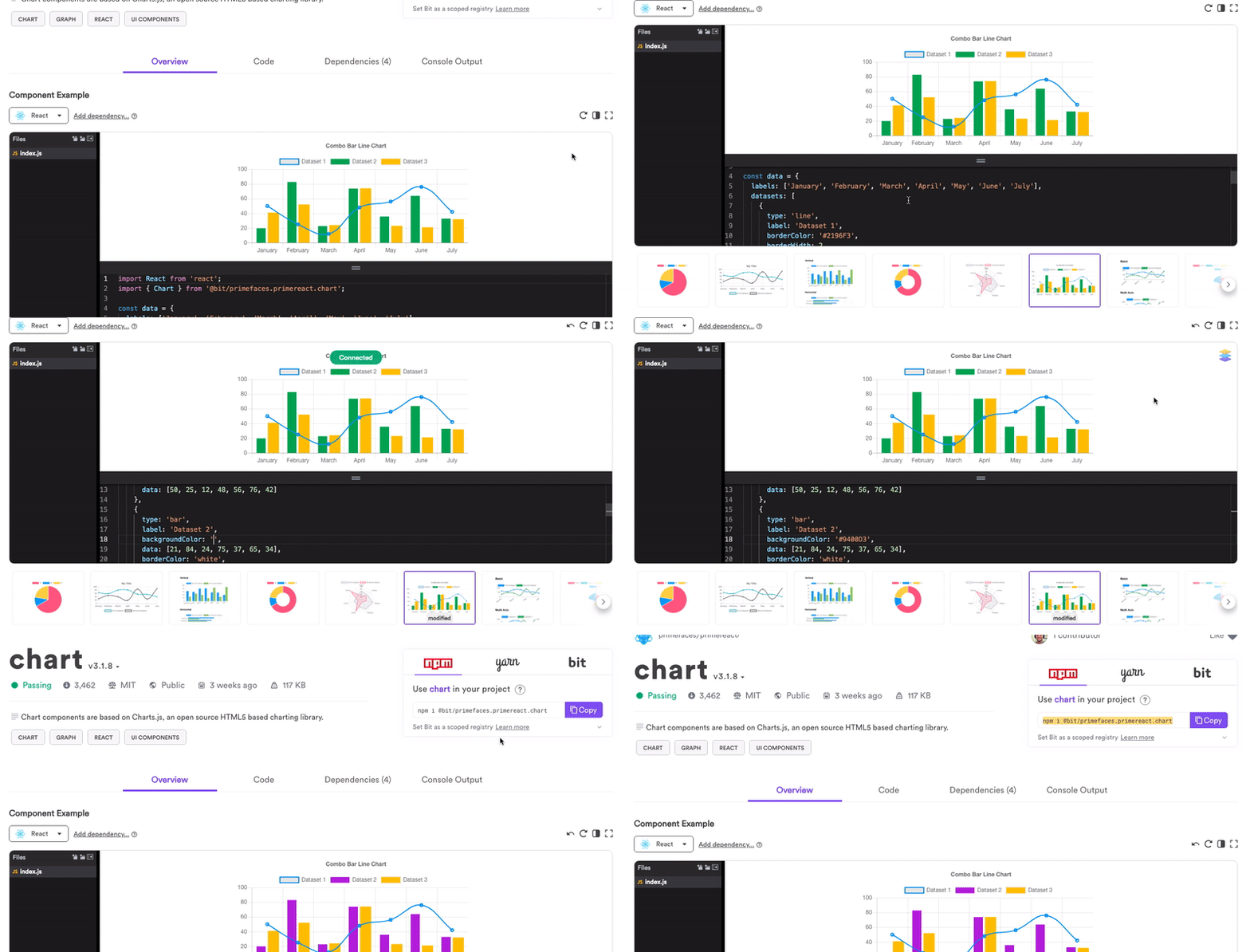
Image for post

Image for post

Each component is even sandboxed and rendered so that everyone can learn how it looks and works, and monitor new versions as they are updated.
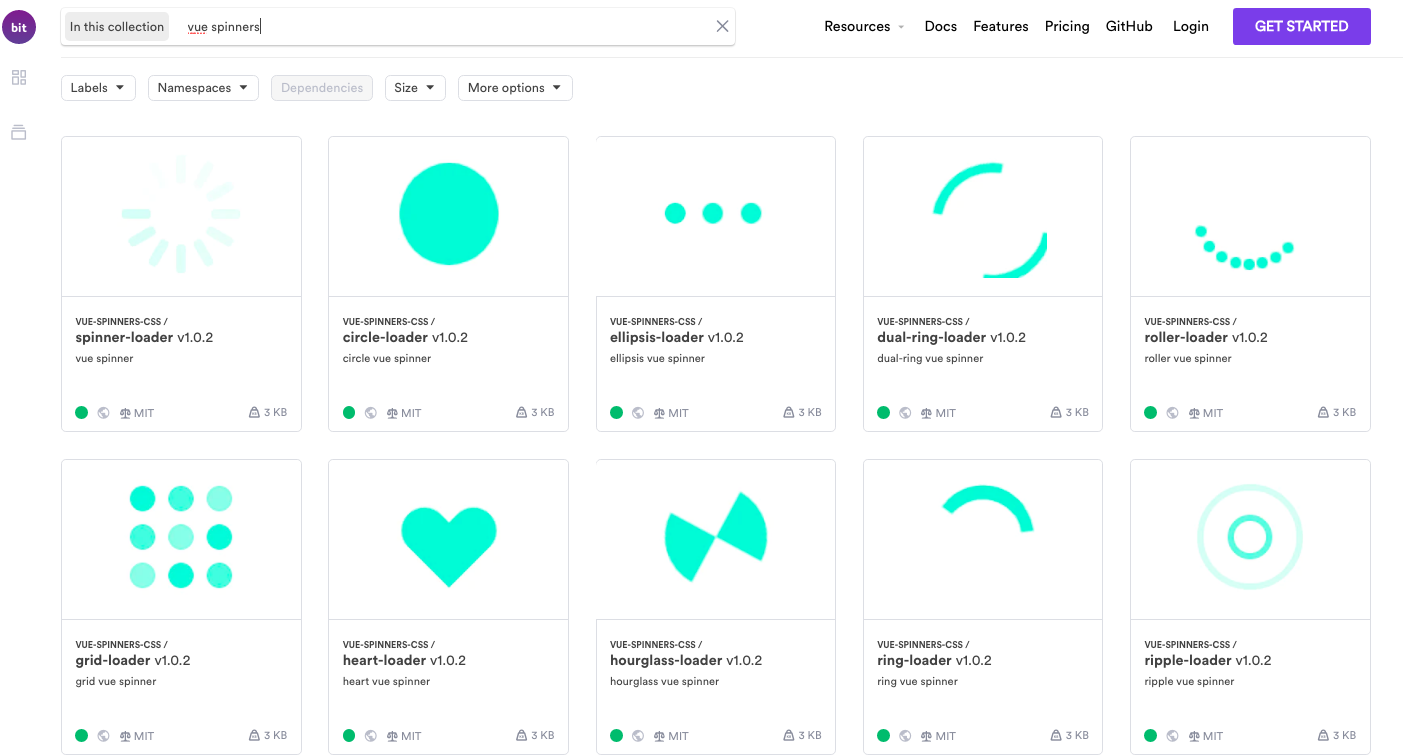
Image for post](http://https//bit.dev/components)

A collection of Vue slider components in bit.dev

Large organizations use Bit to manage components from their library across projects and teams, in a democratized and collaborative workflow, so that their components are truly adopted across products while regulated. This creates a component ecosystem within larger organizations, which leads to a collaborative workflow for building and updating components everywhere.

Smaller teams use Bit to gradually build design systems bottom-up, collecting components from their apps into your bit.dev collection, which is very useful for smaller teams and startups which don’t have the time to build a system.

Check it out:

Bit · Component design systemBuild a UI design system with components. Keep your UI design consistent across applications, reuse components to…bit.dev

Share reusable code components as a team · BitEasily share reusable components between projects and applications to build faster as a team. Collaborate to develop…bit.dev

3. FramerX and BuilderX for component design

Interactively design components translated into React and React native

FramerX

Image for post

Image for post

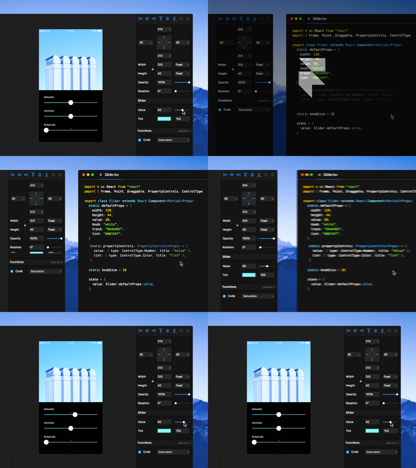
Design facing, FramerX is a prototyping tool for designing interactions while introducing React (and JS/TS) in the design workflow itself over canvas. It lets you turn basic HTML and CSS or React components into visual elements.

You can import design elements from your canvas into code components. Use code to add logic and data, then go back to the canvas to tweak the style. You can also pull in components into Framer, or find pre-made components.


Framer X VIDEO – YouTube.com


When building design systems, Framer can come in useful as you can organize your components in your team’s store, which also introduces push-updates for every change made to components by your team. Thorugh the customization of UI, you can save different instances (spacing etc) for component usage. You can even improvise to pull in your production’s real code into this system as shown in this example by Datadog HQ. Check it out.


USING INVISION

https://blog.prototypr.io/bringing-design-system-components-from-production-into-framer-x-786e89be2250

Bringing Design System Components from Production into Framer X

Spoiler alert: It’s easier than you think

At Datadog, the speed at which we design and build components into our
React-based design system has been increasing. And with greater speed comes the challenge of representing those
components consistently in our design tools.

Our team received invites for Framer X beta and we’ve spent a few days testing
its capabilities. The power of Framer X lies in its ability to allow designers to design on the canvas and with code
interchangeably.

Code from Framer X is not meant to be production code, but it does have the same capabilities as a regular React
project. So we set out to explore the possibility of a workflow to bring our production components into Framer X.

We wrote this article as part guide, part documentation. It follows the process we went through to get our production
components into Framer X.

Image for post

Getting started

This guide assumes you have a basic development environment setup with Node, Yarn and Git, as well as basic Javascript and
React knowledge. Let’s start by cloning the build system repository:

git clone https://github.com/shiftsave/framerx-build-system.git

Next, install the dependencies:

cd framerx-build-system && yarn install

Bundling the codebase

First of all, we needed to bundle our production codebase into a format that Framer X could interpret. That means
plain ES6 and CSS. We used Webpack to bundle our production codebase
into a dependency-free library (referred to as “lib” in code).

The entry point of the library is the index.ts file, which imports the relevant assets and components
from the production codebase. This includes anything from JSX, TSX, LESS, Sass or even SVG images.

One of the biggest hurdles was to have all the production component dependencies resolve correctly in the library
that we are exporting. For example, a dropdown component that is dependent on classnames.

Image for post

To use this build system with your production codebase, point the Webpack entry to your codebase. We
recommend creating a symlink to your production codebase to avoid duplication.

Whether you decide to follow along with our example or use your own, all you have to do is run
yarn build. This will bundle the code inside _production and copy the bundled library into
design-system.framerx.


Image for post

Working with bundled components

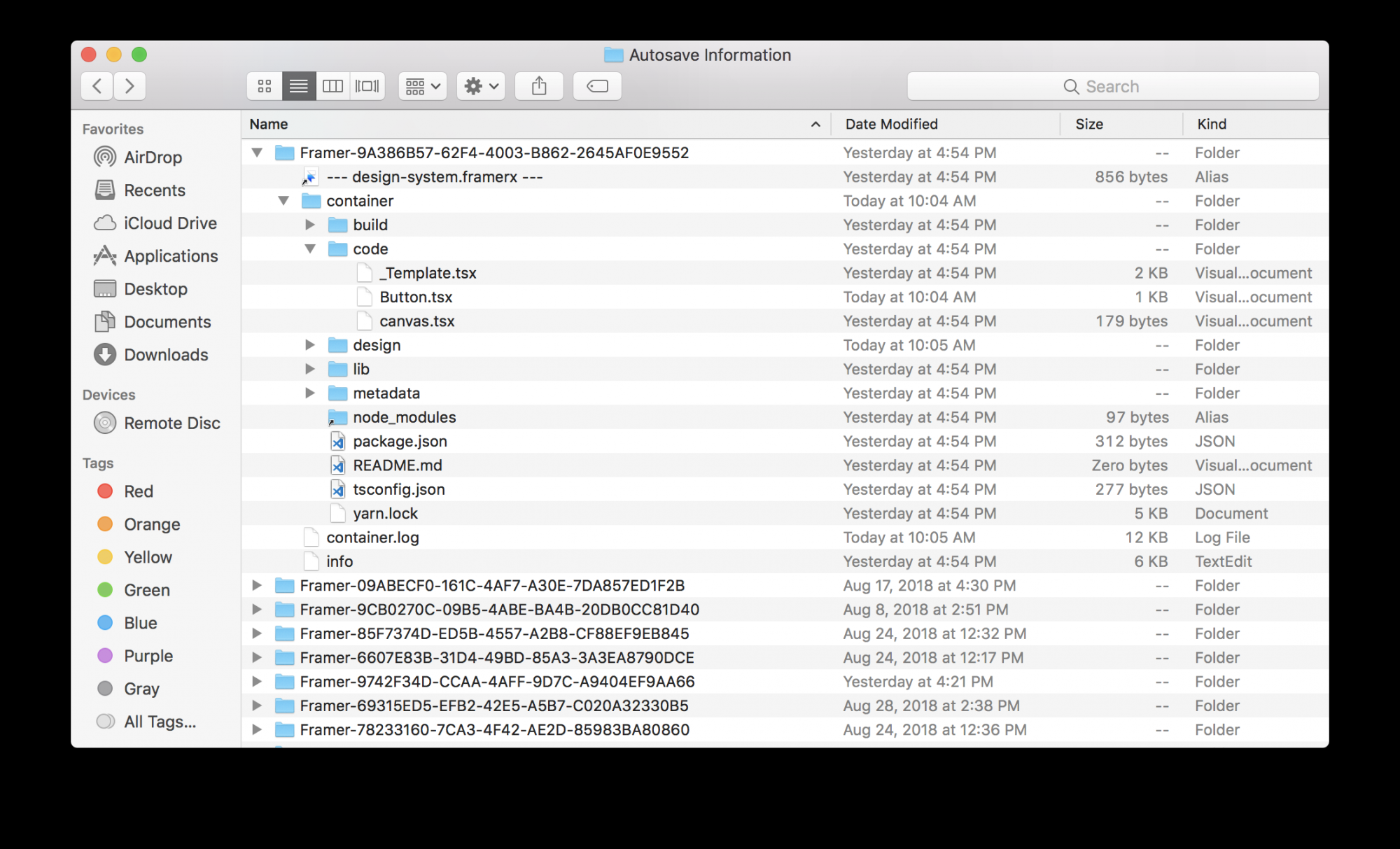
Before we get started, we need to dissipate some haze about the way Framer X works. A .framerx file is a
zipped folder bundled as a binary.

When opened, Framer X unzips the file inside macOS’s AutoSave Information folder. On file close, Framer X zips the
contents back into the file.

Image for post

Adding components

We are going to take our production component from lib, and wrap it in a new component as a bridge
between our production code and Framer X. We need this wrapper to expose Property Controls (We’ll touch on these
soon)

The build system we put together includes a sample
Button component. We will use this component in this section.

Open design-system.framerx and create a new Code Component called Button. Framer X will
open Button.tsx in Visual Studio Code.


Image for post

Let’s remove the boilerplate code and add back what we need piece by piece.

We’ll start with the import declarations. We recommend alias import declarations { Button as _Button }
this allows us to use the original component name as the name of the Framer X Code Component.

import * as React from "react";
import { Button as _Button } from "../lib"; // <- This is the bundled production code we inserted with yarn build.

Next, let’s define the component and its props. The props in the example below match the props defined in the
component from the production folder we bundled with Webpack. Props change the content and visual style of the
component, in this case size, type and title.

import * as React from "react";
import { Button as _Button } from "../lib";enum SIZE_OPTIONS {
  EXTRA_SMALL = "xs",
  SMALL = "sm",
  MEDIUM = "md",
  LARGE = "lg"
}// Define type of property
interface Props {
  buttonType?:
    | "default"
    | "primary"
    | "success"
    | "warning"
    | "danger"
    | "toggle";
  size: SIZE_OPTIONS;
  title: string;// Width and height of the component when loaded in the canvas
  width: number;
  height: number;
}export class Button extends React.Component<Props> {
  render() {
    return <_Button {...this.props}>{this.props.title}</_Button>;
  }
}

Now the component is in Framer X, but you’ll notice it renders a bit off. This is because we haven’t initialized any
defaultProps. Let’s initialize some props to have a better default view of the component.

import * as React from "react";
import { PropertyControls, ControlType } from "framer";
import { Button as _Button } from "../lib";enum SIZE_OPTIONS {
  EXTRA_SMALL = "xs",
  SMALL = "sm",
  MEDIUM = "md",
  LARGE = "lg"
}// Define type of property
interface Props {
  buttonType?:
    | "default"
    | "primary"
    | "success"
    | "warning"
    | "danger"
    | "toggle";
  size: SIZE_OPTIONS;
  title: string;// Width and height of the component when loaded in the canvas
  width: number;
  height: number;
}export class Button extends React.Component<Props> {
  // Set default properties
  static defaultProps = {
    title: "Button",
    size: "md",
    buttonType: "default",
    width: 68,
    height: 28
  };render() {
    return <_Button {...this.props}>{this.props.title}</_Button>;
  }
}

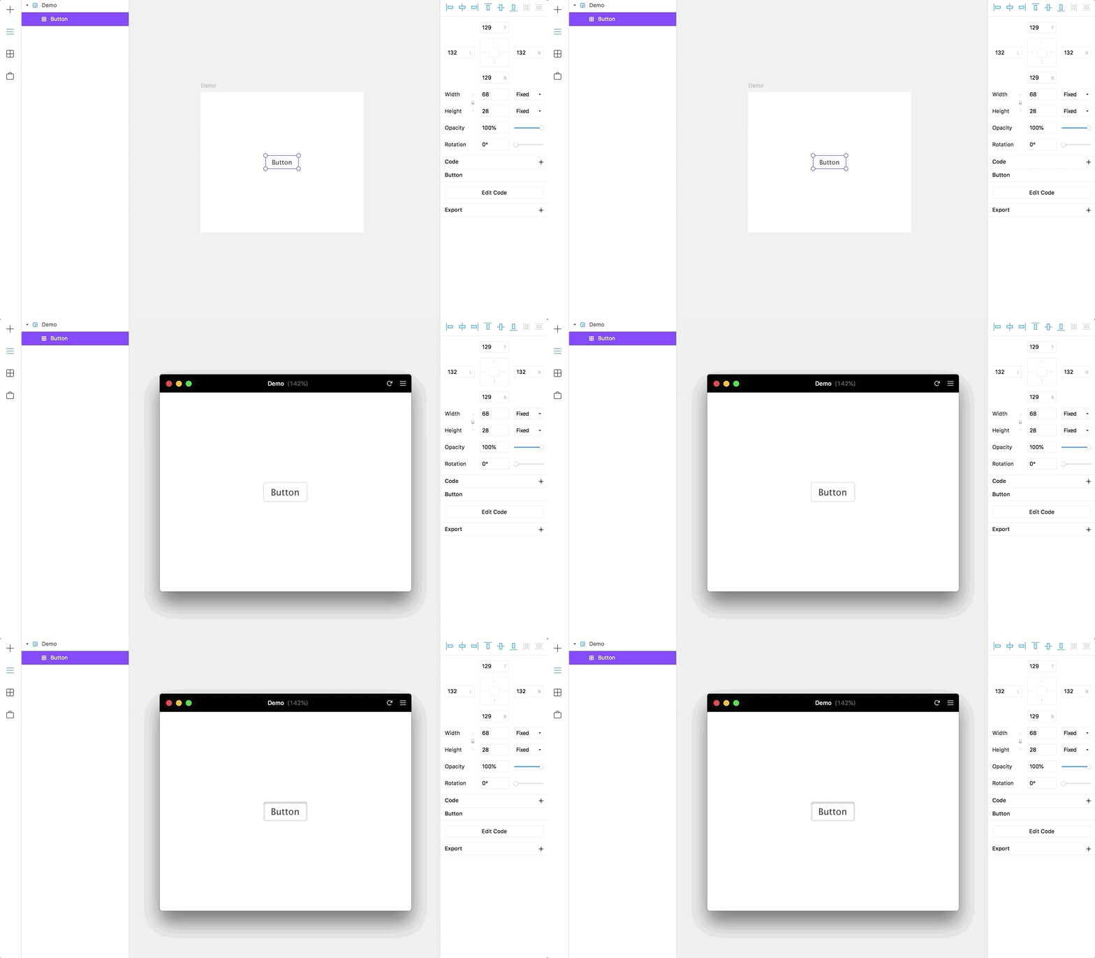
Voila! the production component is in Framer X! 🎉🎊

Image for post

Exposing controls

Next, let’s add some Property Controls. Property Controls are one of the most powerful features of
Framer X; they allow you to expose controls to interact with the props of your component. See Framer X docs for details.

import * as React from "react";
import { PropertyControls, ControlType } from "framer";
import { Button as _Button } from "../lib";enum SIZE_OPTIONS {
  EXTRA_SMALL = "xs",
  SMALL = "sm",
  MEDIUM = "md",
  LARGE = "lg"
}// Define type of property
interface Props {
  buttonType?:
    | "default"
    | "primary"
    | "success"
    | "warning"
    | "danger"
    | "toggle";
  size: SIZE_OPTIONS;
  title: string;// Width and height of the component when loaded in the canvas
  width: number;
  height: number;
}export class Button extends React.Component<Props> {
  // Set default properties
  static defaultProps = {
    title: "Button",
    size: "md",
    buttonType: "default",
    width: 68,
    height: 28
  };// Items shown in property panel
  static propertyControls: PropertyControls = {
    title: { type: ControlType.String, title: "Title" },
    buttonType: {
      type: ControlType.Enum,
      options: ["default", "primary", "success", "warning", "danger", "toggle"],
      title: "Button Type"
    },
    size: {
      type: ControlType.SegmentedEnum,
      options: ["xs", "sm", "md", "lg"],
      title: "Size"
    }
  };render() {
    return <_Button {...this.props}>{this.props.title}</_Button>;
  }
}

Image for post

Collaboration and versioning

One of the biggest hurdles we had to overcome during this process was collaboration, and tracking changes in GitHub.
This meant extracting the components from the Framer X file into the main repository.

We wrote three scripts inside package.json that allow us to sync the Framer file with the contents of
src and vice versa. This allowed us to have full versioning capabilities for Design and Code
components
with minimal impact to the workflow. This works well for now until Framer X has a better
way to handle versioning in the future.

The scrips we implemented for managing the build system are:

yarn build

Bundles the production codebase into ES6 and copies it into the lib inside Framer X contents.

yarn sync:lib

Replaces lib inside Framer X contents with the latest version of the build.

yarn sync:src

Replaces the contents of src with the content of the Framer X file.

yarn sync:framerx

Builds a new Framer X file in case of conflicts or file corruption with the contents of lib and
src.

Conclusion

This workflow is still in its early stages — but the benefits are real:

  • Allows cross-functional teams to have a centralized source for approved components. Yes, a single source
    of truth.
  • Simplifies collaboration between design and engineering . We can easily list out the components and specs needed
    for new features.
  • Empowers designers with development experience to build components that are nearly ready for production.
  • Allows designers to build prototypes with real interactions faster.

At Datadog, we’re designing products that give engineers visibility into their Cloud Infrastructure. Our design
system is complex with lots of moving parts, so we’re excited to test out Framer X’s ability to help us bridge the
gap between design and engineering.

If you’re interested in working on challenges like these and want to help us shape design at Datadog, we’d love to hear from you!


A lightning-fast interactive design tool.Bring your creative ideas to life with Framer, the best tool for interactive design. Create responsive layouts, design…www.framer.com


BuilderX

Image for post

Image for post

is a new tool built to translate component design into a code implementation in React or React native. Through a Sketch import ability, BuilderX aims to let you automatically translate designs from Sketch into code and export them into your project/library. You can dig into this demo application to have your own first-handed impression on how it works.

Image for post

Image for post

While there isn’t much information available in the community to date, it definitely looks very interesting to monitor and track looking forward, as visual editing tools like Framer or Builder combined with developer tools like Bit can pave the way into a truly consolidated designer-developer workflow.

BuilderXBuilderX is a browser based screen design tool that codes React Native & React for youbuilderx.io

4. Stencil, Svelte & lit-html for Web Components

Build pure and standardized components that work everywhere

Back to the developer’s world. Today, most modern application are built using modern component-based frameworks like React, Vue and Angular. But, there’s another way to go: no framework. And, this is probably the future.

Custom components and widgets that build on the Web Component standards, will work across modern browsers, and can be used with any JavaScript library or framework that works with HTML.

This means more reuse, better stability, abstraction and standardization, less work and pretty much everything else that comes with better modularity. While many people are sitting around waiting on projects like web-assembly, in the past year we see new tools and techs rise to bring the future today.

Among the most prominent technologies built for web components, you can find , and . I’ve written about these tools before, so please feel free to dig-in and take a look at how they can help you build a truly standard and reusable design system, used anywhere. Take a look:

7 Tools for Developing Web Components in 2019Web components in the wild: From lit-html to Stencil, Svelete and beyond.blog.bitsrc.io

9 Web Components UI Libraries You Should Know in 2019Looking for framework-agnostic web components? Take a lookblog.bitsrc.io

5. Storybook and Styleguidist for component documentation

Visually develop and document your components

StoryBook and StyleGuidist are too wonderful projects that help develop components in isolation while visually rendering and documenting them.

Image for post

Image for post

StoryBook

is a development environment for UI components. It allows you to browse a component library, view the different states of each component, and interactively develop and test components. When building a library, StoryBook is a neat way to visualize and document components and different AddOns make it easier to integrate into your different tools and workflows. A cool side-project is Storybook design system which can aid in consolidating components into one repository with useful boilerplating for the library.

Image for post

Image for post

StyleGuidist

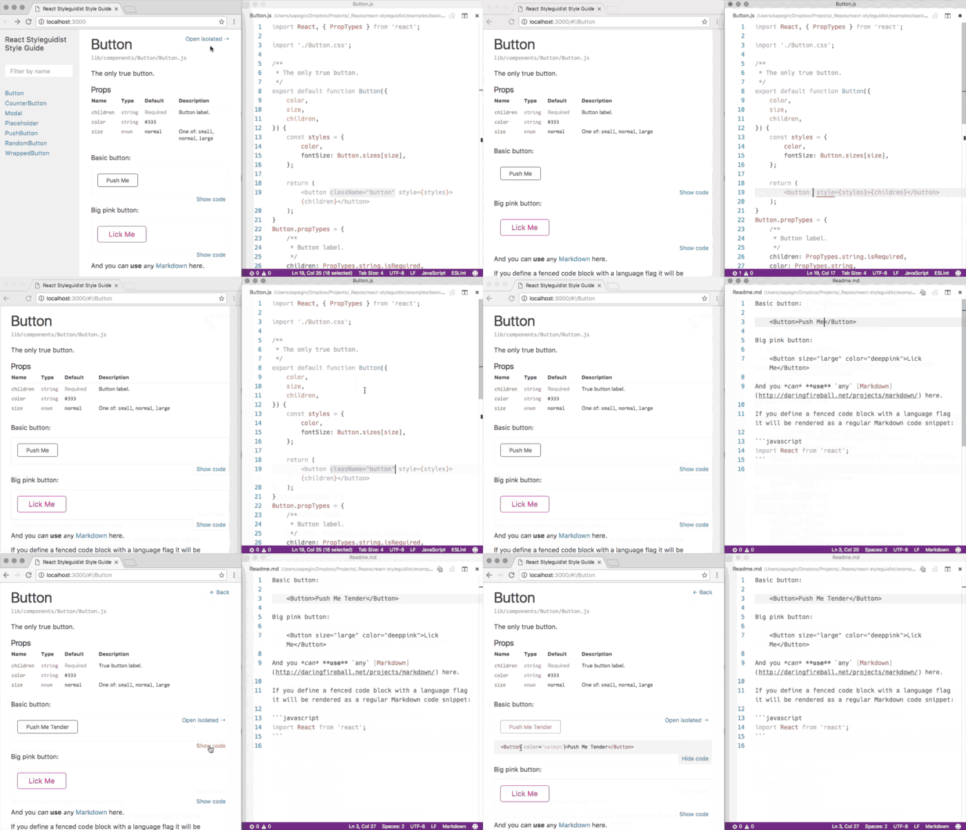
is a React component development environment with a living style guide. It provides a hot reloaded dev server and a living style guide that lists component propTypes and shows editable usage examples based on .md files. It supports ES6, Flow and TypeScript and works with Create React App out of the box. The auto-generated usage docs can help Styleguidist function as a documentation portal for your team’s different components.

6. Zeplin Connected Components

Link components from Zeplin to GitHub

Image for post

Image for post

With the introduction of Connected Components, as a developer, you will now be able to link components in GitHub to their design counterparts in Zeplin. Zeplin automatically collects your component documentation based on the platform/framework you’re working with; JSDoc and PropTypes for the React example above. This high-level overview is flexible and can customize the description, the code snippet and add links to any source like your internal wiki or your design system documentation. Integrations included. Look:

Introducing Connected Components — components in design and code, in harmonyAccess components in your codebase directly on designs in Zeplin with links to Storybook, GitHub and any other source…blog.zeplin.io

7. Sketch2react and React to Sketch

Because why wait for the future when you can try and build it? 😃

Sketch2react

This new tool, which began as a cool side project between a developer and a designer in Stockholm, aims to let you work inside your Sketch app with zero plugins required and export real code. Inside the Sketch app you can build and design with code components that you style & attach simple business logic, and leverage layout & structure with specific framework rules. You can get started by trying this simple pre-made S2R Sketch Shared Library.

Sketch2React.ioSketch2React is a tool and framework that lets you alter your Sketch design files with the super powers of Bootstrap…sketch2react.io

React to Sketch

Image for post

Image for post

Airbnb’s integration between Sketch and React is used to build Airbnb’s design system, letting you implement your designs in code as React components and render them into Sketch, and even lets you fetch and incorporate real data into your Sketch files. The concept is simple, and the usage within design systems is a natural combination. Take a look:

airbnb/react-sketchapprender React components to Sketch; tailor-made for design systems First, make sure you have installed Sketch version…github.com


https://dev.to/andrewbaisden/how-i-setup-my-development-environment-on-macos-2021-edition-1lce

How I setup my Development Environment on macOS 2021 Edition

#javascript #webdev #beginners #react

andrewbaisden profile imageJan 26 ・5 min read

Current Full-Stack Developer Technical Stack 2021

Front-End: HTML, CSS, JavaScript, Typescript, React, React Native, Redux, Flutter/Dart

Back-End: Python, NodeJS, SQL, NoSQL, Kotlin

Transfer Files

Either use a cloud backup solution to restore your data or use an external storage device to transfer your files to your new computer.

Install Web Browsers

Google Chrome

Google Chrome Canary

Firefox

Firefox Developer Edition

Firefox Nightly

Safari Technology Preview

Tor Browser

Install Web Browser Extensions (chrome)

Adblock Plus

Apollo Client Developer Tools

ColorZilla

Honey

JSON Viewer

LastPass

Lighthouse

Momentum

React Developer Tools

Redux DevTools

Pocket

Video DownlodHelper

Wappalyzer

Web Developer

daily.dev

Install Software

I would install all of the apps that I use this includes personal and developer related. So tools like Adobe CC, Microsoft Office, Discord, Slack etc…. I will just include the developer apps as they are more relevant in this guide.

Developer Apps

Android Studio

Docker

Hyper

Insomnia

IntelliJ IDEA CE

iTerm 2

MongoDB Compass

Postman

Valentina Studio

Visual Studio Code

Xcode

Install Package Managers

  • Hombrew
  • npm
  • Pip

Hombrew

https://brew.sh/

/bin/bash -c "$(curl -fsSL https://raw.githubusercontent.com/Homebrew/install/HEAD/install.sh)"


Install Packages

  • Hombrew automatically installs Pip pointing to the Homebrew’d Python 3 for you

You can install Yarn through the Homebrew package manager. This will also install Node.js if it is not already installed. If you use nvm or similar you should exclude installing Node.js so that nvm’s version of Node.js is used.

Use brew to install the below packages

brew install tree (It allows you to view all files in a tree view)
brew install ruby
brew install git
brew install node
brew install python
brew install kotlin
brew install postgresql
brew install yarn or brew install yarn --without-node
brew tap heroku/brew && brew install heroku
brew install graphql-playground
brew install deno


Install oh-my-zsh

ZSH is already preinstalled in the latest versions of macOS. Catalina onwards I believe. I also install https://ohmyz.sh/ as it allows for more configuration and is required in some cases.

sh -c "$(curl -fsSL https://raw.github.com/ohmyzsh/ohmyzsh/master/tools/install.sh)"


Use the command line to show all hidden files as the files you are searching for are going to be hidden by default.

defaults write com.apple.Finder AppleShowAllFiles true
killall Finder


Install the Oh My Zsh plugins below

brew install zsh-autosuggestions
brew install zsh-syntax-highlighting


To activate the plugins, add the following at the end of your .zshrc:

source /usr/local/share/zsh-autosuggestions/zsh-autosuggestions.zsh
source /usr/local/share/zsh-syntax-highlighting/zsh-syntax-highlighting.zsh


You will also need to force reload of your .zshrc:

source ~/.zshrc


If you receive "highlighters directory not found" error message, you may need to add the following to your .zshenv:

export ZSH_HIGHLIGHT_HIGHLIGHTERS_DIR=/usr/local/share/zsh-syntax-highlighting/highlighters


MongoDB Install and Setup

https://stackoverflow.com/questions/57856809/installing-mongodb-with-homebrew

Install the Xcode command-line tools and the Homebrew from https://brew.sh/#install

xcode-select --install


Tap the MongoDB Homebrew Tap:

brew tap mongodb/brew


Verify installation prerequisites in the macOS Terminal:

brew tap | grep mongodb


Install MongoDB

brew install mongodb-community@4.4


Finally to run MongoDB (i.e. the mongod process) as a macOS service, issue the following

brew services start mongodb-community@4.4


Download and install MongoDB Compass https://www.mongodb.com/try/download/compass

Use the command brew list to see all installed packages

npm

Install Packages Globally

npm i -g babel-cli
npm i -g eslint
npm i -g expo-cli
npm i -g firebase-tools
npm i -g gatsby-cli
npm i -g jest
npm i -g lighthouse
npm i -g netlify-cli
npm i -g newman
npm i -g node-sass
npm i -g parcel-bundler
npm i -g pm2
npm i -g prettier
npm i -g serve
npm i -g spaceship-prompt
npm i -g surge
npm i -g typescript
npm i -g update
npm i -g vercel


Use the command npm list -g --depth 0 to see all installed packages

Pip

Install Packages

Use the command pip or pip3 to install depending on your system.

pip3 install astroid
pip3 install autopep8
pip3 install certifi
pip3 install chardet2
pip3 install click
pip3 install Flask
pip3 install Flask-Cors
pip3 install harperdb
pip3 install idna
pip3 install isort
pip3 install itsdangerous
pip3 install Jinja
pip3 install lazy-object-proxy
pip3 install MarkupSafe
pip3 install mccabe
pip3 install psycopg2
pip3 install psycopg2-binary
pip3 install pycodestyle
pip3 install pylint
pip3 install python-dotenv
pip3 install requests
pip3 install setuptools
pip3 install six
pip3 install toml
pip3 install urllib3
pip3 install Werkzeug
pip3 install wrapt


Use the command pip3 list or pip list to see all installed packages

Flutter Setup

https://flutter.dev/docs/get-started/install/macos

Also install the Flutter/Dart and Kotlin plugins and extensions for Visual Studio Code, IntelliJ IDEA CE, and Android Studio.

React Native Setup

https://expo.io/

Setup Terminal App and Code Editors

I am currently using the dracula theme in Visual Studio Code, IntelliJ IDEA CE, Android Studio and the Hyper Terminal.

Typeface

For typefaces I am using Jebrains Mono and FiraCode is currently my second choice.

https://www.jetbrains.com/lp/mono/

https://github.com/tonsky/FiraCode

Hyper Terminal

Install Plugins and customize

hyper i hypercwd
hyper i hyper-snazzy
hyper i hyper-dracula


// default font size in pixels for all tabs
    fontSize: 16,

// font family with optional fallbacks
    fontFamily: 'JetBrains Mono, Menlo, "DejaVu Sans Mono", Consolas, "Lucida Console", monospace',


Visual Studio Code

If it is your first time using Visual Studio Code then do a clean install and configure it whicever way you want. Otherwise install the Settings Sync extension by Shan Khan and then do a download to sync your settings.

# Upload
SHIFT + OPTION + U

# Download
SHIFT + OPTION + D 


As of January 2021 Visual Studio Code has a Settings Sync Feature which probably works the same but is in Early Release.

Set Visual Studio Code as the default editor for programming files by right clicking on that file, and going to "Open with" then change all.

Configure Visual Studio Code so that you can Launch from the command line

Extensions I have installed with Visual Studio Code

better-comments

bracket-pair-colorizer

code-beautifier

code-settings-sync

dart-code

debugger-for-chrome

dotenv

es7-react-js-snippets

flutter

gc-excelviewer

gitlens

graphql-for-vscode

HTMLHint

javascript-ejs-support

jupyter

Kotlin

LiveServer

material-icon-theme

mdx

mongodb-vscode

mssql

night-owl

npm-intellisense

open-in-browser

prettier-vscode

project-manager

python

quokka-vscode

rainbow-csv

remote-containers

shades-of-purple

theme-dracula

vsc-community-material-theme

vsc-material-theme

vsc-material-theme-icons

vscode-color

vscode-colorize

vscode-docker

vscode-eslint

vscode-graphql

vscode-import-cost

vscode-jest

vscode-markdownlint

vscode-npm-script

vscode-peacock

vscode-pull-request-github

vscode-styled-components

vscode-typescript-tslint-plugin


configs


It's hard to remember all the things you need to do to get a proper development environment set up when buying or wiping a MacBook. This guide is here to help!

I have to set up a MacBook Pro fairly often – when starting a new job and when buying a new personal computer. I created this article back in 2015 when I got my first Mac and have been updating it ever since with whatever I need as my job evolves. I'm primarily a full-stack web developer, so most of my needs will revolve around JavaScript/Node.js.

Getting Started

The setup assistant will launch once you turn the computer on. Enter your language, time zone, Apple ID, and so on. The first thing you should do is update macOS to get the latest security updates and patches.

Homebrew

Install the Homebrew package manager. This will allow you to install almost any app from the command line.

/bin/bash -c "$(curl -fsSL https://raw.githubusercontent.com/Homebrew/install/master/install.sh)"

Make sure everything is up to date.

brew update

Install Apps

Here are some the programs I always install.

Don't install Node.js through Homebrew. Use nvm (below).

Program Purpose
Visual Studio Code text editor
Google Chrome web browser
Firefox web browser
Rectangle window resizing
iTerm2 terminal
Docker development
VLC Media Player media player
Slack communication
Spotify music
Postgres database
Postico database UI
Postman API tool

App installation

brew install \
  git \
  yarn \
  make &&

# GUI programs
brew cask install \
  visual-studio-code \
  google-chrome \
  firefox \
  rectangle \
  iterm2 \
  docker \
  vlc \
  slack \
  spotify \
  postgres \
  postico \
  postman

Shell

Catalina comes with zsh as the default shell. Install Oh My Zsh for sensible defaults.

sh -c "$(curl -fsSL https://raw.github.com/ohmyzsh/ohmyzsh/master/tools/install.sh)"

Node.js

Use Node Version Manager (nvm) to install Node.js. This allows you to easily switch between Node versions, which is essential.

curl -o- https://raw.githubusercontent.com/nvm-sh/nvm/v0.35.2/install.sh | bash

Install

Install the latest version.

nvm install node

Restart terminal and run the final command.

nvm use node

Confirm that you are using the latest version of Node and npm.

node -v && npm -v

Update

For later, here's how to update nvm.

nvm install node --reinstall-packages-from=node

Change version

Here's how to switch to another version and use it.

nvm install xx.xx
nvm use xx.xx

And to set the default:

nvm alias default xx.xx

Git

The first thing you should do with Git is set your global configuration.

touch ~/.gitconfig

Input your config and create some aliases.

.gitconfig

[user]
  name   = Firstname Lastname
  email  = you@example.com
[github]
  user   = username
[alias]
  a      = add
  ca     = commit -a
  cam    = commit -am
  cm     = commit -m
  s      = status
  pom    = push origin master
  pog    = push origin gh-pages
  puom   = pull origin master
  puog   = pull origin gh-pages
  cob    = checkout -b
  co     = checkout
  fp     = fetch --prune --all
  l      = log --oneline --decorate --graph
  lall   = log --oneline --decorate --graph --all
  ls     = log --oneline --decorate --graph --stat
  lt     = log --graph --decorate --pretty=format:'%C(yellow)%h%Creset%C(auto)%d%Creset %s %Cgreen(%cr) %C(bold blue)%an%Creset'

With the above aliases, I can run git s instead of git status, for example. The less I have to type, the happier I am.

SSH

Simplify the process of SSHing into other boxes. Create an SSH config file.

mkdir ~/.ssh && touch ~/.ssh/config

Add the following contents, changing the variables for any hosts that you connect to. Using the below will be the same as running ssh -i ~/.ssh/key.pem user@example.com.

.ssh/config

Host *
  AddKeysToAgent yes
  UseKeychain yes
  IdentityFile ~/.ssh/id_rsa

Host myssh
  HostName example.com
  User user
  IdentityFile ~/.ssh/key.pem

Now just run the alias to connect.

ssh myssh

Generate SSH key

You can generate an SSH key to distribute.

ssh-keygen -t rsa -b 4096 -C "email@example.com"

Add key.

ssh-add -K ~/.ssh/id_rsa

Settings

I don't like a lot of the Apple defaults so here are the things I always change.

To get the Home folder in the finder, press CMD + SHIFT + H and drag the home folder to the sidebar.

General

  • Set Dark mode
  • Make Google Chrome default browser

Dock

  • Automatically hide and show Dock
  • Show indicators for open applications

Keyboard

  • Key Repeat -> Fast
  • Delay Until Repeat -> Short
  • Disable "Correct spelling automatically"
  • Disable "Capitalize words automatically"
  • Disable "Add period with double-space"
  • Disable "Use smart quotes and dashes"

Security and Privacy

  • Allow apps downloaded from App Store and identified developers
  • Turn FileVault On (makes sure SSD is securely encrypted)
  • Turn Firewall On (extra security measure)

Sharing

  • Change computer name
  • Make sure all file sharing is disabled

Users & Groups

  • Add "Rectangle" to Login items

Defaults

A few more commands to change some defaults.

# Show Library folder
chflags nohidden ~/Library

# Show hidden files
defaults write com.apple.finder AppleShowAllFiles YES

# Show path bar
defaults write com.apple.finder ShowPathbar -bool true

# Show status bar
defaults write com.apple.finder ShowStatusBar -bool true

# Prevent left and right swipe through history in Chrome
defaults write com.google.Chrome AppleEnableSwipeNavigateWithScrolls -bool false

Application Settings

Chrome

Visual Studio Code

  • Press CMD + SHIFT + P and click "Install code command in PATH".

  • Install Prettier

  • Install New Moon Theme

  • Install GitLens

  • Install Highlight Matching Tag

  • Install ESLint

  • Install Prettier

  • Keyboard Shortcuts

    • Copy Line Down – CMD + SHIFT + E
    • Delete Line – CMD + SHIFT + D
    • Reload Window – Remove Development Mode from When
    • Format Document – CMD + SHIFT + L

Rectangle

  • Full Screen: CMD + SHIFT + ' (prevents messing with other commands)
  • Left Half: CMD + OPTION + LEFT
  • Right Half: CMD + OPTION + RIGHT

iTerm2

Scroll to Top