
https://www.sitepoint.com/react-components-styling-options/
Styled React Components – 7 Ways –
I’ve been working with a couple of developers in my office on React projects, who have varied levels of React experience. This article arose from a question one of them asked about how best to style React components.
There are a number of ways to style React components. Choosing the right method for styling components isn’t a perfect absolute. It’s a specific decision that should serve your particular use case, personal preferences, and above all, architectural goals of the way you work. For example, I make use of notifications in React JS using Noty, and the styling should be able to handle plugins too.
Some of my goals in answering the question included covering these:
- global namespacing
- dependencies
- reusability
- scalability
- dead-code elimination
There seems to be a number of ways of styling React components used widely in the industry for production level work:
- inline CSS
- normal CSS
- CSS in JS libraries
- CSS Modules
- Sass & SCSS
- Less
- Stylable
For each method, I’ll look at the need for dependencies, the difficulty level, and whether or not the approach is really a good one or not.
Inline CSS
- Dependencies: None
- Difficulty: Easy
- Approach: Worst
I don’t think anyone needs an introduction to inline CSS. This is the CSS styling sent to the element directly using the HTML or JSX. You can include a JavaScript object for CSS in React components, although there are a few restrictions such as camel casing any property names which contain a hyphen. You can style React components in two ways using JavaScript objects as shown in the example.
Example
import React from "react";

const spanStyles = {
  color: "#fff",
  borderColor: "#00f"
};

const Button = props => (
  <button style={{
    color: "#fff",
    borderColor: "#00f"
  }}>
    <span style={spanStyles}>Button Name</span>
  </button>
);
Regular CSS
- Dependencies: None
- Difficulty: Easy
- Approach: Okay
Regular CSS is a common approach, arguably one step better than inline CSS. The styles can be imported to any number of pages and elements unlike inline CSS, which is applied directly to the particular element. Normal CSS has several advantages, such as native browser support (it requires no dependencies), there’s no extra tooling to learn, and there’s no danger of vendor lock in.
You can maintain any number of style sheets, and it can be easier to change or customize styles when needed. But regular CSS might be a major problem if you’re working on a bigger project with lots of people involved, especially without an agreed style guide for writing CSS.
Example
/* styles.css */
a:link {
color: gray;
}
a:visited {
color: green;
}
a:hover {
color: rebeccapurple;
}
a:active {
color: teal;
}
import React from "react";
import "styles.css";
const Footer = () => (
<footer>
© 2020
<a href="https://twitter.com/praveenscience">Find me on Twitter</a>
</footer>
);
export default Footer;
More Information
You can read more about regular CSS usage of the W3C’s Learning CSS page. There are many playgrounds — such as JS Bin, JSFiddle, CodePen, and Repl.it — where you can try it out live and get the results in real time.
CSS-in-JS
CSS-in-JS is a technique which enables you to use JavaScript to style components. When this JavaScript is parsed, CSS is generated (usually as a <style> element) and attached into the DOM.
There are several benefits to this approach. For example, the generated CSS is scoped by default, meaning that changes to the styles of a component won’t affect anything else outside that component. This helps prevent stylesheets picking up bloat as time goes by; if you delete a component, you automatically delete its CSS.
Another advantage is that you can leverage the power of JavaScript to interact with the CSS. For example, you can create your own helper functions in JavaScript and use them directly in your CSS to modify the code.
Next, we’ll look at two libraries that can be used to implement this in a React app.
JSS
- Dependencies:
react-jss - Difficulty: Easy
- Approach: Decent
JSS bills itself as “an authoring tool for CSS which allows you to use JavaScript to describe styles in a declarative, conflict-free and reusable way”. It’s framework agnostic, but when it comes to styling React components, React-JSS integrates JSS with React using the new Hooks API.
Example
import React from "react";
import {render} from "react-dom";
import injectSheet from "react-jss";

// Create your styles. Since React-JSS uses the default JSS preset,
// most plugins are available without further configuration needed.
const styles = {
  myButton: {
    color: "green",
    margin: {
      // jss-expand gives more readable syntax
      top: 5, // jss-default-unit makes this 5px
      right: 0,
      bottom: 0,
      left: "1rem"
    },
    "& span": {
      // jss-nested applies this to a child span
      fontWeight: "bold" // jss-camel-case turns this into 'font-weight'
    }
  },
  myLabel: {
    fontStyle: "italic"
  }
};

// Define the component using these styles and pass it the 'classes' prop.
const Button = ({ classes, children }) => (
  <button className={classes.myButton}>
    <span className={classes.myLabel}>{children}</span>
  </button>
);

// Finally, inject the stylesheet into the component.
const StyledButton = injectSheet(styles)(Button);

const App = () => <StyledButton>Submit</StyledButton>
render(<App />, document.getElementById('root'))
More Information
You can learn more about this approach in the JSS official documentation. There’s also a way to try it out using their REPL (read-eval-print loop).
Styled-Components
- Dependencies:
styled-components - Difficulty: Medium
- Approach: Decent
Styled-components is a further library that implements the above-mentioned CSS-in-JS technique. It utilizes tagged template literals — which contain actual CSS code between two backticks — to style your components. This is nice, as you can then copy/paste CSS code from another project (or anywhere else on the Web) and have things work. There’s no converting to camel case or to JS object syntax as with some other libraries.
Styled-components also removes the mapping between components and styles. As can be read in their documentation, this means that when you’re defining your styles, you’re actually creating a normal React component that has your styles attached to it. This makes your code more succinct and easy to follow, as you end up working with a <Layout> component, as opposed to a <div> with a class name of “layout”.
Props can be used to style styled components in the same way that they are passed to normal React components. Props are used instead of classes in CSS and set the properties dynamically.
Example
import React from "react";
import styled, { css } from "styled-components";

const Button = styled.button`
  cursor: pointer;
  background: transparent;
  font-size: 16px;
  border-radius: 3px;
  color: palevioletred;
  margin: 0 1em;
  padding: 0.25em 1em;
  transition: 0.5s all ease-out;
  ${props =>
    props.primary &&
    css`
      background-color: white;
      color: green;
      border-color: green;
    `};
`;

export default Button;
More Information
Styled-components has detailed documentation, and the site also provides a live editor where you can try out the code. Get more information on styled-components at styled-components: Basics.
Styled-Components Alternatives
There are a number of other CSS-in-JS libraries to consider depending on your needs. Some popular examples include:
- Emotion is smaller and faster than styled-components. If you already use styled-components, you may not need to rush out and change libraries — its maintainers say it is closing the gap.
- Linaria is a popular option for developers looking to maximize Core Web Vitals scores. Linaria’s core differentiator is that it’s a zero-runtime library — all of your CSS-in-JS is extracted to CSS files during build.
CSS Modules
- Dependencies:
css-loader - Difficulty: Tough (Uses Loader Configuration)
- Approach: Better
If you’ve ever felt like the CSS global scope problem takes up most of your time when you have to find what a particular style does, or if getting rid of CSS files leaves you nervously wondering if you might break something somewhere else in the code base, I feel you.
CSS Modules solve this problem by making sure that all of the styles for a component are in one single place and apply only to that particular component. This certainly solves the global scope problem of CSS. Their composition feature acts as a weapon to represent shared styles between states in your application. They are similar to mixins in Sass, which makes it possible to combine multiple groups of styles.
Example
import React from "react";
import style from "./panel.css";

const Panel = () => (
  <div className={style.panelDefault}>
    <div className={style.panelBody}>A Basic Panel</div>
  </div>
);

export default Panel;
.panelDefault {
  border-color: #ddd;
}
.panelBody {
  padding: 15px;
}
Please note that, if you’re using Create React App, it supports CSS Modules out of the box. Otherwise, you’ll need webpack and a couple of loaders that enable webpack to bundle CSS files. Robin Wieruch has a great tutorial on this.
Sass & SCSS
- Dependencies:
node-sass - Difficulty: Easy
- Approach: Best
Sass claims that it’s the most mature, stable, and powerful professional-grade CSS extension language in the world. It’s a CSS preprocessor, which adds special features such as variables, nested rules and mixins (sometimes referred to as “syntactic sugar”) into regular CSS. The aim is to make the coding process simpler and more efficient. Just like other programming languages, Sass allows the use of variables, nesting, partials, imports and functions, which add super powers to regular CSS.
There are a number of ways that a Sass stylesheet can be exported and used in a React project. As you might expect, Create React App supports Sass out of the box. If you’re using webpack, you’ll need to use the sass-loader, or you could just use the sass --watch command.
We look at how to use Sass with Create React App at the end of this article.
Example
$font-stack: 'Open Sans', sans-serif;
$primary-color: #333;

body {
  font: 100% $font-stack;
  color: $primary-color;
}
More Information
Learn more about using and installing Sass with a variety of programming languages from their official documentation at Sass: Syntactically Awesome Style Sheets. If you want to try something out, there’s a service called SassMeister – The Sass Playground! where you can play around with different features of Sass and SCSS.
Less
- Dependencies:
less,less-loader - Difficulty: Easy
- Approach: Good
Less (Leaner Style Sheets) is an open-source, dynamic preprocessor style sheet language that can be compiled into CSS and run on the client side or server side. It takes inspiration from both CSS and Sass and is similar to SCSS. A few notable differences include variables starting with an @ sign in Less and with a $ in Sass.
Example
@pale-green-color: #4D926F;

#header {
  color: @pale-green-color;
}
h2 {
  color: @pale-green-color;
}
More Information
You can get started with Less from the official documentation, and there’s LESSTESTER, a Less Sandbox that converts your Less code into CSS.
Stylable
- Dependencies:
stylable,@stylable/webpack-plugin - Difficulty: Difficult
- Approach: Better
If you’re not the biggest fan of CSS-in-JS, then Stylable might be for you. It’s a preprocessor that enables you to scope styles to components so they don’t leak and clash with other styles elsewhere in your app. It comes with several handy features — such as the ability to define custom pseudo-classes — so that you can apply styles to your components based on state. It is also inspired by TypeScript, with the project’s home page stating:
We want to give CSS a type system — to do for CSS what TypeScript does for JavaScript.
When it comes to integrating Stylable with React, they offer a handy guide. There’s also the create-stylable-app project, which will initialize a React-based web application with Stylable as its styling solution.
Example
@namespace "Example1";

/* Every Stylable stylesheet has a reserved class called root
that matches the root node of the component. */
.root {
  -st-states: toggled, loading;
}
.root:toggled { color: red; }
.root:loading { color: green; }
.root:loading:toggled { color: blue; }
/* CSS output*/
.Example1__root.Example1--toggled { color: red; }
.Example1__root.Example1--loading { color: green; }
.Example1__root.Example1--loading.Example1--toggled { color: blue; }
More Information
Stylable has much more to offer. The official documentation on getting started provides detailed explanation.
Getting Our Hands Dirty
With so many options available, I got my hands dirty and tried them one by one. Thanks to Git, I was able to version control and compare everything to see which option is the winner. I was able to get some clarity on how many dependencies I was using and how my workflow was while working with complex styles. I had a bit of a struggle with everything other than normal CSS, CSS Modules and SCSS.
Office Work
CSS Modules helps with imports and other things, but when I tried using it, there wasn’t much support for extending it. CSS Modules had issues when I was using multiple CSS classes and hierarchies. The only good thing about it is that you don’t get any CSS conflicts, but the drawback is that your CSS code is extremely huge. It’s a bit like the BEM methodology.
Added to this, dealing with pseudo elements and states was hell. At times, CSS Modules wouldn’t even compile when I tried to import the contents of another class from a different file. I would prefer to use mixins in SCSS for this, but unfortunately, CSS Modules is still very basic in this area. The composes keyword here almost never worked for me. This is a huge drawback that I personally faced. It could be just my fault for not using it correctly, but it didn’t work for even a genuine case.
Personal Project
I used SCSS as my next attempt in working with styles for React. Fortunately, it worked. Comparing SCSS with CSS Modules gave me good insight. There are so many things that are common between them. One catch here is that I have already used SCSS, and I’m very much comfortable with it, as it’s similar to CSS, but with superpowers. The only thing I need to do along with using Create React App is to install one more dependency, node-sass, and nothing else. No touching webpack configs or ejecting the React JS application from Create React App.
Looking at the power of CSS Modules, I made a shallow comparison between SCSS and CSS Modules and found that I have most features in SCSS. Talking about composing — which is the main reason why my team chose CSS Modules — we can use @mixin and @include in SCSS and they work really well. I haven’t seen CSS modules interacting with the JavaScript, so it’s the same with SCSS — no interaction with the JavaScript part. Looping and inclusions with functions are unique to SCSS, so I thought of going ahead with SCSS for my personal project and a new project in my office.
And the Winner is…
Clearly, SCSS is the absolute winner here. SCSS provides a lot of new features out of the box when compared to CSS Modules. Now follows an in-depth analysis of SCSS — how it’s better and why you should use SCSS in your next project.
SCSS Wins: In-depth Analysis
I love SCSS because of the features it offers. The first thing is that it’s very similar to CSS. You don’t need to learn something new to understand SCSS. If you know CSS, you probably know Sass. Sass comes with two different syntaxes: Sass itself and SCSS, which is used more. SCSS syntax is CSS compatible, so you just have to rename your .css file to .scss. Of course, by doing this you aren’t using any of the superpowers and abilities Sass provides, but at least you realize you don’t need to spend hours and hours to start using Sass. From this starting point, you’d be able to learn the Sass syntax as you go.
You can head over to Sass Basics to get up and running with the basics. Setting up Sass support for your project and starting to style using SCSS is straightforward in the case of React. The next advantage in using SCSS, as with any CSS pre-processor, is the ability to use variables. A variable allows you to store a value or a set of values, and to reuse these variables throughout your Sass files as many times you want and wherever you want. Easy, powerful, and useful. This helps with theming your product or application and getting it styled according to the customer needs without doing much, other than switching a few bits of code, here and there.
Nesting in CSS (or SCSS) is one of the best things that Sass can offer. Sass allows you to use a nested syntax, which is code contained within another piece of code that performs a wider function. In Sass, nesting allows a cleaner way of targeting elements. In other words, you can nest your HTML elements by using CSS selectors. There are so many benefits of nesting the code with Sass, with the main one being the maintainability and readability of SCSS. We’ve all heard of the DRY concept in code, but in CSS, this prevents the need to rewrite selectors multiple times. This also helps in maintaining the code more easily.
The ability to use partials is great. You can split SCSS into partials anywhere and include them wherever they’re required. You can also have them split into mixins and pass some parameters to provide a different CSS altogether. Using variables is great, but what if you have blocks of code repeating in your style sheet? That’s when mixins come into play. Mixins are like functions in other programming languages. They return a value or set of values and can take parameters including default values. Note that Sass also has functions, so don’t confuse a mixin with a function.
Using SCSS with React
With the upgraded Create React App released recently, we got a lot of new tools to play with. Sass is one that I’m excited to have built in, since we used to have to make .scss files compile and write to .css files right in our folder structure. You may be concerned about using Sass in React. Isn’t it a smarter way to write styles with CSS-in-JS libraries like styled-components or aphrodite? I believe that adding Sass support to Create React App will be a big help for React beginners.
Here are some steps to follow:
- Let’s start by installing the Create React App. You can do that by running
npm install -g create-react-appglobally or usingnpx create-react-appto download and invoke it immediately so your installed package won’t be anywhere in your globals. You can find out more about npx here. - Create a new React project with
create-react-app <app-name>and then change into that directory. - Install the
node-sassdependency usingnpm install node-sass --save. This will compile yourscsstocss. - That’s it — we’re done. We can test the configuration by changing our
src/App.cssfile tosrc/App.scssfile and updatingsrc/App.jsto import it. Then we can try out some cool Sass/SCSS features.
Common Examples
Here’s a way to use variables in SCSS:
$blue: #004BB4;
$ubuntu-font: 'Ubuntu', 'Arial', 'Helvetica', sans-serif;
$nunito-font: 'Nunito', 'Arial', 'Helvetica', sans-serif;
Once you’ve created the variables, you can use them wherever you need to, like this:
h2 {
  font: $ubuntu-font;
  color: $blue;
}
a {
  font: $nunito-font;
  background-color: $blue;
  padding: 6px;
}
When you compile your SCSS files, the Sass compiler will take care of the variables you’ve used in your source file, replacing the variable name with its stored value. And changing the value of the color is as quick as updating the variable content and re-compiling. Gone are the days of using “Find and Replace” in your favorite text editor to change colors in your CSS file.
A worthwhile feature that I covered previously is the “nesting” feature of SCSS. An example of that can be demonstrated here:
<ul class="navbar">
  <li><a href="/">Item <span>1</span></a></li>
  <li><a href="/">Item <span>2</span></a></li>
  <li><a href="/">Item <span>3</span></a></li>
  <li><a href="/">Item <span>4</span></a></li>
  <li><a href="/">Item <span>5</span></a></li>
</ul>
.navbar {
  font: $ubuntu-font;
  color: $blue;
  li {
    margin-left: 1rem;
    a {
      padding: 5px;
      font-size: 1.5rem;
      span {
        font-weight: 600;
      }
    }
  }
}
However, be aware that nesting too deeply is not good practice. The deeper you nest, the more verbose the Sass file becomes and the larger the compiled CSS will potentially be, since the nesting is flattened when compiled. So, overuse of nesting can create overly specific CSS rules that are hard to maintain. There’s a chance that the selectors can’t be reused, and there are performance issues too. Nested selectors will create a long CSS selector string that will end up generating a bigger CSS file.
Wrapping Up
In this article, I looked at several ways of styling components in a React application. I then compared and contrasted these methods examining their advantages and disadvantages. Finally, I demonstrated how to use Sass (my preferred method of styling a React application) in a Create React App project.
Sass is a CSS preprocessor, and CSS preprocessors are here to stay. They extend the basic CSS features by providing you with a set of powerful functionalities that will raise your productivity right away. I mentioned a few benefits, but there are many more, like inheritance, functions, control directives, and expressions like if(), for() or while(), data types, interpolation, and so on.
Becoming a Sass guru may take a bit of time; all you need to do is look into the Bootstrap Sass files to see how Sass could turn into a complex thing. But learning the basics and setting it up for your project is something you could start today.
https://www.bensmithett.com/smarter-css-builds-with-webpack/
Smarter CSS builds with Webpack
Wednesday, March 11th 2015
Nobody writes CSS in one big file any more.
You, the savvy CSS developer, well-versed in SMACSS, SUIT and BEM, are writing small, isolated modules in separate files.
stylesheets/
  config/
    colors.sass
    media_queries.sass
  modules/
    btn.sass
    dropdown.sass
    header.sass
  utilities/
    align.sass
    clearfix.sass
When it comes to building a single bundle.css file to send down to your users, you're manually specifying all of the individual files that you know your app needs.
If you're using a preprocessor like Sass, you might be using its @import statement:
@import "vendor/normalize"

@import "config/colors"
@import "config/media_queries"

@import "modules/btn"
@import "modules/dropdown"
@import "modules/header"

@import "utilities/align"
@import "utilities/clearfix"
If you're working with Rails or Middleman, you might be using Sprockets' //= require directives:
//= require vendor/normalize
//= require_tree ./modules
//= require_tree ./utilities
Or you might have rolled your own asset pipeline, using a tool like Gulp or Grunt to collect, process & concatenate the individual files:
gulp.task('styles', function () {
  gulp.src('styles/**/*.scss')
    .pipe(sass())
    .pipe(gulp.dest('./tmp'))
    .pipe(concat('bundle.css'))
    .pipe(autoprefixer())
    .pipe(gulp.dest('./build'));
});
All of these approaches require you to know which bits of CSS your app actually uses. You're tediously maintaining a list of dependencies in a manifest file, or (more likely) glob importing entire directories.
You're potentially including CSS that isn't actually required by your app. You only discover & remove unused CSS by occasionally searching your project's HTML templates for a class name (or having a tool do it for you).
You're keeping your HTML's CSS dependencies in your head and not in code. In my humble opinion, this is a Very Bad Thing™.
But never fear… if you're generating HTML from modular views written in JavaScript, there's a better way! (If you're not, here's a sneak peek of the future!)
Requiring UI dependencies with Webpack
Webpack, the amazing module bundling Swiss army knife that you should probably start using, is all about letting you write modular UI code with explicitly declared dependencies.
You've probably used CommonJS modules before:
var _ = require("underscore");

var findTastiestPizza = function (pizzas) {
  return _.find(pizzas, function (pizza) {
    return pizza === "hawaiian";
  });
};

module.exports = findTastiestPizza;
CommonJS modules sychronously load dependencies, which is fine for Node.js but doesn't work very well in browsers because network requests are asynchronous.
To run our modular code in browsers, we need a module bundler like Webpack or Browserify to bundle up all of our dependencies into a single JavaScript file.
UIs aren't just JavaScript though. Our UI components can also depend on images, fonts and of course CSS. Webpack recognises that and, with the help of loaders, supercharges the require function so you can explicitly require all of your dependencies; not just the JavaScript ones:
require("stylesheets/modules/btn");
var img = require("images/default_avatar.png");
So back to our original problem: generating a single bundle.css programatically, based on the CSS your HTML actually needs, rather than manually maintaining a manifest.
All you need to do is explicitly require each view's own CSS or Sass dependencies like you would its JS dependencies, and Webpack will build a bundle that includes everything you need, performing any extra pre- or post-processing steps as required.
For example, given this entrypoint into our app…
// index.js
var React = require("react");
var Header = require("./header");
var Footer = require("./footer");

var Page = React.createClass({
  render () {
    return (
      <div>
        <Header />
        <Footer />
      </div>
    );
  }
});

React.render(<Page />, document.querySelector("#main"));
… which requires these components, which in turn require their own Sass dependencies…
// header.js
var React = require("react");

require("stylesheets/modules/header");

var Header = React.createClass({
  render () {
    return (
      <div className="header">
        Header
      </div>
    );
  }
});

module.exports = Header;
// footer.js
var React = require("react");

require("stylesheets/modules/footer");
require("stylesheets/utilities/clearfix");

var Footer = React.createClass({
  render () {
    return (
      <div className="footer u-clearfix">
        Footer
      </div>
    );
  }
});

module.exports = Footer;
… Webpack will generate a CSS bundle that looks something like this:
.header { /* ... */ }
.footer { /* ... */ }
.u-clearfix { /* ... */ }
Amazing!
Gotchas
Don't rely on source order
The main caveat to this approach is that you don't have any real control over the generated order of your CSS. Webpack will follow calls to require in the order that you specify them, appending to the generated CSS bundle as it goes.
So if we switched the order of our header & footer require calls…
// index.js
var Footer = require("footer");
var Header = require("header");
… the footer's dependencies, including the .u-clearfix utility, will be included first:
.footer { /* ... */ }
.u-clearfix { /* ... */ }
.header { /* ... */ }
If you're manually maintaining a manifest, it's common to include different types of classes in a specific order, e.g.
- base
- modules
- utilities
… and rely on that order to ensure that styles further down the list will override any preceding styles.
When you can't rely on that manual ordering, you need to be more disciplined about how you use classes.
I don't like relying on source order anyway. I usually tend to avoid applying classes from different files to the same HTML element, especially if those classes both provide a rule for the same property. But occasionally you'll want to do something like this:
<div class="footer u-clearfix">
In that case, it becomes more important to explicitly increase the specificity of those selectors that you always want to apply. SUIT recommends liberally using !important for utilities, or you might want to try the duplicated class hack.
No global Sass context
If you're used to building your bundles using Sass @import, you're probably also used to a shared global context in Sass. You might do something like this…
@import "config/variables"
@import "mixins/vertical_align"

@import "modules/header"
@import "modules/footer"
… so those variables & mixins are available to any modules imported subsequently.
In the Webpack approach, each Sass file is compiled in isolation. This isn't a new idea, but I think it's a much better way of doing Sass. It just means you need to @import dependencies like variables & mixins wherever you use them:
// header.sass
@import "config/colors"

.header
  color: $red
// footer.sass
@import "config/colors"

.footer
  color: $blue
Small, isolated files with explicitly declared dependences are, in my opinion, a Very Good Thing™.
Try it out!
I've created a simple example repo on GitHub that you can play around with.
[/su_tab
Styling in React: 4 ways to style a React app
https://blog.logrocket.com/the-best-styling-in-react-tutorial-youve-ever-seen-676f1284b945/
April 15, 2021 8 min read
*Editor’s Note: This post was updated April 2021 to include information on React styling with Tailwind CSS, updated examples, and additional relevant information.*
There may not be many styling in React tutorials out there, but I’ll tell you what: this is the best one. Why, you ask? First, because we’re going to review three methods of styling React components. Second, because I say so (and my editor says I can take artistic liberties).
I take it from your reading this that you’re here to learn about styling React components. When you’re finished reading this post, I guarantee you’ll know how to do just that.
How to style React components
In this article, we are going to see various ways we can style React components. The methods of styling we will explore are:
- Inline styling
- styled-components
- CSS Modules
We will be using a component that is part of a to-do application to explain each of these methods.
If you are new to React, you can check the official documentation to get started.
Setting up your React application
To set up an application, you can use create-react-app. It is the easiest way to get started with a React project. A CRA demo is out of the scope of the article, though, so we’ll skip that and style a make-believe to-do application.
Let’s get started with the first method.
Method #1: Inline styling of React components
If you are familiar with basic HTML, you’ll know that it is possible to add your CSS inline. This is similar in React.
We can add inline styles to any React component we want to render. These styles are written as attributes and are passed to the element. Let’s style parts of our component using inline styles:
function ToDoApp() {
 //...

  return (
    <div style={{ backgroundColor: "#44014C", width: "300px", minHeight: "200px"}}>
      <h2 style={{ padding: "10px 20px", textAlign: "center", color: "white"}}>ToDo</h2>
      <div>
        <Input onChange={this.handleChange} />
        <p>{this.state.error}</p>
        <ToDoList value={this.state.display} />
      </div>
    </div>
  );
}
We just added inline styles to the outermost div and h2. Here are some things you should note about this.
First, there are two curly brackets. What we are rendering is written in JSX, and, for pure JavaScript expressions to be used in JSX, they have to be included in curly brackets.
The first curly bracket injects JavaScript into JSX. The inner curly brackets creates an object literal. The styles are passed as object literals to the element.
JSX is a preprocessor step that adds XML syntax to JavaScript. You can definitely use React without JSX, but JSX makes React a lot more elegant. Just like XML, JSX tags have a tag name, attributes, and children.
The next thing to note is that the properties are separated by a comma. This is because what we are passing is an object. Because it is a JavaScript attribute, the attributes are written in camelCase and not separated by a dashes.
Now, in the code above, we just added a few properties to the elements we styled. However, imagine we had to add more and more styles to the element. This is where the inline method breaks down because it will not look clean.
There is a way around this, though. We can create object variables and pass them to the elements. Let us do that then.
Creating a style object variable
We create a style object variable the same way we create a JavaScript object. This object is then passed to the style attribute of the element we want to style.
So instead of adding the styles inline directly, as we did in the previous example, we just pass the object variables:
const TodoComponent = {
 width: "300px",
 margin: "30px auto",
 backgroundColor: "#44014C",
 minHeight: "200px",
 boxSizing: "border-box"
}

const Header = {
 padding: "10px 20px",
 textAlign: "center",
 color: "white",
 fontSize: "22px"
}

const ErrorMessage = {
 color: "white",
 fontSize: "13px"
}


function ToDoApp() {
 //...

 return (
   <div style={TodoComponent}>
     <h2 style={Header}>ToDo</h2>
     <div>
       <Input onChange={this.handleChange} />
       <p style={ErrorMessage}>{this.state.error}</p>
       <ToDoList value={this.state.display} />
     </div>
   </div>
 );
}
In the code above, we created three object variables: TodoComponent, Header, and ErrorMessage. We are then passing these variables to the element instead of typing them directly.
We did not have to use double curly brackets in the element because these variables are objects themselves.
If you look at the object properties, the camelCases will be converted to dash-separated CSS attributes during compilation. For instance, this:
backgroundColor: "#44014C",
minHeight: "200px",
boxSizing: "border-box"
In plain CSS, these will be written as:
background-color: #44014C;
min-height: 200px;
box-sizing: border-box;
The camelCase to dash-separated string change applies only to the property names and not property values.
It is possible to pass a variable as a value to a property. So, we can do this:
const spacing = "10px 20px";
const Header = {
  margin: spacing,
  padding: spacing
  // ...
}
In many JavaScript environments, creating a global object variable may be bad practice, but it’s fine in React. Because files are not visible to other files unless they are imported, we can create as many object variables even with the same name without having any conflict.
Sharing styles across many React components
The style objects and the components do not have to be in the same file. We can create a separate .js file for our styles, export these styles, and then import them into the component where we want to use them. Doing this makes styles reusable across multiple components. Let’s do this for our component.
First, we’ll create a separate .js file called styles.js. Then, add these styles:
const TodoComponent = {
  width: "300px",
  margin: "30px auto",
  backgroundColor: "#44014C",
  minHeight: "200px",
  boxSizing: "border-box"
}

const Header = {
  padding: "10px 20px",
  textAlign: "center",
  color: "white",
  fontSize: "22px"
}

const ErrorMessage = {
  color: "white",
  fontSize: "13px"
}

const styles = {
  TodoComponent: TodoComponent,
  Header: Header,
  ErrorMessage: ErrorMessage
}
In the code above, we can choose to export each style object individually, but that will mean importing them individually, too. That might get tedious if there are many style objects in the file.
Therefore, creating an object that contains all styles only makes sense. This object is exported and imported once to the component where it will be used. So let’s do that.
// Import the styles
import {styles} from "./styles";


function ToDoApp() {
 //...

 return (
   <div style={styles.TodoComponent}>
     <h2 style={styles.Header}>ToDo</h2>
     <div>
       <Input onChange={this.handleChange} />
       <p style={styles.ErrorMessage}>{this.state.error}</p>
       <ToDoList value={this.state.display} />
     </div>
   </div>
 );
}
Line 4 is where we import the styles object. This object is then used to style components of our React app and is used just like any JavaScript object.
The thing to take home from this is that styles can be used and reused in multiple components. The styles just need to be imported and added to the style attribute.
Of course, there are situations where you should not use inline styling, and that’s where our next two methods come in.
Method #2: styled-components
With styled-components, we can write actual CSS in our JavaScript file. This means you can use all the features of CSS — like media queries, pseudo-selectors, nesting, etc. — in JavaScript.
styled-components uses ES6’s tagged template literals to style components. With it, the mapping between components and styles is removed. This means that when you’re defining your styles, you’re actually creating a normal React component that has your styles attached to it.
Using styled-components, we can create reusable components with styles. It is quite exciting to create and use. Explaining with an example here will do us a lot of good.
First, we need to install it, so run the following in your React app’s directory:
$ npm install --save styled-components
Let’s go back to our to-do app and make our component use styled components. First, we’ll import the styled-components package:
import styled from 'styled-components';
We can start using it right away. We’ll first create a styled component, then see how we’ll use it:
const TodoComponent = styled.div`
  background-color: #44014C;
  width: 300px;
  min-height: 200px;
  margin: 30px auto;
  box-sizing: border-box;
`;
Above we created a component that can be used the same as any React component. However, notice that we are using pure CSS in a JavaScript file. Next, let’s put this component to use:
function ToDoApp() {
 //...

 return (
   <TodoComponent>
     <h2>ToDo</h2>
     <div>
       <Input onChange={this.handleChange} />
       <p>{this.state.error}</p>
       <ToDoList value={this.state.display} />
     </div>
   </TodoComponent>
 );
}
In the code above, we used the styled component we created — TodoComponent — on line 5 like we’ll use any other HTML element. The only difference is that it comes with its own predefined styles.
We can do the same for other parts of the component:
function ToDoApp() {
 //...

 return (
   <TagComponent>
     <Header>ToDo</Header>
     <div>
       <Input onChange={this.handleChange} />
       <ErrorMessage>{this.state.error}</ErrorMessage>
       <ToDoList value={this.state.display} />
     </div>
   </TagComponent>
 );
}
To find out more about styled components and how to use them, you can read the official documentation here.
Now let’s discuss the third and final way to style in React.
Method #3: CSS Modules
A CSS Module is a CSS file in which all class names and animation names are scoped locally by default. Take note of the words scoped locally. Let’s break that down a little bit.
CSS class names and animation names are scoped globally by default. This can lead to conflict, especially in large stylesheets; one style can override another. This is the problem CSS Modules solves. CSS classes are only available within the component where they are used.
A CSS module is basically a .css file that is compiled. When compiled, it produces two outputs. One is CSS that is a modified version of input CSS with the renamed class names. The other is a JavaScript object that maps the original CSS name with the renamed name.
Let’s see an example of how this works. However, if you want to dig deeper, check out this article on it. Alright, let’s create a CSS class in a module for a sample error message. The name of our module is styles.css:
.error-message {
  color: red;
  font-size: 16px;
}
When compiled, this will produce something like this:
.error-message_jhys {
  color: red;
  font-size: 16px;
}
The added jhys is just a sample key (which I added myself) that is used to uniquely identify this class. As said earlier, it produces a JS object, which can be imported in the React file and used:
{
  error-message: error-message_jhys
}
Let’s see how we can use this now:
import styles from './styles.css';

function Message() {
 return (
   <div className={styles.ErrorMessage}>I am an error message</div>
 );
}
Remember that the main purpose of CSS Modules is to make CSS classes locally scoped and avoid conflicts in naming.
Method #4: Tailwind CSS
Tailwind CSS offers a different approach in which no CSS needs to be written to style an application. Instead, Tailwind CSS uses utility classes for each CSS property that you can use directly in your HTML or JSX.
Perhaps you are wondering, if each CSS attribute is mapped to a class, what is the bundle size for the final CSS? In fact, the bundle size is very small, with most projects shipping bundle sizes lower than 10kb. How? During building time, Tailwind CSS processes the classes you are using and builds a CSS bundle tailored to your project.
TailwindCSS offers much more than CSS classes mapped to attributes, it’s also a complete framework that supports responsive behaviour, grids, states, dark mode, and it’s highly configurable.
To set up TailwindCSS on a CRA project, there are a few steps (and libraries) involved because of what it requires modify the build process of the application to generate the CSS bundles.
First, begin by installing the libraries:
$ npm install -D tailwindcss@npm:@tailwindcss/postcss7-compat
@tailwindcss/postcss7-compat postcss@^7 autoprefixer@^9
Note that all Tailwind-related libraries are installed as dev packages, meaning that they won’t affect your JS bundle size.
Now let’s install and configure CRACO. Because CRA doesn’t let you override the PostCSS configuration natively, we also need to install CRACO to be able to configure Tailwind:
$ npm install @craco/craco
Once installed, update your package.json to use CRACO instead of react-scripts:
{
 // ...
  "scripts": {
  "start": "react-scripts start",
  "build": "react-scripts build",
  "test": "react-scripts test",
  "start": "craco start",
  "build": "craco build",
  "test": "craco test",
  "eject": "react-scripts eject"
 },
}
Let’s now create a CRACO configuration file and add TailwindCSS as a postcss plugin.
// craco.config.js
module.exports = {
 style: {
  postcss: {
   plugins: [
    require('tailwindcss'),
    require('autoprefixer'),
   ],
  },
 },
}
Tailwind CSS offers many configuration options during its set-up, so if you want to learn more, check out the official documentation.
Now we need to set up our CSS baseline. Because Tailwind CSS uses multiple classes with relative values, it is important to set up the same CSS style base across all browsers. Tailwind CSS comes with some default styling to do just that.
Create a CSS file that you can include in your root component and add the following code:
/* ./your-css-folder/styles.css */
@tailwind base;
@tailwind components;
@tailwind utilities;
Note that importing these classes will make all your default elements behave differently than what you expect, so elements such as headings and paragraphs will have the same styling properties until you add Tailwind CSS classes to them.
Finally, use Tailwind CSS classes in your project. With your setup ready, you can now use CSS classes directly on your project. Go ahead and build a ToDo component using Tailwind CSS:
function ToDoApp() {
 //...

 return (
   <div className="bg-gray-100 rounded-xl p-8">
     <h2 className="text-lg font-semibold">ToDo</h2>
     <div>
       <Input onChange={this.handleChange} />
       <p className="font-medium color-red-100">{this.state.error}</p>
       <ToDoList value={this.state.display} />
     </div>
   </div>
  );
}
Notice these classes are directly injected as text to the className prop, and that there is a complete reference to all the class names with states and responsive attributes that can be used. Though it may seem counterintuitive at first, once you work with Tailwind CSS for a few days, chances are you will love it.
Conclusion
So, there we have it — four ways to style a React component. Generally, all the methods are useful, and depending on the project’s size, you can use whichever.
Hope you learned a thing or two about styling in React. If you have any questions or feedback, please leave a comment below.
Full visibility into production React apps
Debugging React applications can be difficult, especially when users experience issues that are difficult to reproduce. If you’re interested in monitoring and tracking Redux state, automatically surfacing JavaScript errors, and tracking slow network requests and component load time, try LogRocket. 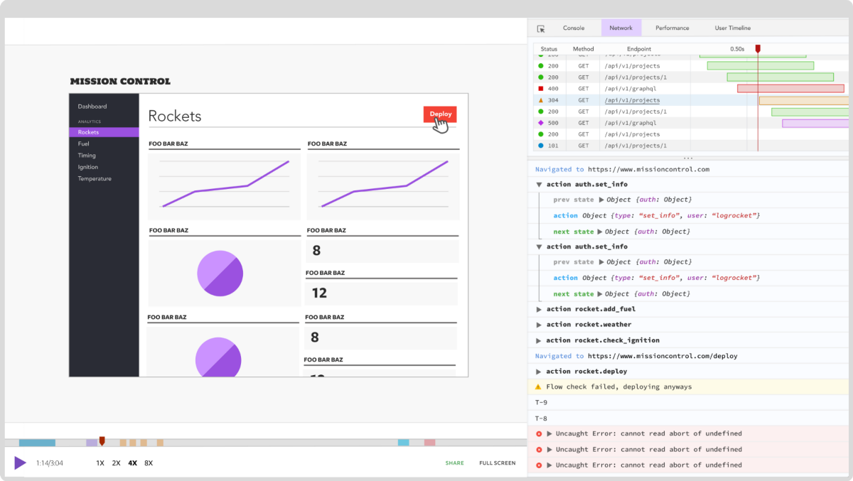 LogRocket is like a DVR for web apps, recording literally everything that happens on your React app. Instead of guessing why problems happen, you can aggregate and report on what state your application was in when an issue occurred. LogRocket also monitors your app's performance, reporting with metrics like client CPU load, client memory usage, and more.
The LogRocket Redux middleware package adds an extra layer of visibility into your user sessions. LogRocket logs all actions and state from your Redux stores.
Modernize how you debug your React apps — start monitoring for free.